entries Tagged as [design]

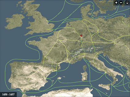
Interactive atlas of early printing

If you’re wondering why Type Daily says ‘since 1455’ up top  . . .  this historical atlas will fill in some of the blanks.

After Johann Gutenberg did his thing, the technology of printing spread across Europe in just around 50 years.

This interactive map from the University of Iowa charts its progress – with timeline, zoom features, trade routes, locations of paper mills and more. Also included is a briefly animated model of what we know of Gutenberg’s press.
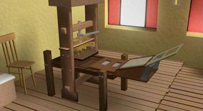
Gutenberg and printing, animated

From the Histeria! series, here’s a cartoon overview of the invention of printing   . . .   well, actually the invention of moveable type   . . .   well, whatever it was that ‘Type A’ Gutenberg guy did.

Found via Twitter.com/MyFonts

City neighborhood posters

Set in FF DIN Condensed, available in multiple colors, thru Ork Posters.

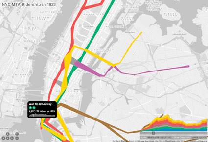
NYC Subway, 1905–2006

New York City Metropolitan Transit Authority ridership interactive map, browsable years 1905-2006.

Found via Twitter.com/jasonsantamaria

Mapping the Tube

Henry C. Beck’s 1933 map for the London Undergound set the standard for transit maps worldwide. Based on an electrical schematic, and handlettered by Beck – he pitched the map to the Underground as easier to understand than what they’d been using. Skeptical at first, they eventually released Beck’s version. It was a major hit with commuters – and he spent the next 27 years updating and revising his creation.

Here’s the iconic tube map as interpreted in this presentation video by Digital Urban  . . .


London Tube Map Traditional Layout from Digital Urban on Vimeo.

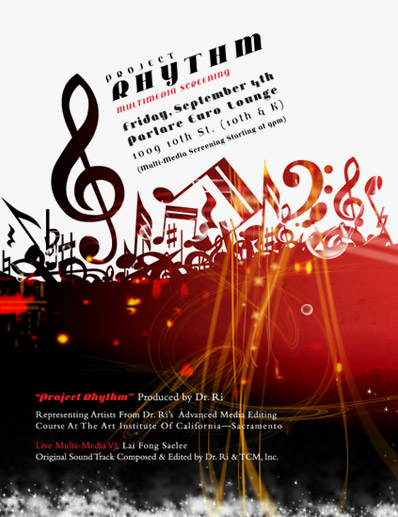
Project Rhythm: featuring Jeanne Moderno

My Jeanne Moderno fonts were spotted on this poster for  . . .

Project Rhythm Multimedia Screening
Friday, September 4th, 2009 at 9 p.m.

At Parlare Euro Lounge, 1009 10th Street (10th & K), Sacramento, CA 95814 [map]

Project Rhythm Multimedia Screening is produced by Dr. Ri and features artists from Dr. Ri’s Advanced Media Editing Course at the Art Institute of California-Sacramento. Also: Live Multimedia VJ: Lai Fong Saelee, original soundtrack composed and edited by Dr. Ri & TCM, Inc.

Erik Spiekermann’s ‘Typefaces give us signals’


Typefaces give us signals from erik spiekermann on Vimeo

The typomaniac music video! Written by Mike Croft, featuring Erik Spiekermann; produced by Alphabeat and Parson Research.

Eric Spiekermann’s ‘Porcelain on Paper’


Porcelain on Paper from erik spiekermann on Vimeo

A presentation video of the identity and catalog designed by Spiekermann Partners for Herig Berlin, manufacturers of fine porcelain.

Erik Spiekermann: typomaniac


Designer Erik Spiekermann on what it’s like to be a typomaniac

Extra footage from Gary Hustwit’s Helvetica film. I still use Spiekermann’s Stop Stealing Sheep as the introductory text in my beginning typography courses.

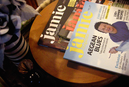
Jamie Oliver: Great chef, beautiful magazine

‘Jamie Oliver made it possible for me to cook a decent meal in under an hour.’
– mehallo

My wife got me hooked on Jamie Oliver when he was known as The Naked Chef. Which was one of the dumbest monikers ever created for marketing purposes. He wasn’t naked, and to this day I’m still not sure why he was called that. His recipes are quick, easy and often come out looking like the photos.

Today he’s been quietly building a food empire over in the UK – akin to what Martha Stewart has done, without all the nasty stuff that is her extended personality (I seem to have the habit of running into people who’ve met and/or worked with her and, wow, the stories I’ve heard). (And I will say I do miss her paint line at K-Mart. Great palettes.) [Read more →]

Cat-n-ham

Funky Lunch designs sandwiches. And you can too!

Found via Because It’s Nice


Creative Commons License

the work at the mehallo blog. beta. is licensed under a creative commons attribution - noncommercial - no derivative works 3.0 united states license.  if reposting, credit must be given to steve mehallo - and if possible, please provide a link back to the mehallo blog. beta.

i include images for the purpose of critique, review, promotion and inspiration - and always make my best effort give credit/link back to the original source.  if i’ve screwed up, please fire me a note.

page layout based on the wordpress 'darkwater theme' by antbag, adapted and redesigned by mehallo.  valuable php assistance from bill mead.