entries Tagged as [design history]

This is CBS

William Golden (1911-59) developed the CBS eye back in the 1950s. The report by Charles Osgood (above) tells the story. Today, the CBS eye is considered one of the most identifiable marks in the world, right next to Target’s bulls-eye.

Golden also developed a proprietary Bodoni Didot font (a mix of Bodoni and Didot) as part of the Columbia Broadcasting System’s brand. This typeface has been used in multiple forms by CBS over the years.

Golden died of a heart attack at the age of 48. His replacement, Lou Dorfsman (1918-08), spent the next 40 years maintaining and refining the quality of the CBS brand; the Tiffany of networks.

More about Golden here. Below, a collection of CBS onscreen graphics/bumpers from over the years:

Scary logos

‘What about the children?’

Many worry about the content of children’s programming. Did anybody ever consider that the content may not have ever been as dangerous as the logos?

Video (above) of creepy tee vee logos that frightened us as children. End of shows, beginning of shows. Both versions of the Children’s Television Workshop (CTW) was nightmare-inducing. On merit alone, Viacom should get an award or something.

Here’s a few more  . . .  RKO Television 9 has to be the most chilling:

More Moderno wallpaper, from Austria

Arno Kathollnig/Typoatelier has been making typographic wallpapers. He had featured my Jeanne Moderno fonts as part of an earlier series. He’s back with a sequel (above). Go here.

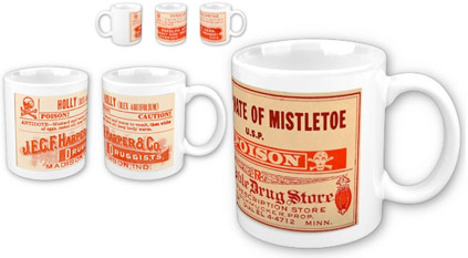
Holiday mugs to die for


Dangerous Mugs by mehallo

what’s your poison?
Celebrate the holiday season with your favorite seasonal toxin on a mug! Choose from Poinsetta, Mistletoe, Holly or the often elusive Pyracantha (which is a bit like holly). Vintage druggist labels on a nice, clean mug. Brand new, limited edition merchandise, available only thru end of December 2009.

Go here to order.

For additional mehallo merchandise, go here.

Rudi Gernreich: Fun future fashion


Gernreich’s unisex thong, 1974

Rudi Gernreich (1922-85) invented the world’s first topless swimsuit, the thong and the ‘No-Bra Bra.’

He also designed the clothing on Moonbase Alpha (below). Article and video here. Posthumous MySpace here.


Costume design for Space 1999, 1975

Type note: Space 1999 used Futura and Futura Black for its title sequence.

Lustig collection

‘He was in the vanguard of a relatively small group who fervently, indeed religiously, believed in the curative power of good design when applied to all aspects of American life.’ -Steven Heller, Eye Magazine

Alvin Lustig (1915-55) didn’t limit himself to the field of graphic design – as a ‘generalist’ he designed just about everything he could leave his mark on. Including a helicopter.

Check out the incredible collection of book jackets designed by Lustig here. More here.

And for even more, visit the Alvin Lustig Archive.

Found via Twitter.com/Sandoer

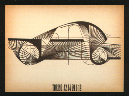
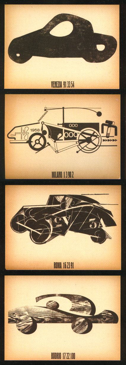
Pino Tovaglia: Alfa Romeo


Series of futuristic drawings by Pino Tovaglia for Alfa Romeo, 1958

I just picked up a used copy of the book Pino Tovaglia. La regola che corregge l’emozione. Book review over at Grain Edit.

Star Trek shuttle: The Kellogg, Loewy, Avanti connection

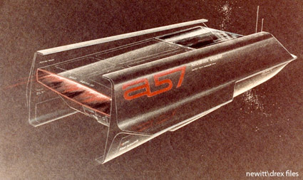
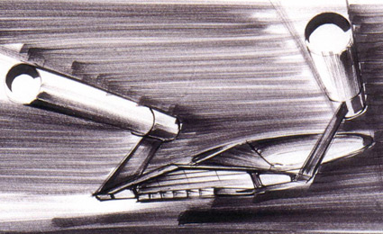
Matt Jeffries was the production designer for the original Star Trek, but somewhere along the way designer Thomas Kellogg was brought in to develop the Shuttlecraft Galileo – made famous in the episode The Galileo Seven.

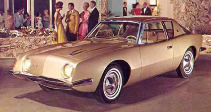
Kellogg became well-known for his design for the Studebaker Avanti Coupe while working under über designer Raymond Loewy. One can see the likeness between the shuttlecraft rendering (above) and the Avanti (below).

And read more about all this here.

Plus
Here’s an interview with Tom Kellogg.

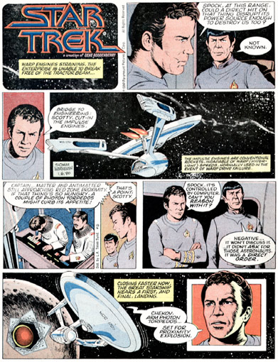
The long lost Star Trek comic strip

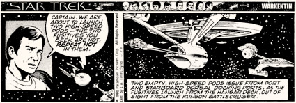
In 1979, the week the first movie premiered, Paramount launched a daily Star Trek comic strip. Thomas Warkentin was the first writer/artist to work on the title and I loved his attention to detail.

The strip adapted the production design of the first motion picture and Warkentin even went so far as to put small details on the viewscreens that was often wasted when printed small in the paper. I had a drawer full of the clipped strips, they’d turned a nice gold color over time.

The strip itself has never been reprinted, lost in a world of legal ownership issues. But the entire run can be found here. Though not in the best user friendly format. There’s also links to some great UK-based Star Trek comics from the 1970s. Handy checklist here.

More Trek: Artist Toru Kanamori

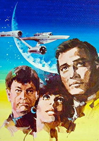
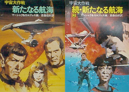
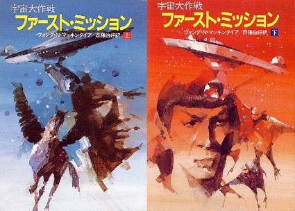
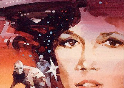
When Star Trek first became a global sensation, Toru Kanamori landed a gig illustrating Japanese translations of the original series stories. Wouldn’t it be great to reprint a bunch of these in an art book with text from the Blish novels?

You know, I’d love to design something like that. Somebody call me.

For more about the work of Toru Kanamori, jump here.

Ken Adam and Ralph McQuarrie do Trek


The Enterprise by Ken Adam

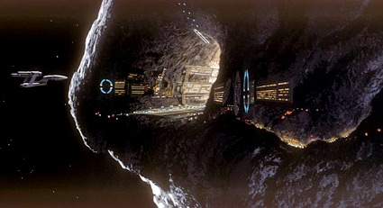
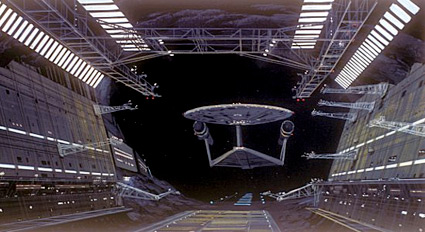
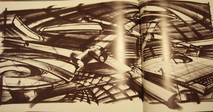
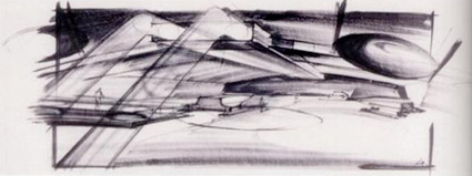
Somewhere in the limbo that was the 1970s was a never-completed UK-produced film Star Trek: Planet of the Titans.

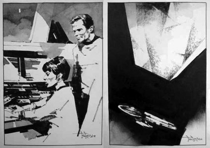
They made it as far as the conceptual illustrations. Ken Adam was hired as production designer and Star Wars visionary Ralph McQuarrie set about redesigning the Enterprise.

Article here. More McQuarrie art here.


Enterprise interior


Enterprise shuttlebay


Creative Commons License

the work at the mehallo blog. beta. is licensed under a creative commons attribution - noncommercial - no derivative works 3.0 united states license.  if reposting, credit must be given to steve mehallo - and if possible, please provide a link back to the mehallo blog. beta.

i include images for the purpose of critique, review, promotion and inspiration - and always make my best effort give credit/link back to the original source.  if i’ve screwed up, please fire me a note.

page layout based on the wordpress 'darkwater theme' by antbag, adapted and redesigned by mehallo.  valuable php assistance from bill mead.