entries Tagged as [design history]

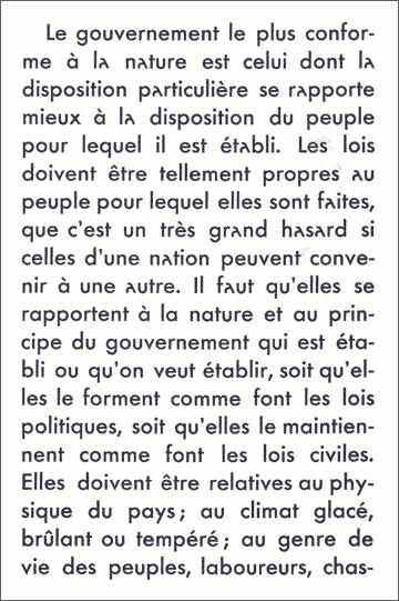
French Futura: You get an a

Paul Renner’s Futura fonts were exported to France under the name Europe. And they came with an interesting alternate a (seen in the top half of this sample). Changes the whole look and feel of the type. Details here.

Found via Colin M. Ford

Greasy spoon

I like a good greasy spoon.

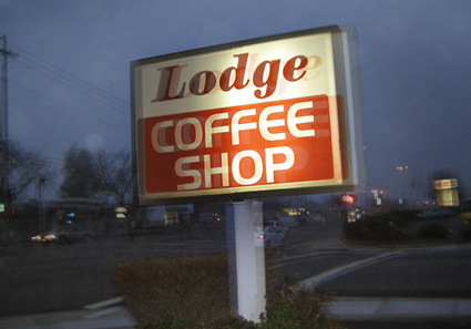
A few weeks back I went in search of a good old school diner joint. Haven’t found many good local ones, often food plated up is basic food service quality. Found a small gem though: I ended up at at the Lodge Coffee Shop in Citrus Heights.
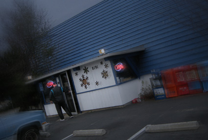
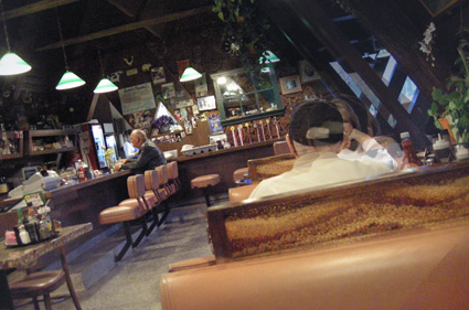
Open since 1958, the Lodge is a mix of interesting interior styles. Some original mid-century ski lodge touches (A-frame building), some googie (a little bit), some 1970s ‘harvest-theme’ updates, a splash of 1990s country – and a fish tank where all the fish are named ‘Dave.’ To avoid confusion.

What hooked me was an authentic Chicken Fried Steak with a really good sausage/bulldog gravy. Not a deep-fried burger, but a breaded cube steak, grilled to order. Like it’s supposed to be done. The owner works the kitchen.
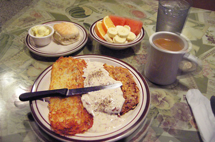
Had a few quiet breakfusts there recently. Ate and organized ideas/projects in my sketchbook. Nice start to my day.

Lodge opens at 6 a.m. [map]

Local Towers

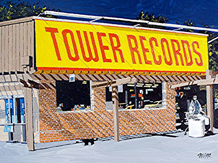
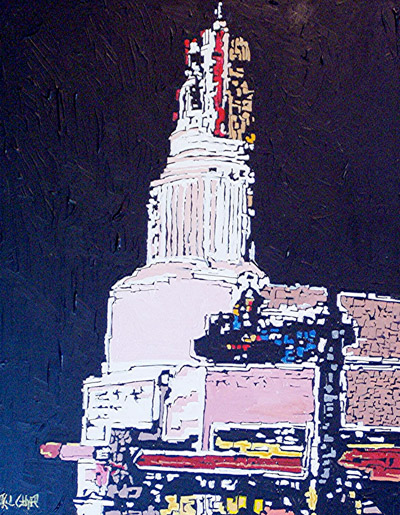
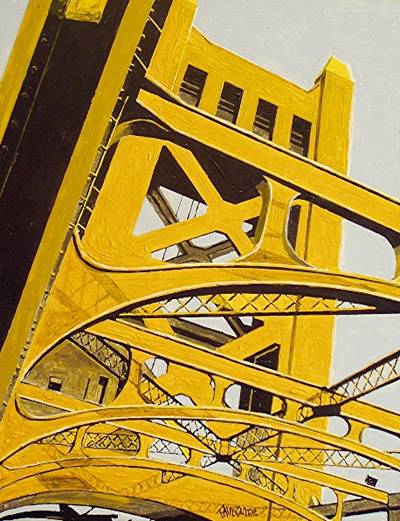
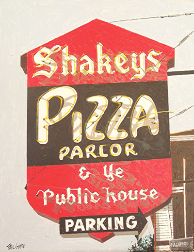
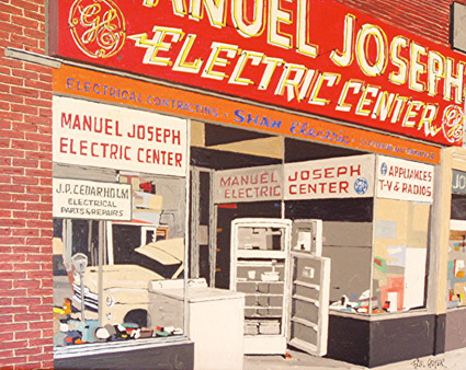
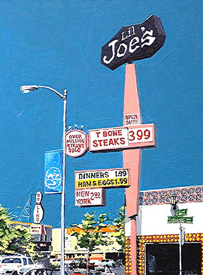
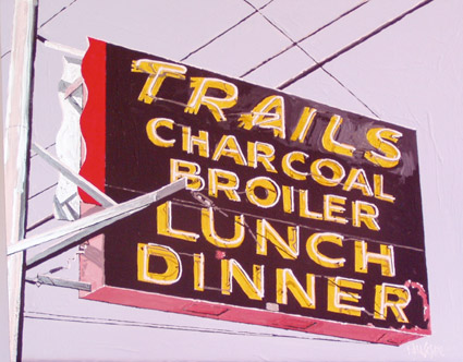
Things in Sacramento are named Tower.

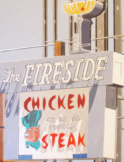
After the bridge, after the theatre (both below). Tower Records (as a walk in store) started  . . .  and finished here. I’m convinced the local auto museum, the Towe was actually supposed to be the Tower but they forgot to add the r.

Pictured: Sacramento Cityscapes by Paul Guyer. More here.

(Shakey’s Pizza started here too)

Towers


Nicola López, woodcut and silkscreen on paper

Ten visions of towers, over at PRINTERESTING.


Vladimir Tatlin, letterpress book cover


Michael Dal Cerro, woodcut


Anne-Maree Hunter, book arts, intaglio, silkscreen

Great ideas

More inspiration at LEGO CL!CK.

Found via E Design Studio

Rethinking Snoopy

Todd St. John’s Rethinking Snoopy spot illustration for Giant Robot.

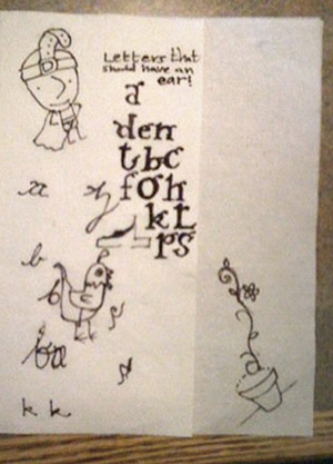
Alphabet ears


Sketches by dr. mendez and nurse wickland

I think our lowercase g is our screwiest letter. It evolved into something quite odd. It has parts that other letters do not have. It also has an ear. It’s often drawn just like a dog’s ear.

Two of my students have been pondering (above) other letters that should have ears.

A Trashy preview

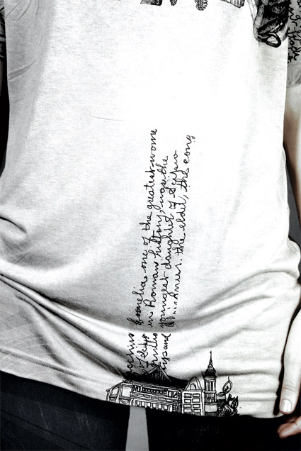
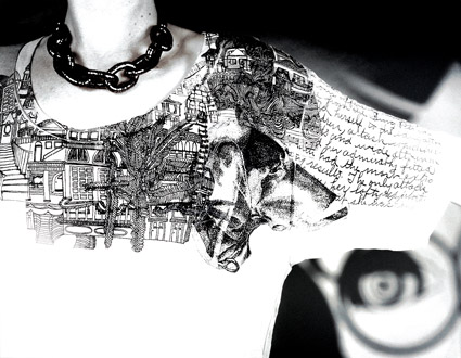
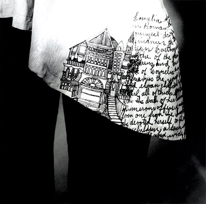
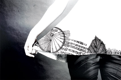
For the past few months, I’ve been working on a new collection with Trisha Rhomberg of Pretty Trashy. Prints on vintage clothing, American Apparel, historical interpretations, typography, illustration, some naughtiness and more.

Here’s some preview images. Will post more as we get closer to a launch date.

Happy Up Here

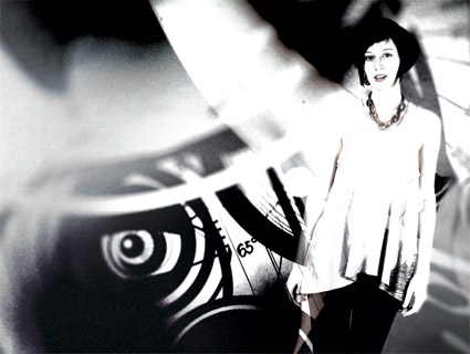
Video for Royksopp’s Happy Up Here. Directed by Reuben Sutherland. From the album Junior.

The Royksopp website.

Found via Matthew Valentine

Orson Welles on champagne (literally)

‘We will sell no wine before its time’

Legendary Orson Welles was the 1970s pitchman for Paul Masson. Outtakes above. Completed, salvaged commercial below  . . .

Ring in the New Year

New Years Eve was always about André. Champagne and Cold Duck.

André is, of course, from the makers of Thunderbird  . . .

And Ripple  . . .


Creative Commons License

the work at the mehallo blog. beta. is licensed under a creative commons attribution - noncommercial - no derivative works 3.0 united states license.  if reposting, credit must be given to steve mehallo - and if possible, please provide a link back to the mehallo blog. beta.

i include images for the purpose of critique, review, promotion and inspiration - and always make my best effort give credit/link back to the original source.  if i’ve screwed up, please fire me a note.

page layout based on the wordpress 'darkwater theme' by antbag, adapted and redesigned by mehallo.  valuable php assistance from bill mead.