entries Tagged as [design history]
Type specimens galore!
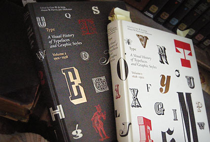
These two oversized coffee table books – which were published in the past year or so – are an odd sort.
Both volumes of Type A Visual History of Typefaces and Graphic Styles sell themselves as design history books.
They have the current editor of Meggs (and similar cover design), but the history is really just a backdrop (with, unfortunately, poorly annotated notes) to what the books are all about: They’re actually an incredible collection of rare typography specimens dated c. 1830-1930. [Read more →]
My take: Graphic design history fu
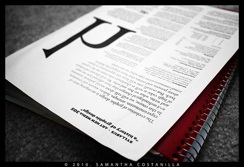
My syllabus, photographed by student Samantha Costanilla
So I’ve been teaching my version of ‘a history of graphic design’ for several years now. Just finished up my 9th session.
As a text, Philip B. Meggs’ landmark research book – History of Graphic Design, first released in 1984 – is the bible on the subject. Even the ‘making of’ has its own edition.
It’s the most thorough analysis, and one of the best graphic design reference books I own. But as Meggs points out in his introduction, it’s only the tip of the iceberg. There is so much more to discover, find, research and incorporate into one’s own view.
Finally, there is another book that just hit the market – The Story of Graphic Design by Patrick Cramsie. It tackles similar ground, but from another angle. A refreshing find. And from what I could tell so far, it syncs with my own classroom take on ‘The Story’ . . . [Read more →]
Anderson: Cooper Black
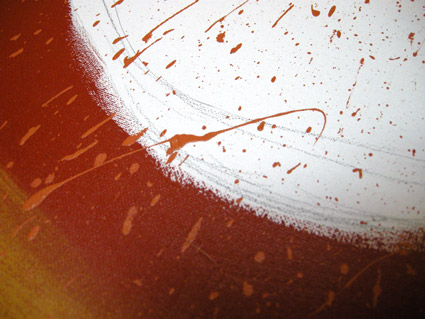
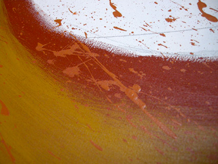
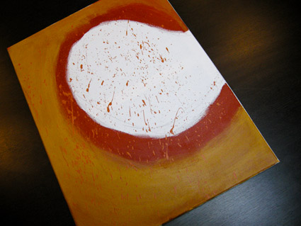
David M. Anderson’s Chaotic Times of Cooper Black, 2008. Mixed media on canvas.
Based on the type of Ozwald Cooper (1879-1940). From my Typography 3 course at Art Institute of California Sacramento.
Design manifestos
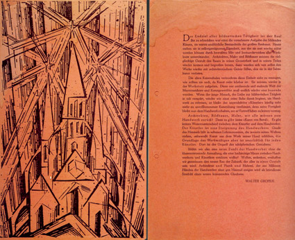
“Gropius’ Bauhaus manifesto, 1919; woodcut by Lyonnel Feininger
Everyone needs a good manifesto. I have one.
Here’s 100+ years worth of em.
‘Poison Unlimited’
Ratcat’s Candyman. From the 1993 album Insideout.
Restaurant menus, vintage
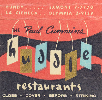
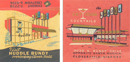
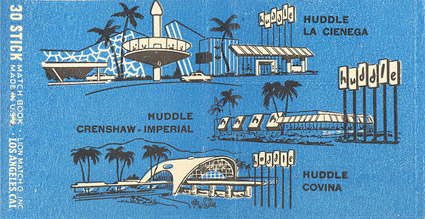
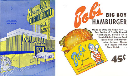
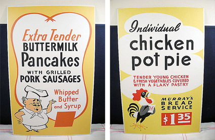
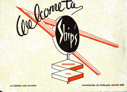
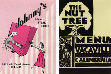
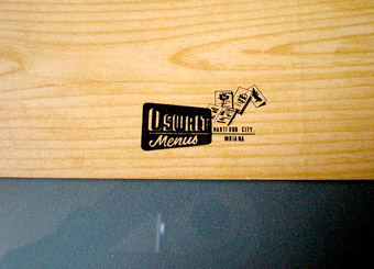
I have a small collection of vintage menus. Some cards, matchbooks, other ephemera. My Joe’s and Googie stuff.
They just don’t make em like this anymore. Beautiful utilitarian type suggesting odd specials and Braised Swiss Steak.
Nothing worse than walking into a small town diner and seeing a computer-generated mess passing itself off as a menu. Happens too much these days.
Pictured, some finds from Flickr (better than what I have). More here, here and here. Best book I’ve found on the subject, Jim Heimann’s May I Take Your Order?
Jackie Gleason Orchestra: Yesterdays
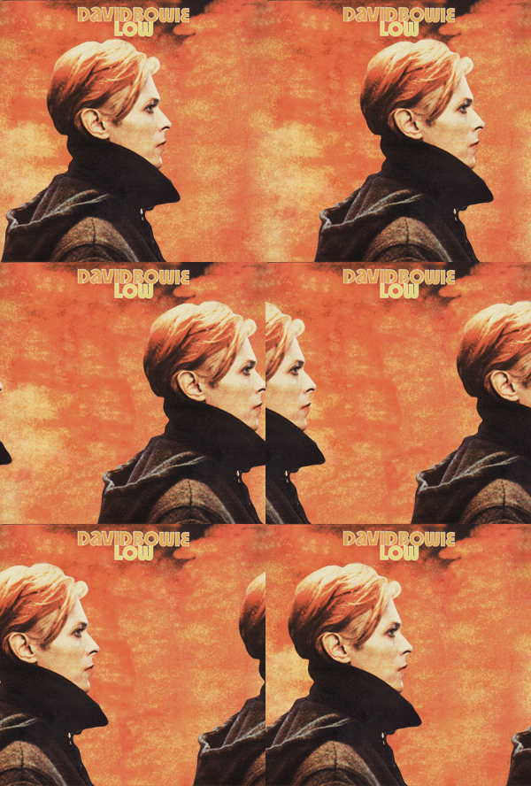
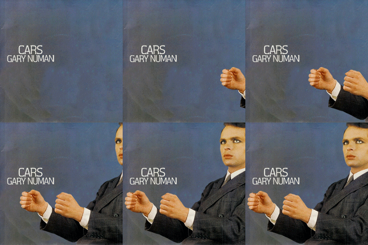
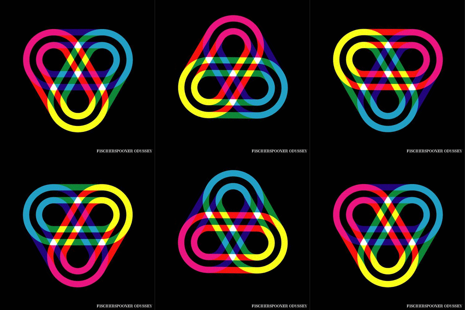
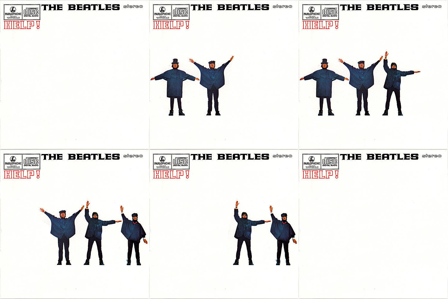
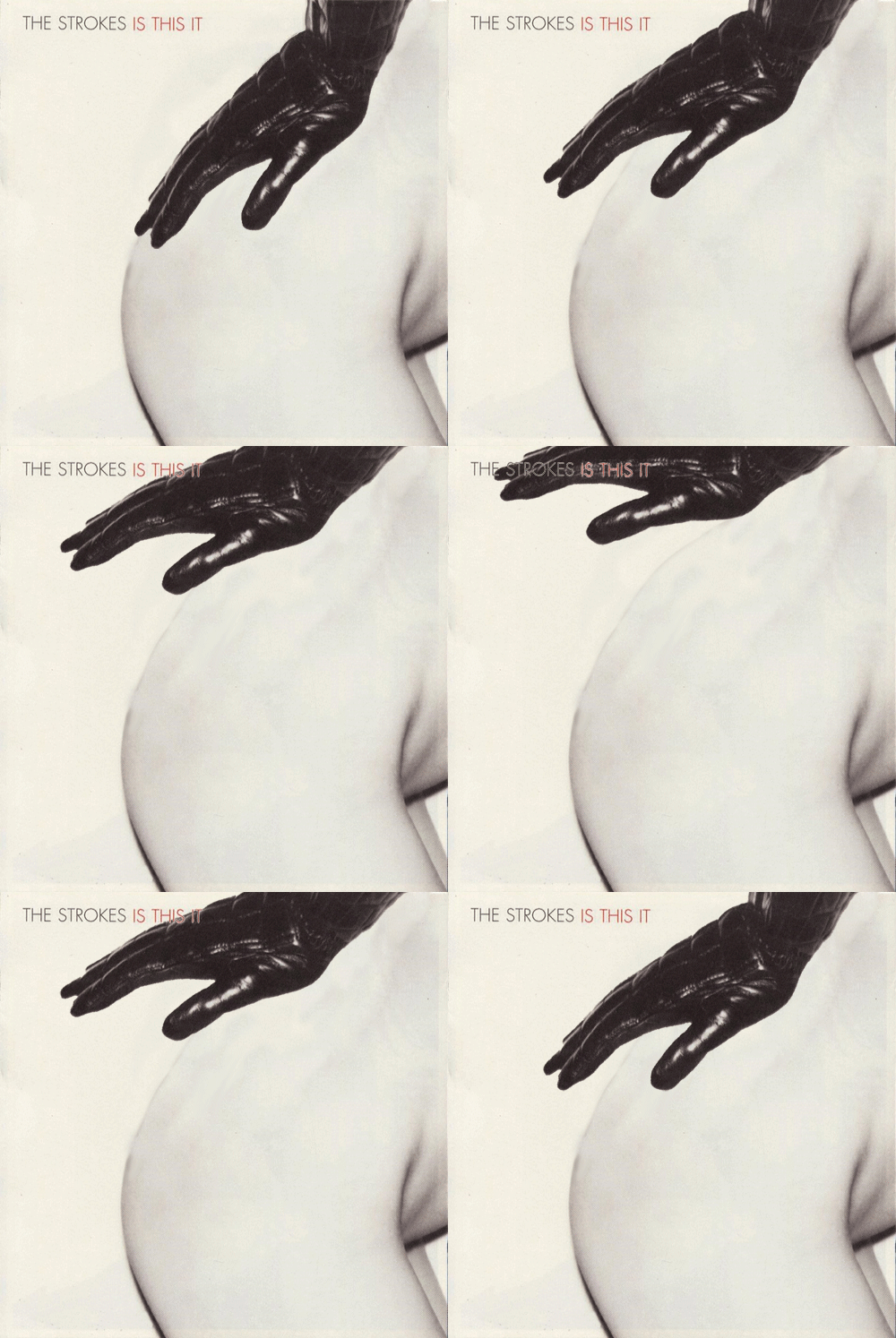
Animated album covers
New blog animates some jackets. Gif style. Go here.
The Strokes: Take It Or Leave It
Found via Nina Stoessinger
Valentine
‘The Valentine Notebook, shares the Olivetti Valentine’s red case, pullout keyboard form and functional beauty’
Design students Julia Kaisinger, Pia Weitgasser, Martin Zopf and Tony Weichselbraun of the University of Applied Arts Vienna have rethunk Olivetti‘s Valentine typewriter. More info here.
‘Stile Olivetti’

An Olivetti Manual typewriter at Urban Outfitters? Cool comeback.
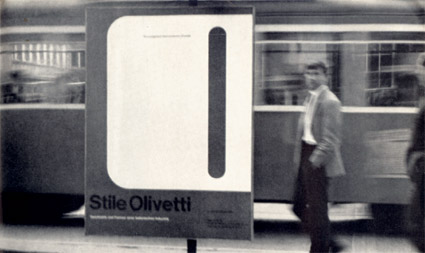
Back in the 1950s, Italian business machine manufacturer Olivetti developed a super cool house style under the design leadership of Giovanni Pintori. The work of Paul Rand, Herbert Bayer, Walter Ballmer, Ettore Sottsass, Milton Glazer followed. [Read more →]
