entries Tagged as [design history]
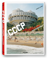
Chaubin, CCCP
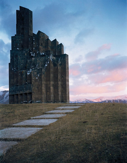
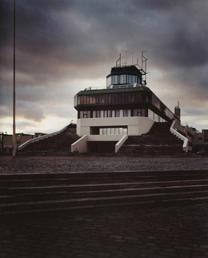
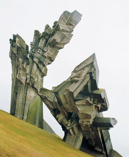
‘The beauty of Soviet brutalism’
Frédéric Chaubin’s photographs of 90 oddly-designed buildings constructed in the final decades of the Soviet Union.
And thru Taschen, available in handy book form.
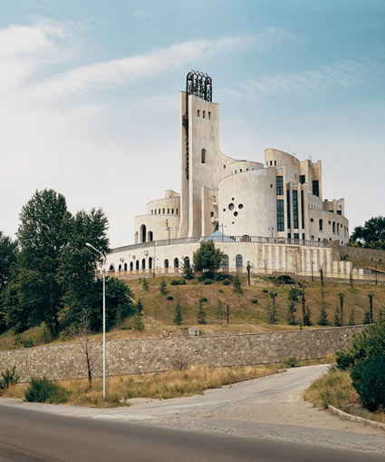
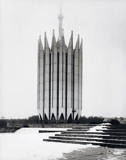
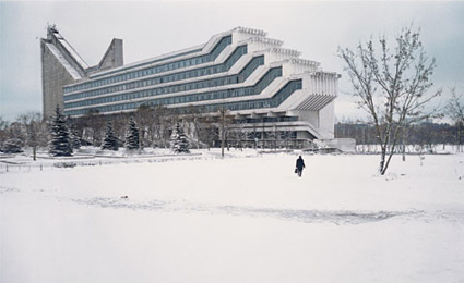
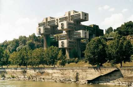
Found via RebeccaWho
A TETRIS History of the Soviet Union
Video for Pig With The Face Of A Boy’s A Complete History of the Soviet Union as Told by a Humble Worker, Arranged to the Melody of TETRIS. Directed, animated and edited by Chris Lincé.
Andrews, 1934

Sybil Andrews’ Speedway (above) is a linotype print commissioned by the London Passenger Transport Board in 1934 to advertise what was a new spectator sport, Speedway Racing.
The final piece – like the famous ‘keep calm’ poster – was never used for its intended purpose.
Found via Gunther Stephan
Goncharova, 1913

‘She did not hesitate to break up forms and rearrange their component parts. She introduced musical notation, letters and words, as they flash past in shop signs; she expressed movement by repeating the same form in several phases of its action and velocity by blurring contours.’ –Goncharova: Stage Designs and Paintings
The work of Natalya Goncharova (1881-1962).
Metzinger, 1913
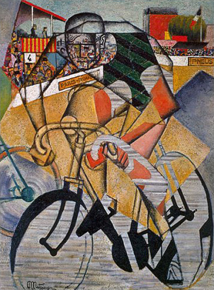
‘Metzinger celebrated the salutory effects of exercise on the male population in his ‘Cyclist,’ which focused on a sport that historian Eugen Weber has described as a French creation, and one affordable to the French working class by 1900.’ –Mark Antliff, Patricia Leighten
In 1913, Jean Metzinger (1883-1956) created his Cubist Cyclist to depict audience, participant and the interaction involved.
(Been doing a lot of reading on early modern art)
David Byrne: Architecture affects music
‘Does the venue make the music? From outdoor drumming to Wagnerian operas to arena rock, he explores how context has pushed musical innovation’
Found via Lucy Cook
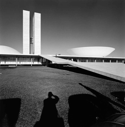
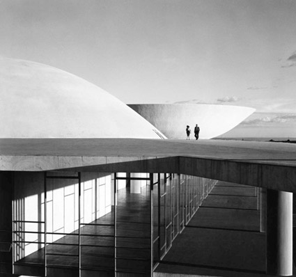
Building Brasilia
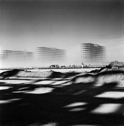
‘Gautherot’s photographs of Brasilia offer a thorough, cohesive portrait of the new city.’
Photographs by Marcel Gautherot document the early construction of modernist urban planning landmark Brasilia, 1957-1960.
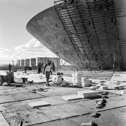

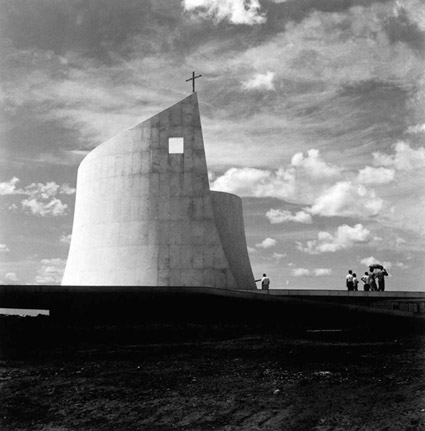
Found via DesignFeast
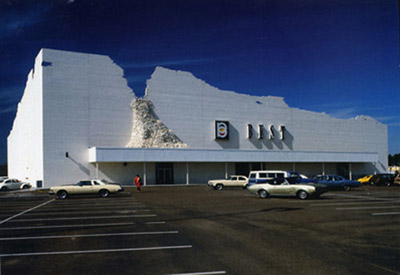
BEST Peeling
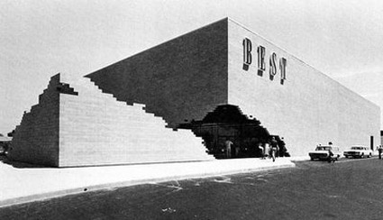
‘This approach is a way of asking questions and changing public response to the significance of commercial buildings in the suburban environment.’
Back in the 1970s, architectural firm SITE created some great facades for the BEST retail chain as part of what was titled The Peeling Project. Sacramento was home to the ‘earthquake’ variant (pictured). The pushed out slab could be moved as necessary to reveal the front entrance.
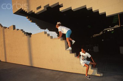
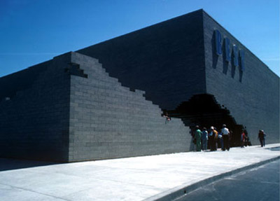
The BEST chain is now gone – tho evolved into Best Buy, which currently occupies the same building, but the cool entrance is long gone.
More info here. SITE site here.
