BEST Peeling
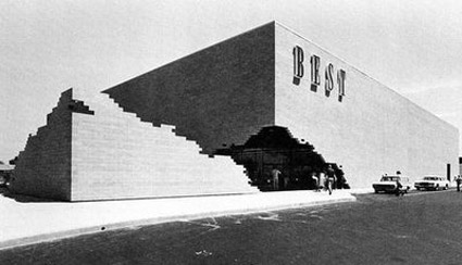
‘This approach is a way of asking questions and changing public response to the significance of commercial buildings in the suburban environment.’
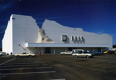
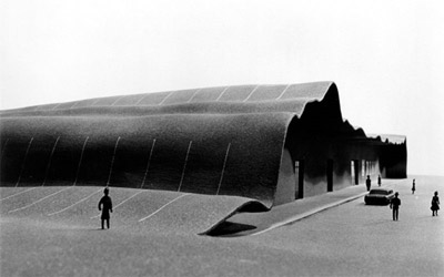
Back in the 1970s, architectural firm SITE created some great facades for the BEST retail chain as part of what was titled The Peeling Project. Sacramento was home to the ‘earthquake’ variant (pictured). The pushed out slab could be moved as necessary to reveal the front entrance.
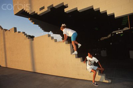
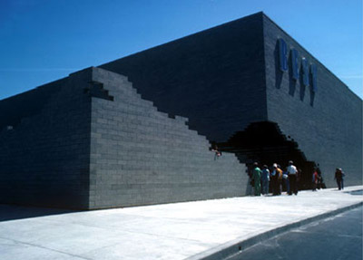
The BEST chain is now gone – tho evolved into Best Buy, which currently occupies the same building, but the cool entrance is long gone.
More info here. SITE site here.


















Garmin 1490t…
[…]below you’ll find the link to some sites that we think you should visit[…]…
Garmin 1490t…
[…]below you’ll find the link to some sites that we think you should visit[…]…
1.) More…
2.) […]if you want to read a bit more then I recommend the following[…]…