entries Tagged as [design history]
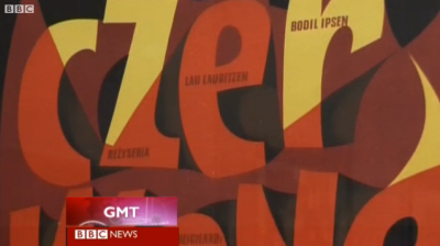
Roman Cieślewicz, graphic designer
‘Cieślewicz always compared himself to a journalist; but he referred to himself as a visual journalist. So Graphic designer, as a profession, is very close to that of journalism; except that it is about articulating clear ideas through the justaposition of imagery and layout – it’s a question of wanting to say something.’ –Professor Andrezej Klimowski, Royal College of Art
Above, a BBC overview of the work of Roman Cieślewicz (1930–96), which was part of a retrospective this summer at the Royal College of Art in London.
Click image to view video/jump.
Found via BBC News
Graphic design: Training one’s eye
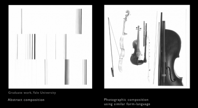
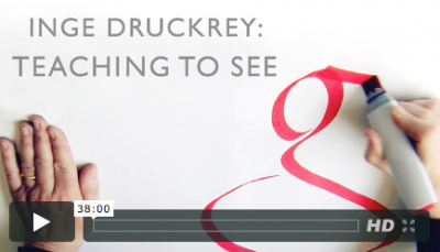
Still from Ingre Druckrey: Teaching to See
As an educator, I’ve broken graphic design into three components: Message, Typography, Layout.
I’m not the first educator to do this – just happened to constantly notice these three elements staring back at me in all the student pieces I evaluate. In my opinion, careful appreciation, understanding and implementation of the three can lead to beautiful work.
message
Graphic design is a communication field, so Message should always drive the project. Today we are bombarded by thousands of Messages on a daily basis, so being on Message is critical. And yes, this usually involves language and writing – which is why I love when students take their written studies seriously.
typography
I’ve seen an (often not cited/supported) statistic that graphic design is 95% typography. Scientific or not, I agree with this. Type is important. I like comparing the exploration of lettering to that of music – there’s enough complexity for it to become a lifetime endeavor. And most of what I teach is type, from multiple angles.
form
Graphic designers are taught to use grids for layout – though relying on ‘grid’ as a catch all way of handling form can be misleading. Grids provide support, a fallback position for dealing with massive amounts of information. Though important, grids have their limitations. Building structure using symmetry, asymmetry, balance, color – some elements obvious, some not – involves continuous practice, a trained eye, instinct.
These three are not formulas, can’t be added together. They need to work in tandem, like cooking a great stew where the ingredients are based on what feels just right.
On a related note, the above film – Edward Tufte’s Ingre Druckrey: Teaching to See – found its way into my Twitter feed. It’s about graphic design and beauty. And much more.
In January I’m going to be teaching my first non-type course on Form and Space. I’m starting prep now because I consider form so important – so powerful, so delicate.
And beautiful when done right.
Video found via ayana baltrip
State of graphic design, 2012
‘As a student, live by these words, ‘Quantity rather than quality.’ The more you design the better your quality will become and you will continue to grow’ –Tony Montano
I like that quote.
Quality does come later. Being a designer becomes all about instinct – not having the best computer, not software, not measurements, not rules.
I’ve just started teaching another semester of Graphic Design History and Typography at American River College – have a whole new group of kids to introduce to my gospel of visuals.
One thought that’s been weaving its way thru my classes over the years is simply, ‘the more you do, the better you get.’ We’ve all heard this, and yeah, it’s true. The only real stumbling block is ‘the more you do, if you’re not paying attention, you probably won’t get better.’
This year the student work has been incredible – but only when tied to good, old fashioned Hard Work. Risk taking, going out on that edge, trying something one has never done before leads to fantastic creations.
I haven’t been blogging much – I also have my usual four type classes at Ai Sacramento and a rather large project that’s been taking up the rest of my time (more on that soooooon) – so something had to give. It was blogging.
I’ll be posting more as time permits; otherwise been immediately throwing finds up on my Twitter account.
I’m keeping busy. Hope you are too.
Infographic found via Ai Sacramento Graphic Design; click image to jump/view larger
Trans Europe Express
Video for Kraftwerk’s Trans Europe Express. From 1977.
