World Cup typography

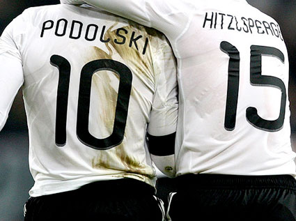
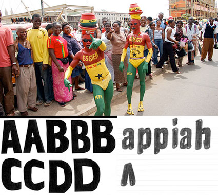
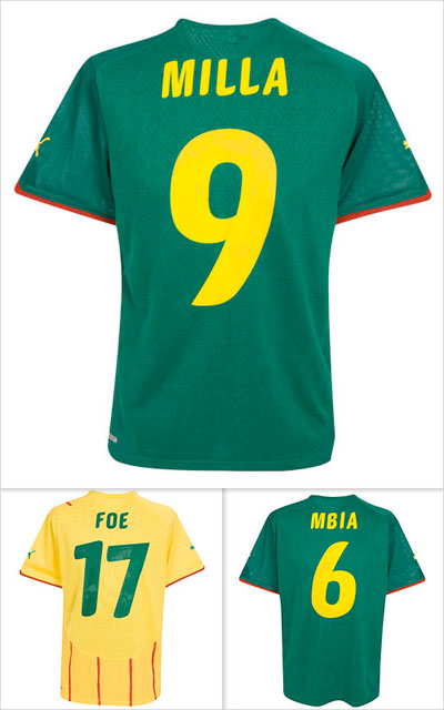
‘Football and typography may seem like an unlikely pairing, but they’ve been getting along quite well since a while. In 2006 Dalton Maag claimed the team with the best typography won the World Cup.’

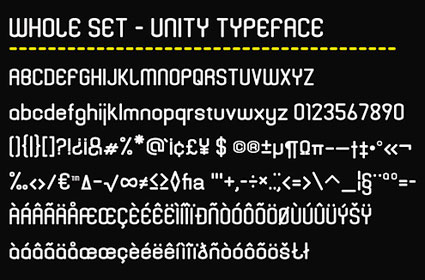
Here’s two overviews of World Cup typography: The work of Paul Barnes and the work of Yomar Augusto – over at The FontFeed.

One Response to “World Cup typography”

  1. any sport and type is a ripe combo…thanks for sharing your thoughts – great per usual!


Creative Commons License

the work at the mehallo blog. beta. is licensed under a creative commons attribution - noncommercial - no derivative works 3.0 united states license.  if reposting, credit must be given to steve mehallo - and if possible, please provide a link back to the mehallo blog. beta.

i include images for the purpose of critique, review, promotion and inspiration - and always make my best effort give credit/link back to the original source.  if i’ve screwed up, please fire me a note.

page layout based on the wordpress 'darkwater theme' by antbag, adapted and redesigned by mehallo.  valuable php assistance from bill mead.