Really seksi spam buttons – for charity

As I write this, there are 2,728 items in my spam folder; most of them involve some form of penis renovation, ‘The Big Pink,’ ‘urgent and confidential business’ inquiries from deposed royal family members that need my help – and on my blog, 2,201 spam posts sitting in what I call my ‘hey asshole, don’t spam my blog’ folder.

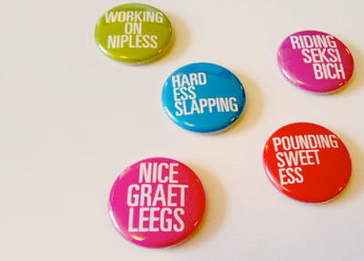
Designer Floyd Hayes has decided to turn annoying spam into money – for a good cause. Since a lot of spam is about freaky misspelled sex stuff, every four weeks Hayes will be issuing the best subject lines as buttons and donate all the profits to a sexual health charity. Details here.

Oh and wait – ‘The Big Pink’ is actually a cool new band, it’s an email I’m actually subscribing to. Here’s their debut album, A Brief History Of Love. Drops September 22nd.

I really wish spam filters worked better.

Buttons found via PSFK

Information design: Life, death, taxes and spam

‘Le Grand Content examines the omnipresent Powerpoint-culture in search for its philosophical potential. Intersections and diagrams are assembled to form a grand ‘association-chain-massacre’ which challenges itself to answer all questions of the universe and some more.

‘Of course, it totally fails this assignment, but in its failure it still manages to produce some magical nuance and shades between the great topics death, cable tv, emotions and hamsters.’

For more about the work of Clemens Kogler, go here.

Redesinging the threat level

‘To mark the return to sanity, The New York Times asked four graphic designers to imagine a new warning system. Their designs range from the cheeky to the possibly useful. Kurt Andersen provides commentary and explains why the current system is a joke.’ -Andrew Price, GOOD

Legendary SPY magazine was one of my favorites – and founding editor Kurt Andersen is still making snarky commentary. Click either the image or the quote link to read more.

For more from Kurt, check out his weekly radio program Studio 360 and ‘Get inside the creative mind.’

And for the record, I am really glad the Obama administration recognizes the value of good graphic design. Makes me all warm and fuzzy inside just knowing this.

Found via GOOD

Disgust this

San Francisco is a beautiful city.

But there is a dark, very visible problem – one that frames our current national Health Care debate. The problem stems from what has been the traditional US approach: It’s not even happening or We wish all that would just go away.

For the rest of the country, it can be adapted to the acronym: NIMBY. It’s Not In My Backyard so it doesn’t exist. Or: we don’t see it in our backyard, so it’s not actually there.

Danish band Mew was in SF recently and guitarist Bo Madsen posted a simple but poignant observation on their MySpace blog. Here’s the text: [Read more →]

Just thinking

Some photos I snapped at the Legion of Honor, San Francisco.

Penguin: The covers

Check out Joe Kral’s Flickr collection of some of Penguin (and Pelican)’s best cover designs.

And  . . .  check out Phil Baine’s Penguin by Design: A Cover Story 1935-2005.

Found via LifeClever

Tschichold: distinguisted typographer

When I want to design something that calls for sophistication, I thumb thru the work of Jan Tschichold (1902-1974).

Modernist and  . . .  Classicist. This contrast leads to some interesting thinking that informs my own ability to design for different industries.

Tschichold put The New Typography on the map by publishing the book on the subject and helped spread the idea of the bauhaus – and modernism – worldwide.

The largest project of his career took place in the late 1940s – the redesign of Penguin’s line of paperbacks (below). As a whole, Penguin’s quality hasn’t wavered since.

Here’s an overview of the work of Tschichold at retinart – with some good links for additional info.

And I’m still looking for a decent (inexpensive) replacement text for my beginning type courses since Tschichold’s Treasury of Alphabets and Lettering is now out of print. Nothing I’ve found so far comes close to showing well-drawn – and well selected – metal specimens.


Penguin redesign, an exercise in subtlety: before (1941) and after (1947)

Penguin by Illustrators

When it comes to design, UK-based Penguin Books produces some beautiful specimens. And here’s a write up by Ace Jet 170 on the Penguin Collectors Society and their wonderful Penguin by Illustrators monograph.

David A. Carter: Popping up in Roseville


The Pop Up Artist
Video produced by Manny Crisostomo for The Sacramento Bee

 
Pop-up book master – and paper engineer – David A. Carter has been expanding his art into geometric abstraction.

Inspired by the work of Alexander Calder (1898-1976), Carter’s Red Dot series will be on display at the Blue Line Gallery in Roseville, CA [map]

The opening reception is this weekend: Saturday, September 19th, 2009 from 6:30 – 9 p.m.

Read The Sacramento Bee article here.
Show information here.
Exhibition runs thru January 9, 2010.

Found via Jonathan Weast

Typographic art by Daïd

Based out of France, artist Daïd Daragones was in the new media show I co-curated last year. Some of his typographic works are now available thru MYFACE. Go here.

Type face


Illustration for Computer Arts Magazine article about typography

The work of Austrialian designer Christopher Haines.


Cover illustration for Computer Arts Magazine


Creative Commons License

the work at the mehallo blog. beta. is licensed under a creative commons attribution - noncommercial - no derivative works 3.0 united states license.  if reposting, credit must be given to steve mehallo - and if possible, please provide a link back to the mehallo blog. beta.

i include images for the purpose of critique, review, promotion and inspiration - and always make my best effort give credit/link back to the original source.  if i’ve screwed up, please fire me a note.

page layout based on the wordpress 'darkwater theme' by antbag, adapted and redesigned by mehallo.  valuable php assistance from bill mead.