‘Design Like Nobody’s Watching’
Posted on June 4th, 2013 by steve
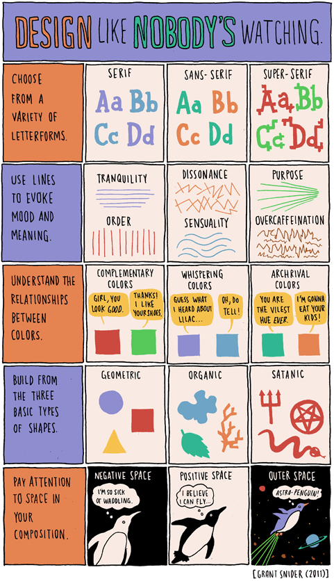
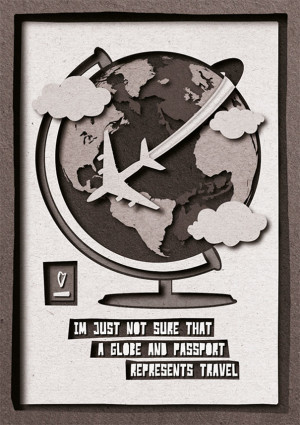
Years ago Step By Step was a graphic design magazine that showed complex design solutions in a ‘step by step’ process. So was HOW, which broke out HOW things were designed.
Today we assume computers just design everything. Not true. Not everything.
Pictured is the work of Dmitry Karpov. And at Behance, here is the Step by Step breakdown of HOW they were done.
Found via Designcollector Network
‘a nice typo series by talented recent SVA grad Zipeng Zhu’
Timely messages for a bunch of people in my life – including the redneck in the large white truck.
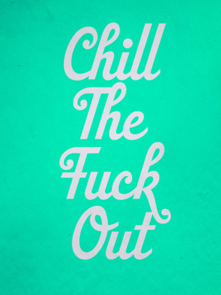
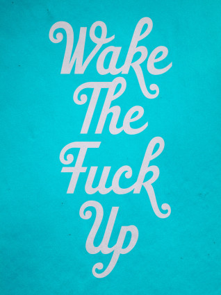
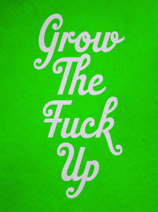
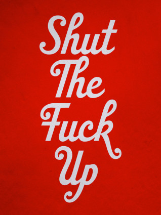

Found via Jessica Walsh
‘His most famous title sequences include the animated paper cut-out of a heroin addict’s arm for Preminger’s The Man with the Golden Arm, the credits racing up and down what eventually becomes a high-angle shot of a skyscraper in Hitchcock’s North by Northwest, and the disjointed text that races together and apart in Psycho’
Last night, Google doodled this (above).
Last week in my history class, I presented footage of the original titles that Saul Bass designed that Google doodled this (above) was based on.
Dave Brubeck came along for the ride.
More info here.
Found via Alice Woodruff
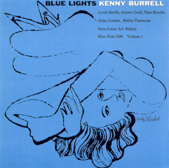
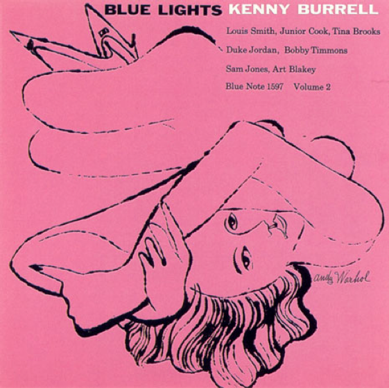
Covers for Kenny Burrell’s Blue Lights. Reid Miles, design; Andy Warhol, illustration. Blue Note Records, 1958.
Just because.
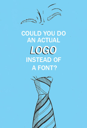
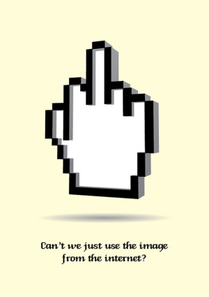
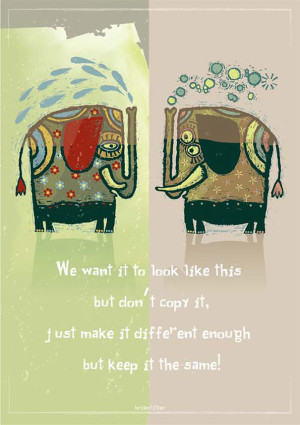
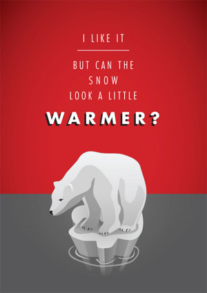
As a side project, Irish graphic designers Mark Shanley and Paddy Treacy turned a bunch of client feedback (the bad kind) into a series of posters. They then put them up for sale and ended raising a bunch of money for charity.
Pictured, a few. More here.
Of course, the goal is always to work with clients that know shit. And are willing to go thru a creative process that leads to the best work imaginable. This usually involves understanding that good logos typically involve letterforms (I’ve heard poster #1 before).
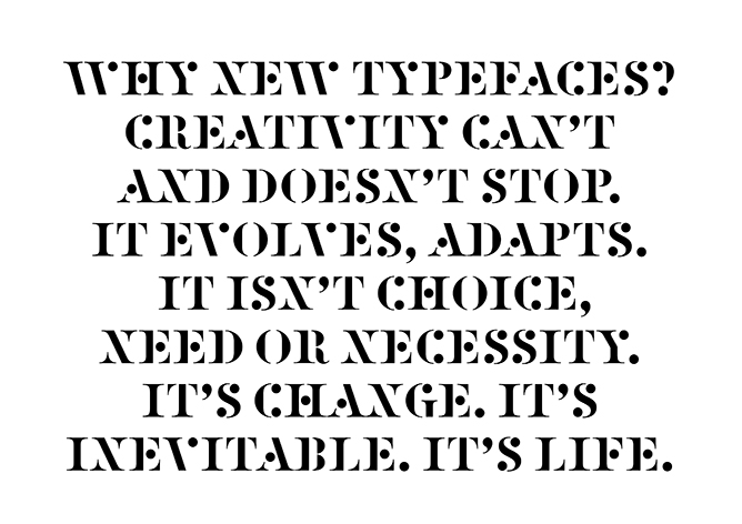
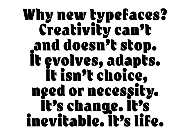
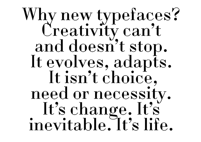
‘So just as we change as we grow up and our bodies, opinions and tastes change. This is Time. This is Life. They are defined by Change. So Change is inevitable, its outside of need or necessity. It just Is.’
The images (and words) are from this wonderful post over at the Alias blog: Why new typefaces? Alias is run by David James and Gareth Hague.
In my opinion/experience, we’ll stop having a need for new typefaces right about the time we stop wanting new music, new food ideas (I’m hooked on detox water right now) and new ways of looking at how we dress ourselves.
Types have personality, just like humans. Take it all away and we become . . . Helvetica. On a Star Trek planet where we all look, think and dress alike.
Type is everywhere. And humans like to mess with shit.
via Alias
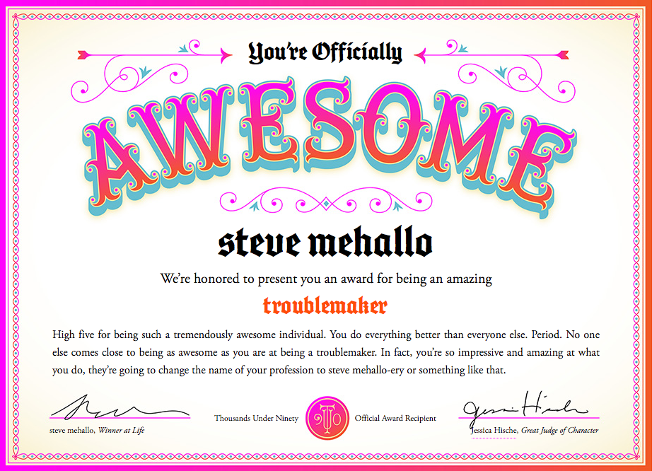
Too many graphic design award competitions award people for being young and full of ideas. What about the rest of us who are OLDER than YOUNG and maybe filled with better ideas?
I think experience and wanting to keep doing NEW is worth something, no?
So you can now be AWESOME too. At any age. Go here.
Courtesy Jessica Hische; found via Jessica Walsh
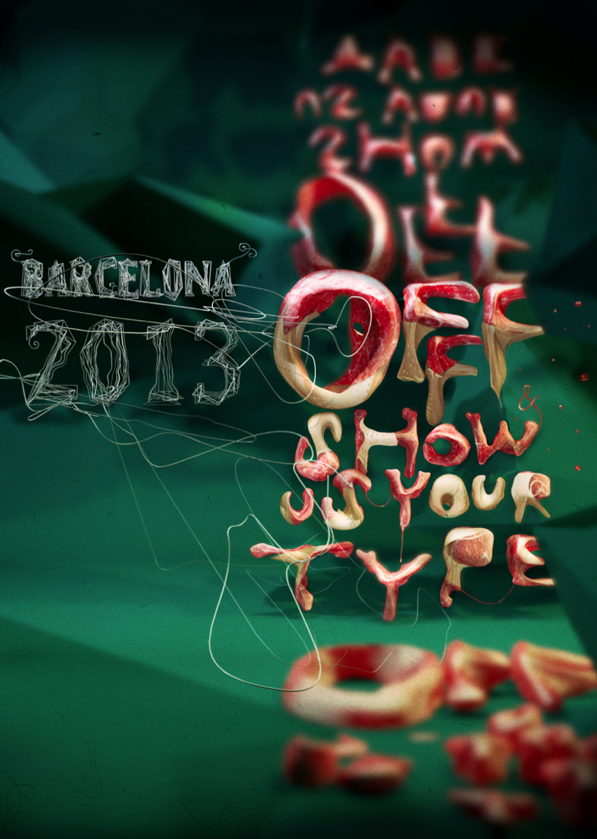
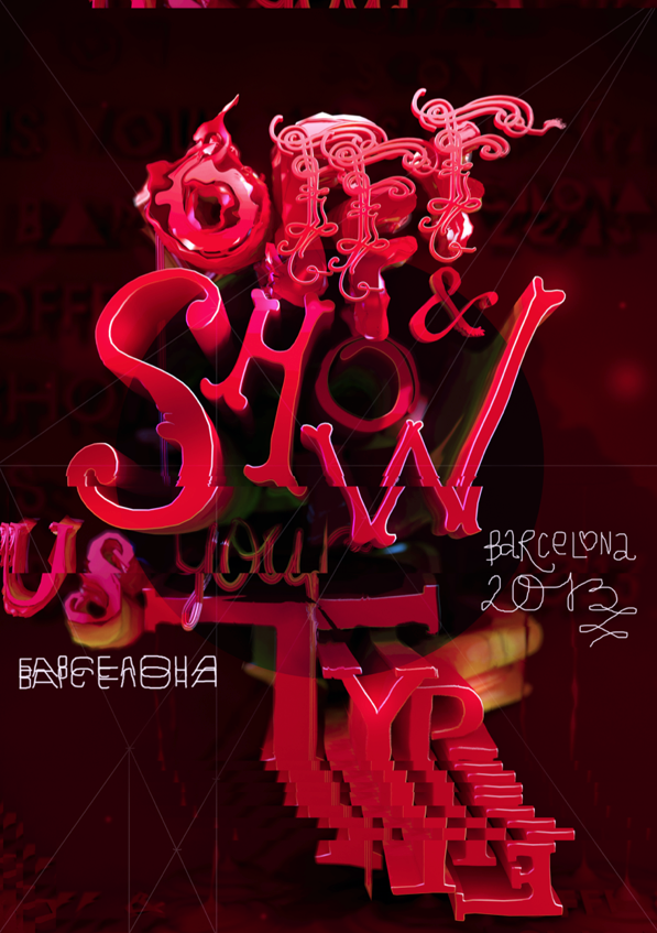
Last week I attended TYPO in San Francisco and noticed that my notebook was full. No room for notes.
My solution was the #typo13 hashtag, Twitter, plus big fingers and cranky iPhone. Everything I attended I tweeted, autocorrect had other ideas, TYPO ended up meaning typo.
Typically if I go on a tweeeeting binge like this, I lose ‘followers’ and get bitched out a bit. Instead I ended up meeting some cool people from around the planet.
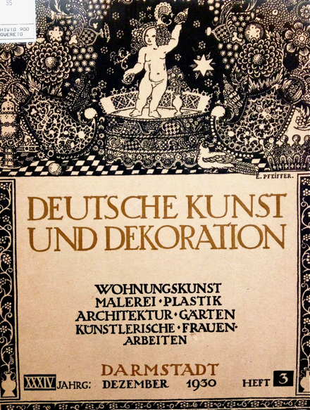
Sol Kawage lives in South Tyrol, a ‘german speaking region in northern Italy.’ Her tagline on her Twitter account states: ‘Annoying people since 1980.’
Pics are from her blog, cool holdings of a small Museum of Modern Art in the City of Rovereto. More here and here.
In 1998 I attended this over-the-top crazy creative conference in San Francisco.
It was called FUSE: Beyond Typography and it was a Neville Brody gig, named for his font magazine. The whole shebang overstuffed itself into San Francisco’s Masonic Center on Nob Hill. And what happened inside was really ‘beyond typography,’ in that the typophiles I knew were complaining where’s the type? It made sense. It was BEYOND.
It was many days. I think a week. Maybe a month, a year? I don’t remember. Nob Hill is up in the clouds, which was fitting. But what I do know is the speakers – which ranged from budding architects Zaha Hadid and Michael Sorkin to author Karrie Jacobs and a slide show from soon-to-pass-on Tibor Kalman – left me recharged about graphic design and what a real creative can do.
Then, turned out the week of FUSE Phil Hartman died.
And
2001 changed everything.
And the economic disaster that followed also put a lot of creative plans on hold. I quit my corporate job right after FUSE and moved on to more meaningful work, eventually landing in teaching. I kept doing the fun work, but bread-n-butter work started to take over. Survival became more important as creativity was pushed aside.
In 2007 I left my position as president of the Art Directors and Artists Club of Sacramento and from a distance, saw it shut down early 2012. BUT I did remember the spark of FUSE (which was a money-loser for the organizers) and kept side projects going. I started this very blog, released a few fonts. [Read more →]
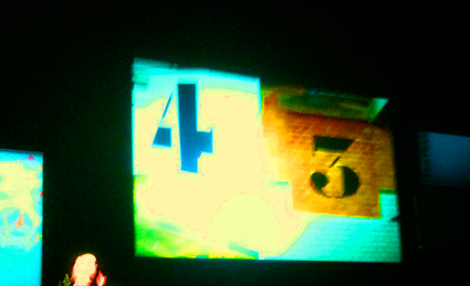
Modern graphic design has roots in Russian Suprematism and Constructivism. Here’s a trailer for a film by Sergey Shanovich that looks at what’s been happening since.
Facebook page here.
Found via Motioncollector


the work at the mehallo blog. beta. is licensed under a creative commons attribution - noncommercial - no derivative works 3.0 united states license. if reposting, credit must be given to steve mehallo - and if possible, please provide a link back to the mehallo blog. beta.
i include images for the purpose of critique, review, promotion and inspiration - and always make my best effort give credit/link back to the original source. if i’ve screwed up, please fire me a note.
page layout based on the wordpress 'darkwater theme' by antbag, adapted and redesigned by mehallo. valuable php assistance from bill mead.