‘Nymphomaniacs in Clogs’

The world of graphic designer Laurie Rosenworld.
Illustration and fonts.
And here’s the Sweden/Nymphomaniac story.


The world of graphic designer Laurie Rosenworld.
Illustration and fonts.
And here’s the Sweden/Nymphomaniac story.


If you follow Ashley Simko’s blog, you’ll notice her content flows thru related themes. This is a collection of her ampersand posts.
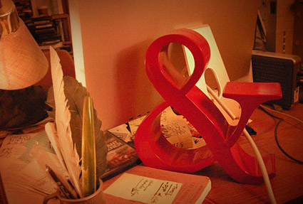
‘You can’t tempt a font designer with a carrot . . . but a nice red ampersand will do.’ -me
A while back, I was running thru Pottery Barn on my way to the Apple Store. This red one was on mark down. Marked wayyy down.
It called to me.
‘How it works: Artists partner with A Beautiful Idea and create a product(s). They sell it and donate the money to our current charity via A Beautiful Idea’s donation center. It is really that simple.’
Oklahoma City-based Evie Shaffer has launched A Beautiful Idea, a site where artists can help donate to charity. Details here.
Found via Jessica Hische (who also designed the logo)
‘The Haiti Poster Project seeks limited edition sets of posters from artists, designers and design firms from around the world. The donated posters will be sold online to raise money for Doctors Without Borders.’
Deadline is March 15, 2010. Details here. Some poster entries (below) are being shown on the Haiti Poster Project Facebook page.
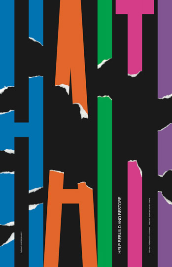
Poster entry by the great Ivan Chermayeff
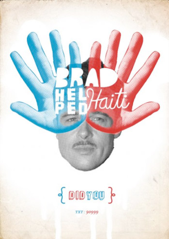
‘I wanted to create a series of these posters to spark peoples intrest in texting to donate to the relief fund. I only finished this brad pit one.’ –Matt Stallings
Poster entry by Wertzateria
SOTA’s Font Aid IV jumped into action a few weeks ago – to benefit the victims of the recent earthquake in Haiti.
The result was released today. A collaborative font.
purchase
Snag your copy of the Coming Together font thru any of these sources:
[1] Ascender Fonts
[2] Veer
[3] MyFonts
[4] FontShop
The font sells for 20 bucks (US) and all proceeds go to Doctors Without Borders to help the people of Haiti recover from the devastating earthquake.
all ampersands
The font consists of just under 400 ampersands from type designers from around the world – including myself (see below).
For more about ampersands, history and use, read Steve Matteson’s article here. For more about Font Aid IV, go here.
‘Baby, you’re my Univers. Meeting you was no Akzidenz. I can see that we‘ve got a great Futura. We were Meta be together.’
Handmade by Machine’s Just My Type greeting cards. Details here. Unfortunately, only UK-shipping is available for now.
Found via cebe design
So this past semester, I added a more comprehensive safety lecture to the learning to use an X-Acto knife portion of my beginning design classes.
And this was the first semester that some serious injuries actually occurred.
I’m thinking I should have not warned them so conscientiously. Usually I just say, a sharp X-Acto can cut thru pretty much anything. Paper, boards, plastic triangle, fingers. That’s my disclaimer. Don’t want to go into any more detail.
Elsa Mora does cool things with cut paper. She has a great X-Acto tutorial here.
(Yes designers still use X-Acto knifes. Mostly for presentation/mockups. And yes, I was once trained as a paste-up artist; something I could fall back on if computers just suddenly vanish. Sort of. Ahh, the smell of fresh Amberlith in the morning!)
Found via Natasha Newton