entries Tagged as [typography]

Meatballs, worms and bugs

NASA Meatball
Here’s a brief history of NASA’s logos, including the ‘meatball’ (above) and the ‘worm’ (below).
The worm was put to rest in 1992. If you wish, condolences can be left here.

NASA Worm
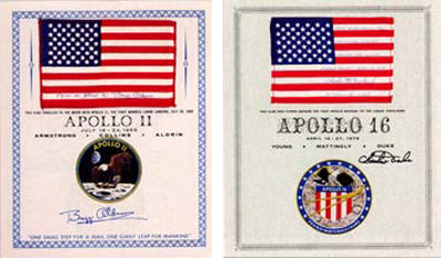
When it comes to official type, NASA is Helvetica, Futura, Times, Garamond and something . . . Victorian?
Article here.
Plus
Here’s a look at some goofy names for some other classic ‘bugs.’
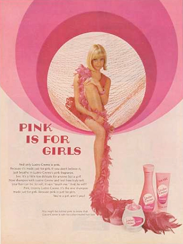
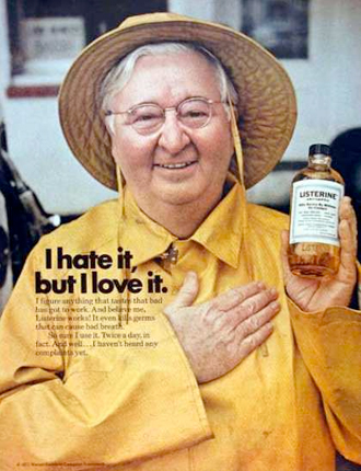
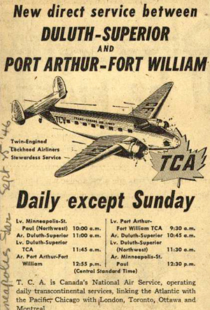
Vintage ads
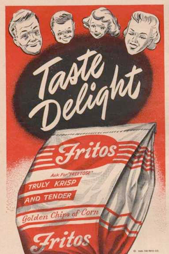
‘Vintage Ads Reveal Fashions And Trends In Type And Commercial Lettering’
Check out Vintage Ad Browser.
And
Great article about how to typographically mimic these looks at The Font Feed.
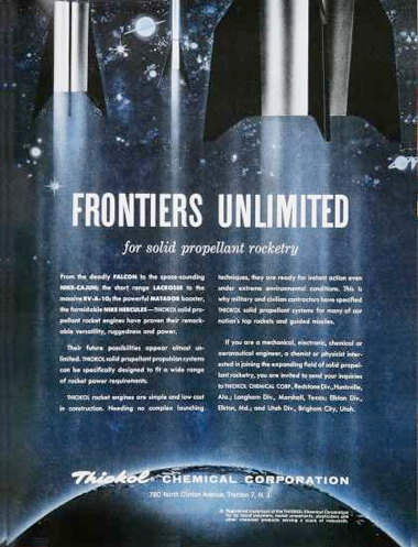
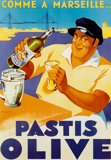
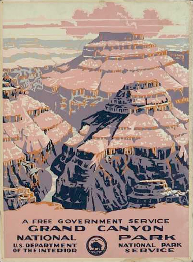
Found via The Font Feed


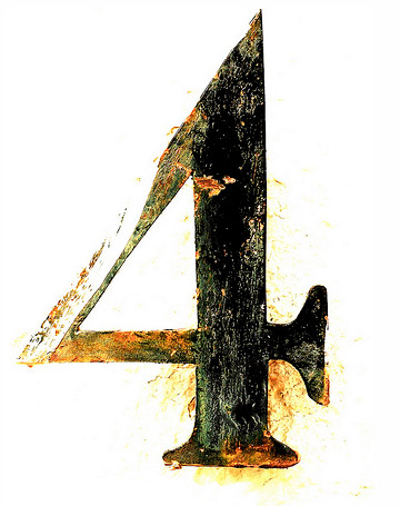
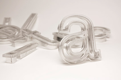
French Futura: You get an a
Paul Renner’s Futura fonts were exported to France under the name Europe. And they came with an interesting alternate a (seen in the top half of this sample). Changes the whole look and feel of the type. Details here.
Found via Colin M. Ford


handpicked posts

a piano falls in old manhattan
tetro and typography
it’s typography: film, song and dance
ghosts of gustov klimt
the great times new roman controversy
picking fonts
kapitaal
defining terms: design is not decoration
garcia's 'pure design'
'enhance that image!'
magic highway remixed
the cynic
rad anthem
Brought to you by man dom-


buy my fonts
go shopping
mehalloreads

Divinely Elegant: The World of Ernst Dryden
Jozsef Pecsi: Photo and Advertising
Color: A Natural History of the Palette
Collage: Assembling Contemporary Art
Modern Dog: 20 Years of Poster Art
Gaberbocchus Press: An Experiment in Publishing, 1948-1979
Advertising Art in the Art Deco Style
Googie Redux: Ultramodern Roadside Architecture
Hot Sour Salty Sweet: A Culinary Journey Through Southeast Asia
now playing


the work at the mehallo blog. beta. is licensed under a creative commons attribution - noncommercial - no derivative works 3.0 united states license. if reposting, credit must be given to steve mehallo - and if possible, please provide a link back to the mehallo blog. beta.
i include images for the purpose of critique, review, promotion and inspiration - and always make my best effort give credit/link back to the original source. if i’ve screwed up, please fire me a note.
page layout based on the wordpress 'darkwater theme' by antbag, adapted and redesigned by mehallo. valuable php assistance from bill mead.


