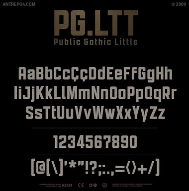
entries Tagged as [typography]
Gift to White House: Ben Eine’s graffiti typography
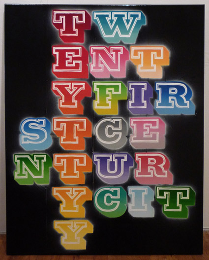
Ben Eine: Twenty First Century City, spray paint and black gloss on canvas
‘Ben Eine (real name Ben Flynn) is a street artist in London who has recently gained a whole lot of recognition in the states. British Prime Minister David Cameron presented his work to President Barack Obama for his first official visit to the U.S.’ –Global Grind
Article here. Check out Eine’s official site here.
Found via Chank Diesel

Letterman
‘Stronger than silent e, able to leap capital T in a single bound’
Before David Letterman had a show, I used to watch Letterman.
Joan Rivers narrated the Letterman spots with Gene Wilder as the voice of the hero.
These shorts were from the original Electric Company (1972-77), which was the coolest childrens show ever. Even had Morgan Freeman, Rita Moreno, Mel Brooks and Spider-man.
And
In an odd jump back to my childhood, Libby the Kid and The Electric Company ended up influencing some of the design stuff I’ve done for Normandie.
abcdefg . . . vw
One more.
And this week was brought to you (mostly) by the letter C
The classic Sesame Street Typewriter Guy. From 1978.
Chandler on Chandler
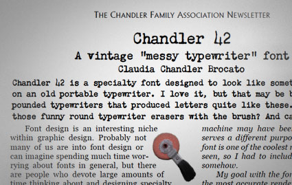
A few months back, Claudia Chandler Brocato of the Chandler Family Association contacted me about Chandler 42 – my 1994 contribution to the ‘messy typewriter’ font genre.
And they ended up giving me a really nice write up in their quarterly newsletter. Just click the above image to read/download a one page PDF.
Kurt Schwitters’ Primiti Too Taa
‘an excerpt from the poem Ursonate (Sonata in primitive sounds) by Kurt Schwitters (1887-1948)’
Created by Ed Ackerman and Colin Morton, 1986.
Found via Typophile
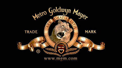
MGM’s Leo the Lion
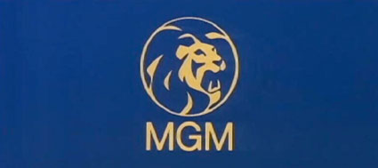
Leo the Lion in the restored MGM logo, 2008-present
Below, a visual history of MGM’s Leo the Lion.
Around the lion’s head: ARS GRATIA ARTIS is a Latin translation of ‘art for art’s sake.’
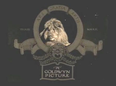
Slats, the original ‘Leo the Lion’ at Goldwyn Pictures, 1916-24
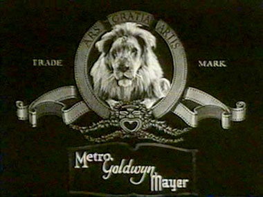
Slats, in the first official MGM logo, 1924-28

Jackie, the second lion, 1928-56
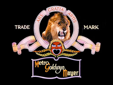
Tanner, 1934-56

George the Lion, 1956-57
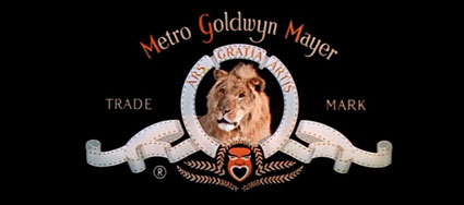
Leo the Lion, 1957-83
Modernist logo used only in two films, Grand Prix (1966) and 2001: A Space Odyssey (1968)
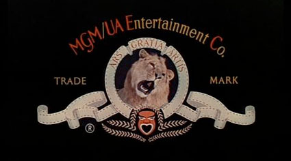
Leo the Lion in the MGM/UA Entertainment Co. logo, 1982-87
Leo the Lion, 1987-2008

Tom, 1963-67
Found via Big Fun
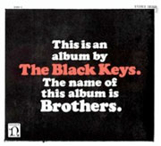
Cooper Black Keys
‘Do it for Frank’ -set in Cooper Black
The Black Keys’ Tighten Up, from the album Brothers.
Found via David Rosales

handpicked posts

a piano falls in old manhattan
tetro and typography
it’s typography: film, song and dance
ghosts of gustov klimt
the great times new roman controversy
picking fonts
kapitaal
defining terms: design is not decoration
garcia's 'pure design'
'enhance that image!'
magic highway remixed
the cynic
rad anthem
Brought to you by man dom-


buy my fonts
go shopping
mehalloreads

Divinely Elegant: The World of Ernst Dryden
Jozsef Pecsi: Photo and Advertising
Color: A Natural History of the Palette
Collage: Assembling Contemporary Art
Modern Dog: 20 Years of Poster Art
Gaberbocchus Press: An Experiment in Publishing, 1948-1979
Advertising Art in the Art Deco Style
Googie Redux: Ultramodern Roadside Architecture
Hot Sour Salty Sweet: A Culinary Journey Through Southeast Asia
now playing


the work at the mehallo blog. beta. is licensed under a creative commons attribution - noncommercial - no derivative works 3.0 united states license. if reposting, credit must be given to steve mehallo - and if possible, please provide a link back to the mehallo blog. beta.
i include images for the purpose of critique, review, promotion and inspiration - and always make my best effort give credit/link back to the original source. if i’ve screwed up, please fire me a note.
page layout based on the wordpress 'darkwater theme' by antbag, adapted and redesigned by mehallo. valuable php assistance from bill mead.


