‘So just as we change as we grow up and our bodies, opinions and tastes change. This is Time. This is Life. They are defined by Change. So Change is inevitable, its outside of need or necessity. It just Is.’
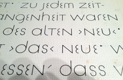
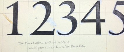
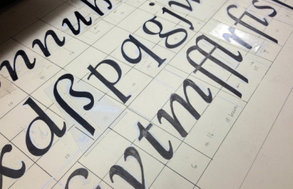
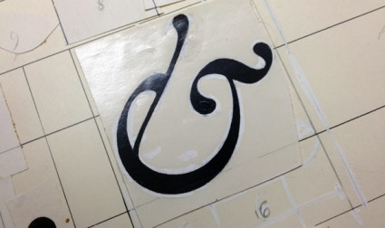
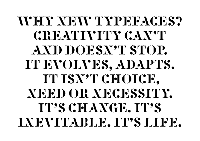
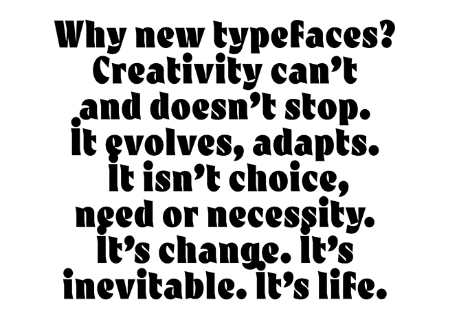
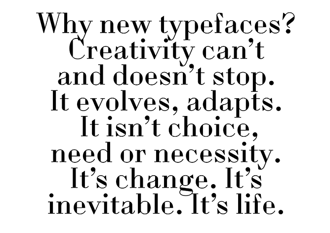
The images (and words) are from this wonderful post over at the Alias blog: Why new typefaces? Alias is run by David James and Gareth Hague.
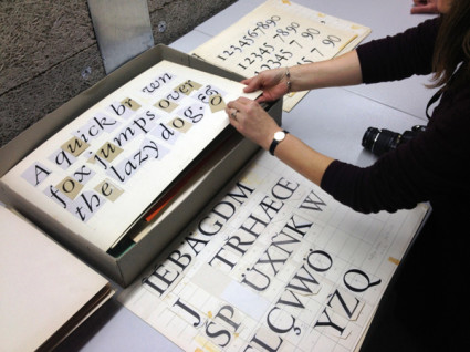
In my opinion/experience, we’ll stop having a need for new typefaces right about the time we stop wanting new music, new food ideas (I’m hooked on detox water right now) and new ways of looking at how we dress ourselves.
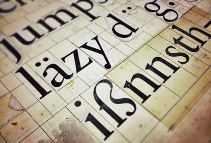
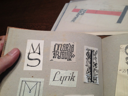
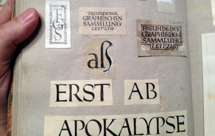
Types have personality, just like humans. Take it all away and we become . . . Helvetica. On a Star Trek planet where we all look, think and dress alike.
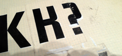
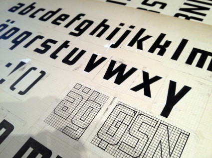
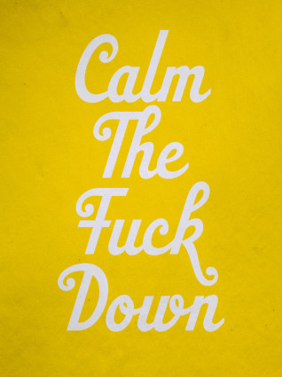
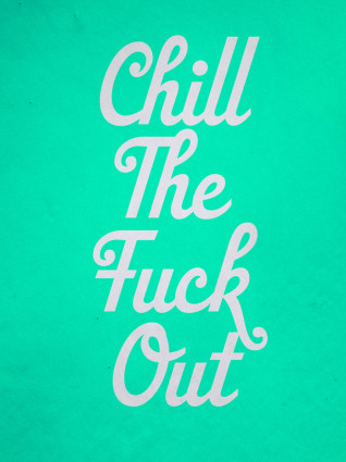
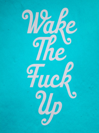
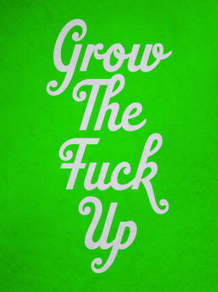
Type is everywhere. And humans like to mess with shit.
via Alias
Tags: culinary, design, education, fonts, thoughts, typography by steve
Comments Off on Don’t we have enough fonts already?