entries Tagged as [illustration]
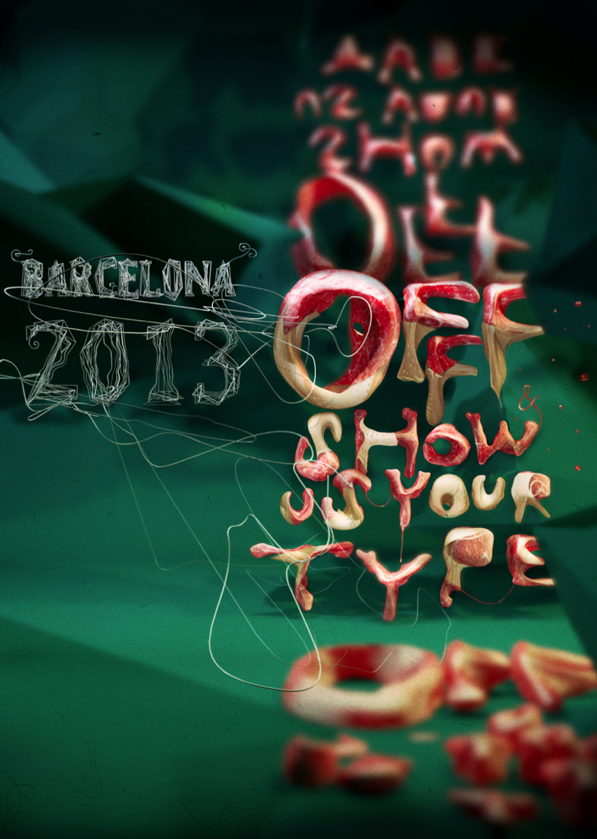
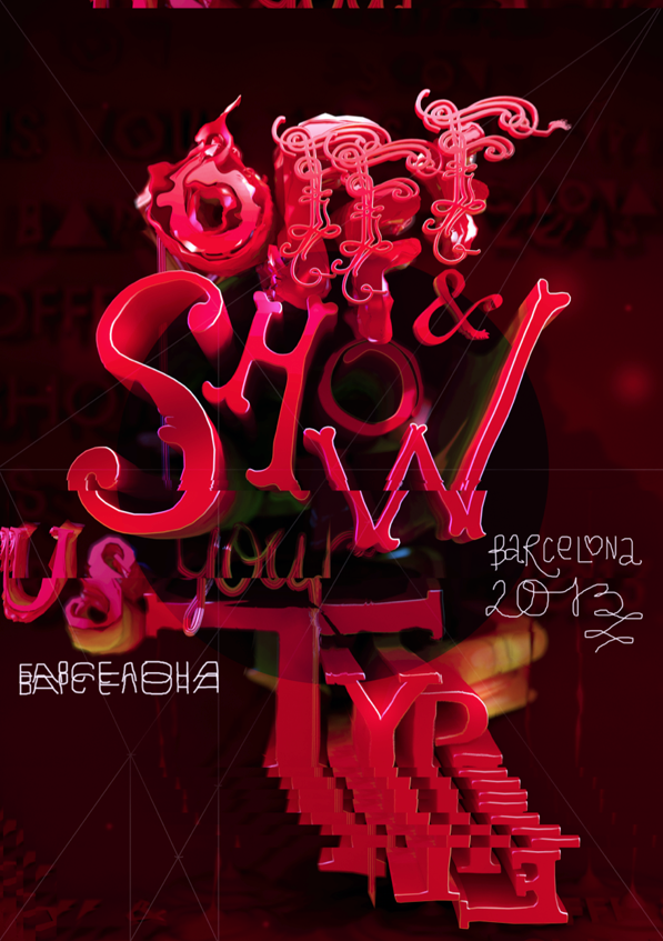
OFFF poster 2013
Years ago Step By Step was a graphic design magazine that showed complex design solutions in a ‘step by step’ process. So was HOW, which broke out HOW things were designed.
Today we assume computers just design everything. Not true. Not everything.
Pictured is the work of Dmitry Karpov. And at Behance, here is the Step by Step breakdown of HOW they were done.
Found via Designcollector Network
Bass at 93
‘His most famous title sequences include the animated paper cut-out of a heroin addict’s arm for Preminger’s The Man with the Golden Arm, the credits racing up and down what eventually becomes a high-angle shot of a skyscraper in Hitchcock’s North by Northwest, and the disjointed text that races together and apart in Psycho’
Last night, Google doodled this (above).
Last week in my history class, I presented footage of the original titles that Saul Bass designed that Google doodled this (above) was based on.
Dave Brubeck came along for the ride.
More info here.
Found via Alice Woodruff
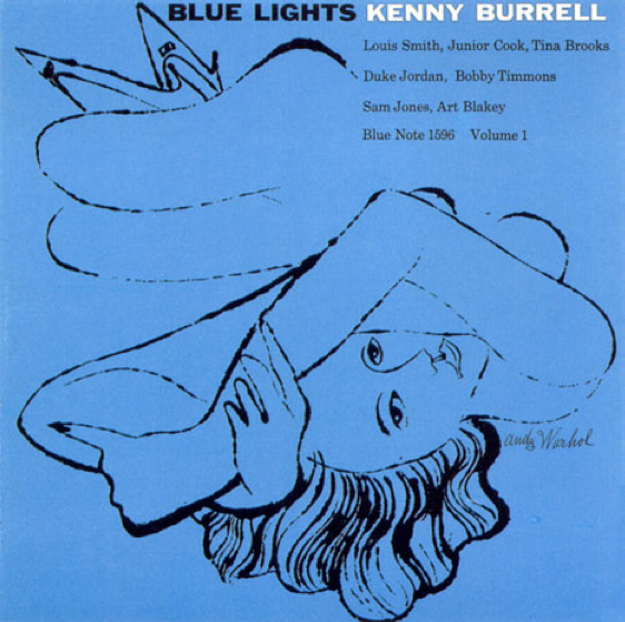
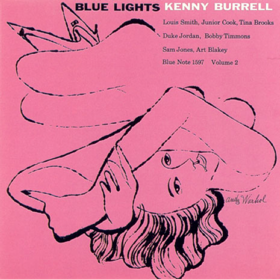
Blue Lights
Covers for Kenny Burrell’s Blue Lights. Reid Miles, design; Andy Warhol, illustration. Blue Note Records, 1958.
Just because.
Clients know shit
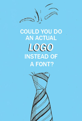
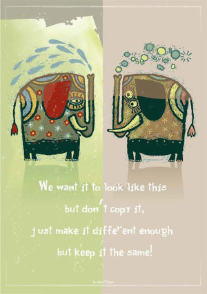
As a side project, Irish graphic designers Mark Shanley and Paddy Treacy turned a bunch of client feedback (the bad kind) into a series of posters. They then put them up for sale and ended raising a bunch of money for charity.
Pictured, a few. More here.
Of course, the goal is always to work with clients that know shit. And are willing to go thru a creative process that leads to the best work imaginable. This usually involves understanding that good logos typically involve letterforms (I’ve heard poster #1 before).
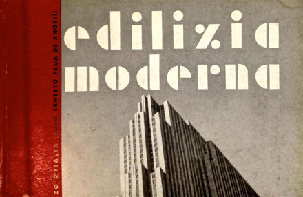
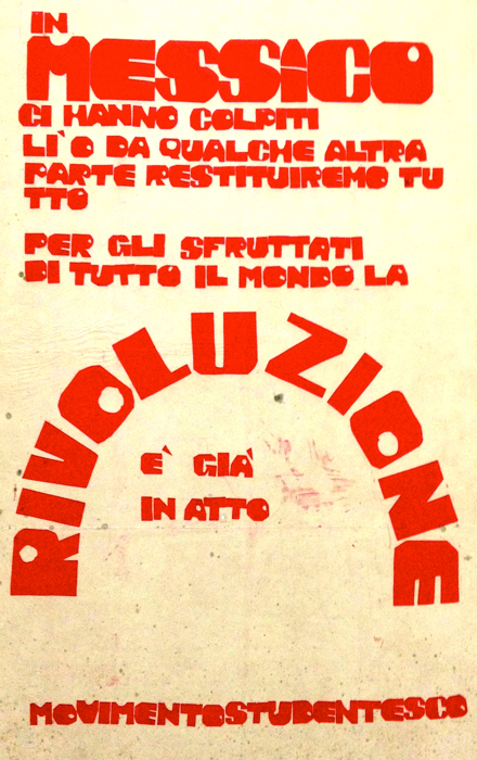
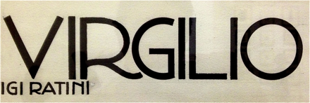
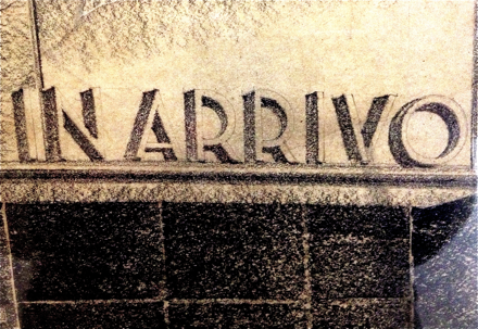
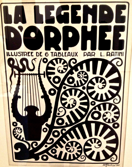
Typographic soft porn, via Italy
Last week I attended TYPO in San Francisco and noticed that my notebook was full. No room for notes.
My solution was the #typo13 hashtag, Twitter, plus big fingers and cranky iPhone. Everything I attended I tweeted, autocorrect had other ideas, TYPO ended up meaning typo.
Typically if I go on a tweeeeting binge like this, I lose ‘followers’ and get bitched out a bit. Instead I ended up meeting some cool people from around the planet.
Sol Kawage lives in South Tyrol, a ‘german speaking region in northern Italy.’ Her tagline on her Twitter account states: ‘Annoying people since 1980.’
Pics are from her blog, cool holdings of a small Museum of Modern Art in the City of Rovereto. More here and here.
Sunday Rock, analog Cyrillic
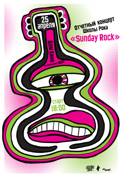
‘Specialization of our school is contemporary music teaching for kids and teenagers’
Modern Dog recently created this poster for Sunday Rock, a music school in Yekaterinburg, Russia.
And I provided Robynne and Co. some quick Cyrillic type the old fashioned way: Scanned in from early 20th Century sources, pieced together letter by letter.
Four different scripts combined to have similar weight, rough edges, heavy caps. I’ve been doing a bunch of work this way lately – sometimes one has to go back to basics.
And on weathered days (like today) vinyl sounds better than digital.
Monty Python moves
‘The whole point of animation to me is to tell a story, make a joke, express an idea. The technique itself doesn’t really matter. Whatever works is the thing to use.’
Terry Gilliam on animation. From 1974.
Found via Cartoon Brew
She said
‘The very first rock and roll Music Video. A stop motion film of the Beatles singing ‘I Feel Fine’ drawn by Stephen Verona and hand colored by Verona and John Lennon’
Typesetter blues
‘Voiced by Canadian legend Gordon Pinsent (Away From Her, Pillars Of The Earth) Typesetter Blues is written in the nonsense poetry tradition of Edward Lear and Shel Silverstein’
Crafted by Toronto-based TOGETHER – part of their silly rhymes series Beastly Bards.
