entries Tagged as [graphic design]

Van Doesburg
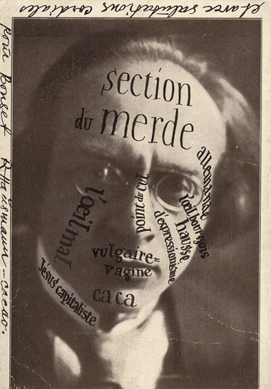
‘Raoul Hausmann’s postcard to IK Bonset (van Doesburg’s alter ego) of rival theorist Herwarth Walden’
Theo van Doesburg (1883-1931). Magazine publisher. Artist. Designer. Propagandist. Troublemaker. Dutch. The guy behind de Stijl.
A van Doesburg show just opened yesterday (my birthday, how bout that?) at the Tate Modern. Review here. Another review here.
Runs thru May 16, 2010.
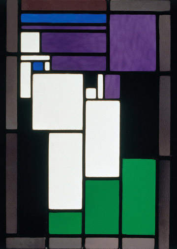
Stained glass composition by van Doesburg
Plus,
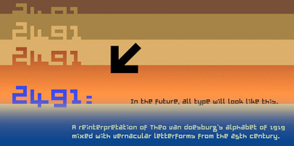
Here’s a link to my own low cost, van Doesburg-influenced font, 2491.
French Futura: You get an a
Paul Renner’s Futura fonts were exported to France under the name Europe. And they came with an interesting alternate a (seen in the top half of this sample). Changes the whole look and feel of the type. Details here.
Found via Colin M. Ford
Healthy junk
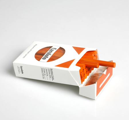
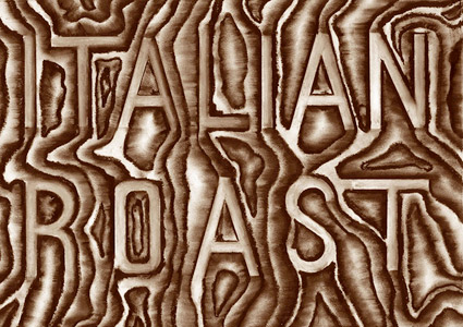
‘Healthy snacks packaged to look like drugs and junk food’
The work of designer Daizi Zheng.
More images here.
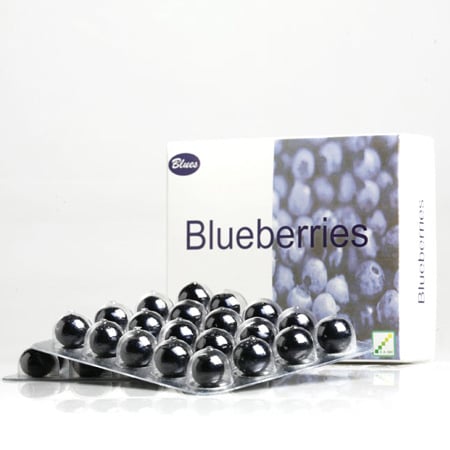
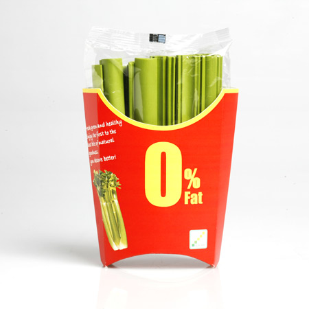
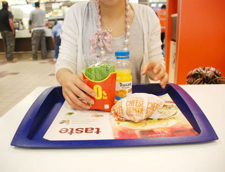
Found via Dezeen
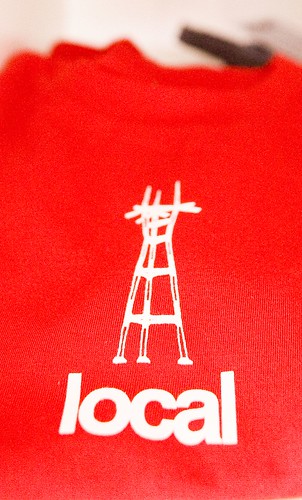 Sutro Tower shirt, San Francisco.
Towers

Nicola López, woodcut and silkscreen on paper
Ten visions of towers, over at PRINTERESTING.

Vladimir Tatlin, letterpress book cover

Michael Dal Cerro, woodcut

Anne-Maree Hunter, book arts, intaglio, silkscreen
The mehallo font library at Typekit
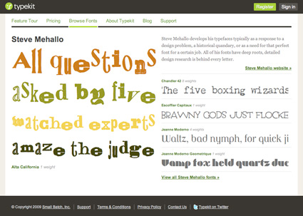
Recently, I made most of my font library available for the web via Typekit.
The list is here.
Thru TypeKit web designers can (legally) embed my fonts as html text at any website. Here’s a site that’s using Chandler 42.
Typekit has 4 subscription options; with a free trial plan available. Note: My fonts are only available through the Portfolio plan and higher.
For more info, drop by Typekit. Subscribe to their blog for updates.
And
Here’s a review at Webmonkey that does a good job explaining what all this font embedding hoohah is about.

Alphabet ears
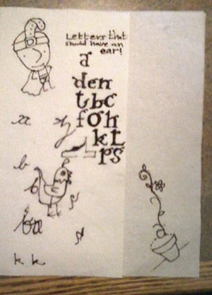
Sketches by dr. mendez and nurse wickland
I think our lowercase g is our screwiest letter. It evolved into something quite odd. It has parts that other letters do not have. It also has an ear. It’s often drawn just like a dog’s ear.
Two of my students have been pondering (above) other letters that should have ears.

handpicked posts

a piano falls in old manhattan
tetro and typography
it’s typography: film, song and dance
ghosts of gustov klimt
the great times new roman controversy
picking fonts
kapitaal
defining terms: design is not decoration
garcia's 'pure design'
'enhance that image!'
magic highway remixed
the cynic
rad anthem
Brought to you by man dom-


buy my fonts
go shopping
mehalloreads

Divinely Elegant: The World of Ernst Dryden
Jozsef Pecsi: Photo and Advertising
Color: A Natural History of the Palette
Collage: Assembling Contemporary Art
Modern Dog: 20 Years of Poster Art
Gaberbocchus Press: An Experiment in Publishing, 1948-1979
Advertising Art in the Art Deco Style
Googie Redux: Ultramodern Roadside Architecture
Hot Sour Salty Sweet: A Culinary Journey Through Southeast Asia
now playing


the work at the mehallo blog. beta. is licensed under a creative commons attribution - noncommercial - no derivative works 3.0 united states license. if reposting, credit must be given to steve mehallo - and if possible, please provide a link back to the mehallo blog. beta.
i include images for the purpose of critique, review, promotion and inspiration - and always make my best effort give credit/link back to the original source. if i’ve screwed up, please fire me a note.
page layout based on the wordpress 'darkwater theme' by antbag, adapted and redesigned by mehallo. valuable php assistance from bill mead.


