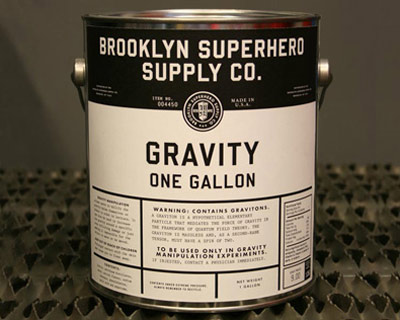
Gravity

Available at Dave Eggers’ Superhero Supply Store in Brooklyn. Which is really just a front for 826NYC.
TED Prize talk below.
Found via theclickclickpress

Available at Dave Eggers’ Superhero Supply Store in Brooklyn. Which is really just a front for 826NYC.
TED Prize talk below.
Found via theclickclickpress
Action Comics No. 1 as ‘covered’ by illustrator Tom Addison.
More comic book ‘covers’ here. The original Action No. 1, below.
Metropolis poster by Pietari Posti and Underware. 6-layered silkscreen print, 2008. Run of 100.
With glow-in-the-dark lettering.
Cinematography for Fritz Lang’s Metropolis (1927) was inspired by Paul Citroen’s 1923 Metropolis photomontage (above).
And so was Boris Bilinsky’s poster for the film (below).
Commercial artists took some liberties with how they created visual promotion for Metropolis – redrawing or recreating the ‘maschinenmensch’ (machine-man) and the modernist cityscapes. [Read more →]
Metropolis by E. McKnight Kauffer. Gouache on paper, 1926.
Foreshadows Depero’s compositions, such as his view of New York – and his work for Campari.

They used to put these digital roadsigns out on Madison Avenue, on the median.
They had taunting sayings about driving safety. Generic ‘don’t drive drunk’ or ‘be aware’ messages.
Saw the officers out there smiling as they typed in all the snotty safety messages. They would get really clever about it too. Rhyming, plays on words.
Frankly, I know I (personally) can’t easily drive AND be cleverly scolded at the same time.
The signs were dangerous to drivers. Almost crashed a couple times trying to see what the next ‘safety verse’ would be. Madison is a really busy thoroughfare.
The last time I saw the signs in use, a small graffiti tag said:
‘Fuck Cops.’
Never saw the signs again after that.
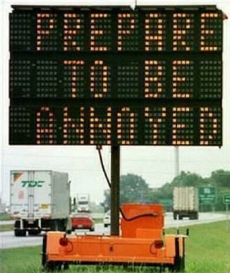
Pictured, a hacked roadsign from somewhere else. More at Urlesque.