She said
‘The very first rock and roll Music Video. A stop motion film of the Beatles singing ‘I Feel Fine’ drawn by Stephen Verona and hand colored by Verona and John Lennon’
‘The very first rock and roll Music Video. A stop motion film of the Beatles singing ‘I Feel Fine’ drawn by Stephen Verona and hand colored by Verona and John Lennon’
‘Voiced by Canadian legend Gordon Pinsent (Away From Her, Pillars Of The Earth) Typesetter Blues is written in the nonsense poetry tradition of Edward Lear and Shel Silverstein’
Crafted by Toronto-based TOGETHER – part of their silly rhymes series Beastly Bards.
If there were in the world today any large number of people who desired their own happiness more than they desired the unhappiness of others, we could have paradise in a few years. –Bertrand Russell (1872-1970)
Years ago I knew a head general counsel who worked for a legal department for a rather large corporation.
When it came to lawsuits, he explained to me that their approach was they ‘never settled’ and ‘would use all of our resources – millions of dollars at our disposal’ to fight any suit that came in. Whether they were right or wrong. “If they’re going to go up against us, that’s what they’re going to get.’
Years later I sat in on a ‘business ethics’ class where this ethic was explained in detail: ‘it is okay to destroy the competition. That’s good business ethics.’ And throw in that businesses today operate to ‘keep shareholders happy’ over everything else – we live in a very frightening world. One that squashes innovation and creativity in favor of ‘good competition.’
Good competition is fantastic – when the tables are ‘fair and balanced,’ a term – even today – that’s not used for what it actually means. There’s a lot we CAN be doing as a race – in terms of social, political and humanitarian causes – but we don’t. There’s a great scene in An Inconvenient Truth where Al Gore points to an illustration of a pot of gold. It’s our motivation. It’s what we live for. A pot of gold. A shiny pot of gold we can hide from others, shower with, rub on our bodies if it makes us feel better.
the battle
Right now there’s a David v. Goliath lawsuit going on. It seems simple open and shut: Large corporations profit from stolen artwork. So artists who created artwork get a lawyer and take on the corporations.
In this situation, the corporations are our darlings: The fantastically wonderful Disney and the ‘god I love what they do for design’ Target. And I spent an afternoon recently going thru the case files – which are posted at Friends of Modern Dog – and to me it seems it’s another bury the little guy response.
You’d think it would be Urban Outfitters doing this – it IS their modis operandi – but no. It appeares Disney and Target are poised to destroy Seattle’s very own Modern Dog.
Ashamed is not a word I use much. Though I think it applies here: BOTH Disney and Target should be ashamed. They are BOTH corporations that benefit from creative innovation. BOTH should be working WITH Modern Dog, not – as this lawsuit seems to be doing – putting them out of business . . . [Read more →]

‘Cieślewicz always compared himself to a journalist; but he referred to himself as a visual journalist. So Graphic designer, as a profession, is very close to that of journalism; except that it is about articulating clear ideas through the justaposition of imagery and layout – it’s a question of wanting to say something.’ –Professor Andrezej Klimowski, Royal College of Art
Above, a BBC overview of the work of Roman Cieślewicz (1930–96), which was part of a retrospective this summer at the Royal College of Art in London.
Click image to view video/jump.
Found via BBC News

Still from Ingre Druckrey: Teaching to See
As an educator, I’ve broken graphic design into three components: Message, Typography, Layout.
I’m not the first educator to do this – just happened to constantly notice these three elements staring back at me in all the student pieces I evaluate. In my opinion, careful appreciation, understanding and implementation of the three can lead to beautiful work.
message
Graphic design is a communication field, so Message should always drive the project. Today we are bombarded by thousands of Messages on a daily basis, so being on Message is critical. And yes, this usually involves language and writing – which is why I love when students take their written studies seriously.
typography
I’ve seen an (often not cited/supported) statistic that graphic design is 95% typography. Scientific or not, I agree with this. Type is important. I like comparing the exploration of lettering to that of music – there’s enough complexity for it to become a lifetime endeavor. And most of what I teach is type, from multiple angles.
form
Graphic designers are taught to use grids for layout – though relying on ‘grid’ as a catch all way of handling form can be misleading. Grids provide support, a fallback position for dealing with massive amounts of information. Though important, grids have their limitations. Building structure using symmetry, asymmetry, balance, color – some elements obvious, some not – involves continuous practice, a trained eye, instinct.
These three are not formulas, can’t be added together. They need to work in tandem, like cooking a great stew where the ingredients are based on what feels just right.

Click to view/jump
On a related note, the above film – Edward Tufte’s Ingre Druckrey: Teaching to See – found its way into my Twitter feed. It’s about graphic design and beauty. And much more.
In January I’m going to be teaching my first non-type course on Form and Space. I’m starting prep now because I consider form so important – so powerful, so delicate.
And beautiful when done right.
Video found via ayana baltrip

‘As a student, live by these words, ‘Quantity rather than quality.’ The more you design the better your quality will become and you will continue to grow’ –Tony Montano
I like that quote.
Quality does come later. Being a designer becomes all about instinct – not having the best computer, not software, not measurements, not rules.
I’ve just started teaching another semester of Graphic Design History and Typography at American River College – have a whole new group of kids to introduce to my gospel of visuals.
One thought that’s been weaving its way thru my classes over the years is simply, ‘the more you do, the better you get.’ We’ve all heard this, and yeah, it’s true. The only real stumbling block is ‘the more you do, if you’re not paying attention, you probably won’t get better.’
This year the student work has been incredible – but only when tied to good, old fashioned Hard Work. Risk taking, going out on that edge, trying something one has never done before leads to fantastic creations.
I haven’t been blogging much – I also have my usual four type classes at Ai Sacramento and a rather large project that’s been taking up the rest of my time (more on that soooooon) – so something had to give. It was blogging.
I’ll be posting more as time permits; otherwise been immediately throwing finds up on my Twitter account.
I’m keeping busy. Hope you are too.
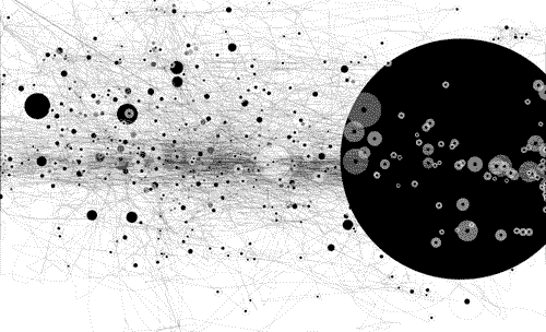
Infographic found via Ai Sacramento Graphic Design; click image to jump/view larger
New video for Amanda Palmer & The Grand Theft Orchestra’s Want It Back. Lettering by Curran James.
Found via aeroplanegirl
Exquisite lettering by Luca Barcellona and Francesca Biasetton for ELITA, Milan.
Found via Cátedra Bardelás
Often there’s this thing – where the graphic designer – feels like shouting, ‘I’M A PROFESSIONAL, I KNOW WHAT I’M DOING. REALLY.’
It usually arises from the idea that graphic design is a voodoo art that many do not understand. Or they think they do, but only understand a small portion of it. Trained, professional designers do spend at least 4–5 years studying our craft – and the years after finessing what we know.
Keeping communication open to clients is also important. But really, there’s some of us who know what we’re doing.
Mostly.
Button design by UXPin.
Found via Sandoer Berg


the work at the mehallo blog. beta. is licensed under a creative commons attribution - noncommercial - no derivative works 3.0 united states license. if reposting, credit must be given to steve mehallo - and if possible, please provide a link back to the mehallo blog. beta.
i include images for the purpose of critique, review, promotion and inspiration - and always make my best effort give credit/link back to the original source. if i’ve screwed up, please fire me a note.
page layout based on the wordpress 'darkwater theme' by antbag, adapted and redesigned by mehallo. valuable php assistance from bill mead.