entries Tagged as [graphic design]
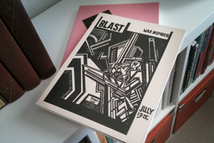
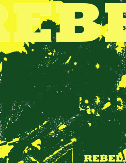
Blast!!
‘Vorticism was a radical art movement that shone briefly but brightly in the years before and during World War I.’
A few months back, I picked up Black Sparrow Press’ reprints of Wyndham Lewis’ Vorticist journal Blast Magazine. Vorticism was the British entry into the realm of modern art.
There were only two issues – which ‘blasted’ old Edwardian forms in favor of the new machine aesthetic that was about to take over the world.
Out with the old, in with the new, as it were.
The two issues of Blast – there were only two – are available for browsing at issuu. Check them out here and here.
I see a connection between Lewis’ work and the original production design of TRON. But that may just be me.
There is also a retrospective now going on at the Tate. Video referencing the work of Vorticist practitioner Henri Gaudier-Brzeska (1891-1915), below.
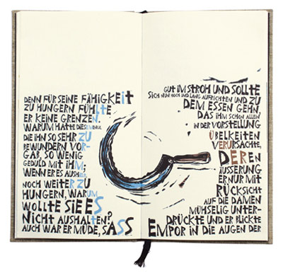
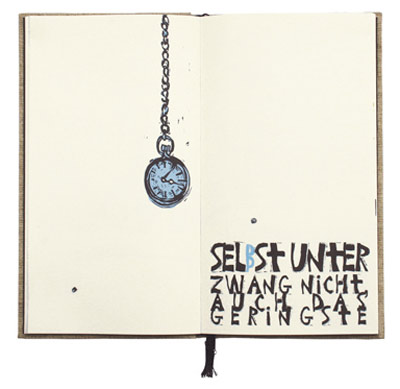
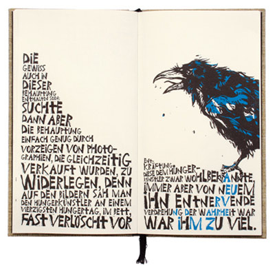
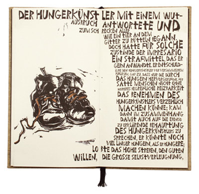
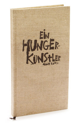
Ein Hungerkünstler
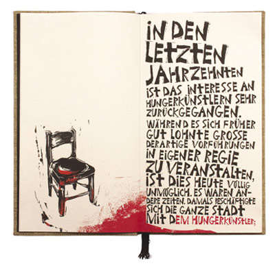
‘the letters and punctuation marks were carved into lino plates and digitized to portray the bipolar nature of the protagonist by using lettering with a harsh edge.’
Juergen Schlotter’s interpretation of Kafka’s Ein Hungerkünstler (A Starving Artist). Details here.
Found via Communication Arts
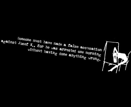
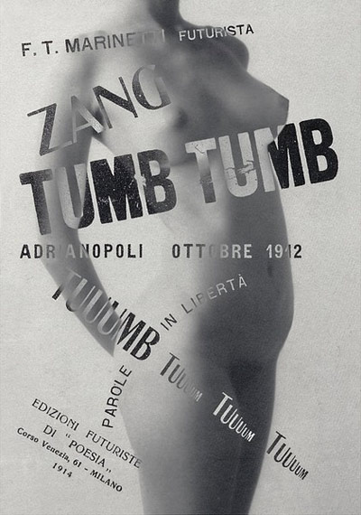
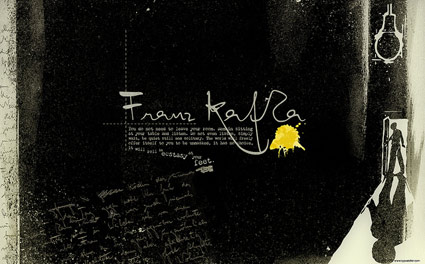
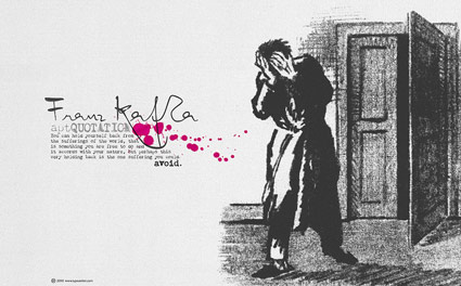
Kafka Chandler 42
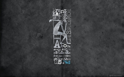
Even more free wallpapers by Arno Kathollnig . . .
Franz Kafka Trilogy – featuring my own Chandler 42 fonts (with some pointing hands from Alta California).
Amerika!
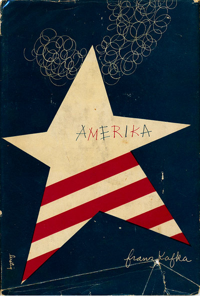
‘On the 4th we celebrate what it means to be American: Consuming more than we need to and making things explode.’ –Andy Borowitz
Pictured, Alvin Lustig’s 1946 cover design for Franz Kafka’s Amerika.
Image found via Scott Lindberg
Ditto!!
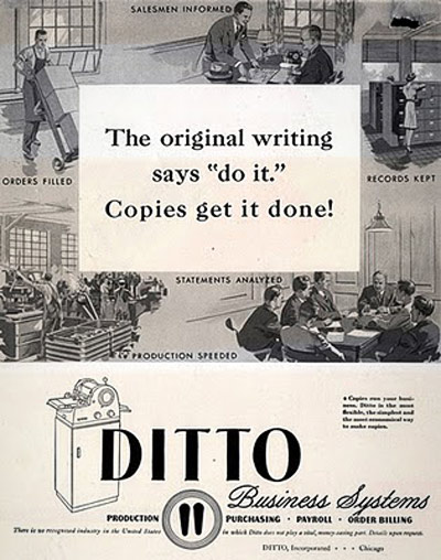
‘Before there were photocopiers, scanners and printers, there was the Ditto Machine (a.k.a. spirit duplicator), produced by the Illinois-based Ditto Corporation; originally introduced in 1923.’ –mnn
Clifford the Big Red Dog was supposed to be red. But in the handout I got in kindergarten, he was purple.
So was my introduction to the Ditto Machine – a device used to replicate most of the paperwork I’d used in elementary school.
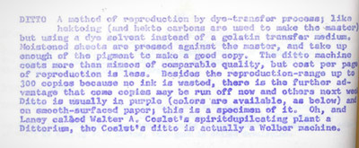
Some of my earliest experiences as a ‘graphics’ guy was playing with one of these machines – seeing what it could reproduce and what it couldn’t. It couldn’t reproduce much. The copies were so smudgy, Dittos were grunge before grunge was grunge.
And the smell of the purple ink was incredible. Fruity and chemically at the same time! Tho it turns out ink ingredients – isopropanol and methanol – are toxic substances. Who knew? [Read more →]
Futura Maschine 2011
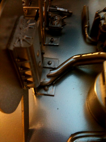
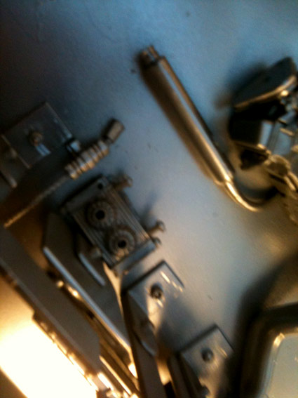
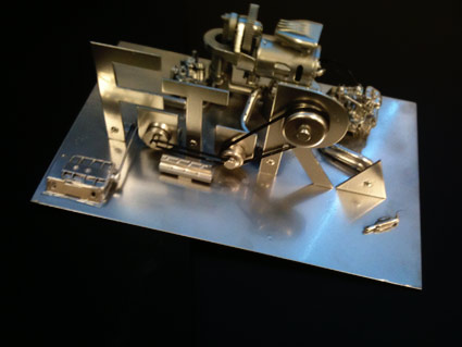
‘Paul Renner’s Futura interpreted in metal’
Handmade model with engine. Cesar Santos Perez’s final project from my most-recent experimental typography course at Ai Sacramento.
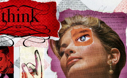
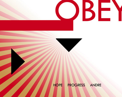
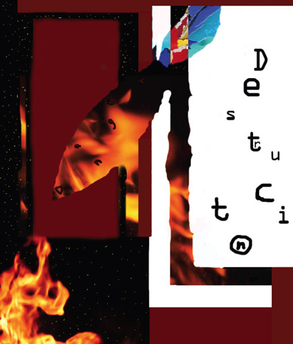
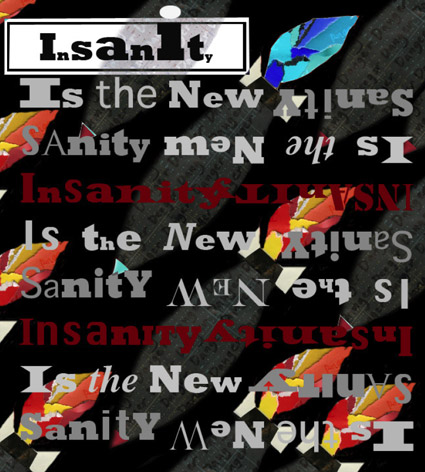
Summer Studio 2011
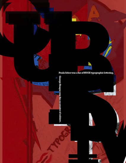
‘What I did on my summer vacation’
Last week, I spent four full days with a handful of some really cool teens.
I found myself saying, ‘Yes, I’ll do it. What is it?’ to teaching a week-long Summer Studio workshop at Ai Sacramento.
I called the whole thing ‘Designer Mashup’ – and set about having my students mix contemporary designers with historical luminaries.
Design history, research, handmade collages, form studies and handing work off to other students (to reinterpret) were part of the process.
Pictured, some of the final pieces.
Designers studied included Paula Scher, Georges Braque, Josef Albers, El Lisstizky, Rick Griffin, Jessica Hische, Raoul Hausmann, Marian Bantjes, Hannah Höch, Alvin Lustig, Shepard Fairey and David Carson.

handpicked posts

a piano falls in old manhattan
tetro and typography
it’s typography: film, song and dance
ghosts of gustov klimt
the great times new roman controversy
picking fonts
kapitaal
defining terms: design is not decoration
garcia's 'pure design'
'enhance that image!'
magic highway remixed
the cynic
rad anthem
Brought to you by man dom-


buy my fonts
go shopping
mehalloreads

Divinely Elegant: The World of Ernst Dryden
Jozsef Pecsi: Photo and Advertising
Color: A Natural History of the Palette
Collage: Assembling Contemporary Art
Modern Dog: 20 Years of Poster Art
Gaberbocchus Press: An Experiment in Publishing, 1948-1979
Advertising Art in the Art Deco Style
Googie Redux: Ultramodern Roadside Architecture
Hot Sour Salty Sweet: A Culinary Journey Through Southeast Asia
now playing


the work at the mehallo blog. beta. is licensed under a creative commons attribution - noncommercial - no derivative works 3.0 united states license. if reposting, credit must be given to steve mehallo - and if possible, please provide a link back to the mehallo blog. beta.
i include images for the purpose of critique, review, promotion and inspiration - and always make my best effort give credit/link back to the original source. if i’ve screwed up, please fire me a note.
page layout based on the wordpress 'darkwater theme' by antbag, adapted and redesigned by mehallo. valuable php assistance from bill mead.


