entries Tagged as [graphic design]

Eastern Block

‘A typeface designed to reflect the aesthetic qualities of Soviet Union product design and manufacture. The typeface uses a unilateral x-height, cap height and faux Cyrillic to create a blocky, angular and awkward response. To allude to the dated methods of production, I produced the entire face as printing blocks.’

Andy Barnes’ Eastern Block typeface. Website here.

Found via Arts Thread

Suprematism/Constructivism, experiments


Stefan Bürke’s Airplane Flying

Two short interpretations of the work of Suprematist Malevitch and Constructivist Lissitzky.


Jostein Finnekaasa’s Suprematism/Constructivism

Caged vodka

‘The vodka is ‘onstage’ in a chromium-plated cage to match its cool, argentiferous look which is reflected all around it. A silver lock secures the cage.’

Package design for Zeitgeist Vodka, made in Germany. Website here.

Found via Design made in Germany

Niedermann Grotesk: My new, old font

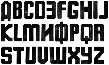
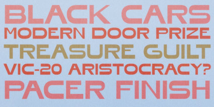
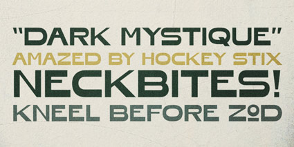
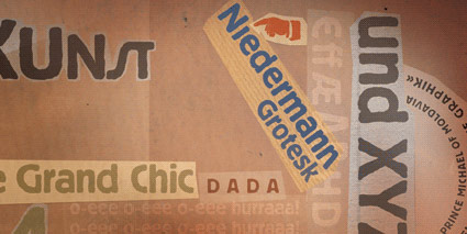
Niedermann Grotesk is my newest font and it’s been sitting in the hopper for awhile.

It became a side project that appeared while I’d been working on my update to Jeanne Moderno (which is Jeanne Texte, which has been in a little limbo due to other projects) (I plan on getting back to it next month).

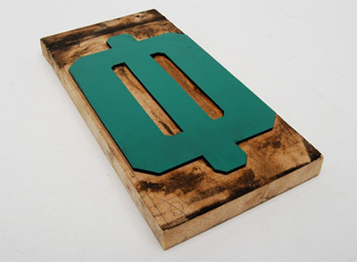
Along the way I fell in love with types that were part of the German Sachplakat (object poster) style pioneered by the great Lucian Bernhard – a lot of which can be seen (as backgrounds) in their original zeitgeist settings in the 1927 Ruttmann film I posted on Sunday.

Plakat lettering was drawn as needed, typically painted. For my adaptation, I went back to brush – and included a handful of alternative characters, ligatures, plus a few dingbats.

Grab your copy here.

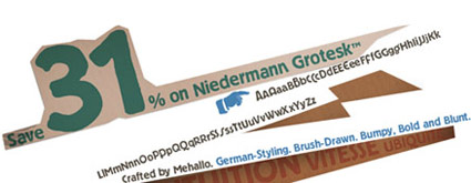
And  . . .  Save 31%! Niedermann Grotesk is on sale right now at MyFonts. Sale ends September 22, 2011.

Cabaret-Berlin: Die wilde Bühne 1919-33

‘In her 2010 documentary about the Berlin cabaret scene of the interwar period, Fabienne Rousso-Lenoir includes archival material, excerpts from German cinema classics, rediscovered promotional and institutional films, rare modern art experiments as well as documentaries of the time – all restored in high-definition.’

Above, the first five minutes of Fabienne Rousso-Lenoir’s Cabaret-Berlin: Die wilde Bühne (The Wild Stage) 1919-33. This 2010 documentary is loaded with incredible images from an era that went away in the 1930s.

Watch the entire untranslated film here. (Note: Veoh player download required)

Salad dressing

The concept of salad dressing – oil and water – is the basis for the magic we call printing. I learned this a long time ago, in a class. Or something.

Also, years ago, learned that this stuff is pretty much one of the few things that will remove printing ink from skin.

Pictured, the typographic work of UK-based Craig Ward.

Off Book: Type

‘Type is universal’

Typography is everywhere – and as an art form is often overlooked.

There are very few actual documentaries about type – and PBS decided to take on the task of making one. Or in this case, remaking one. Off Book: Type premiered this week as sort of a seven minute version of Gary Hustwit’s Helvetica. Sort of. It IS a new doc, tho it does cover some ground already treaded.

Off Book is PBS’ new online series focusing on ‘experimental and nontraditional art forms.’ For more information, read here. Website here.

More lost type: PLINC is back!

Back in the day, Photo-Lettering Inc. was THE resource for custom set hedline typography, odd letter distortions and other custom font creations that were made possible by the new technology of the time, phototypesetting.

Since, PLINC’s original stock has been sitting in a warehouse. Just sitting. With the elements of time eating up the original negatives.

Several years ago, House bought rights to the collection and set about building an online version of PLINC’s original services – where type is sold one custom set headline at a time. PLINC fonts – which included a lot of ligatures and alternate characters – needed a professional typesetter at the helm.

Today, after years in development, low cost custom hedline type is now available digitally at the new PLINC website. One hed at a time  . . . . [Read more →]

Honfleur

‘inspired by lettering on an antique perfume poster’

Ray and Chikako Larabie’s funky Honfleur font. Snag it free now, offer ends Saturday August 6, 2011.

Comic Jens font

‘G’day, I’m Comic Jens! I’m a sympathetic alternative for Comic Sans.’

Jens Kutilek’s Comic Jens. Free download here.

The Lost Type Co-Op

‘founded with the intention of providing unique and quality fonts based on a pay-what-you-want model. All designers get 100% of the donations their font receives.’

The Lost Type Co-Op is the brain child of Tyer Galpin and Riley Cran.

Peruse Lost Type’s fonts here. And pay what you feel the fonts are worth.


Creative Commons License

the work at the mehallo blog. beta. is licensed under a creative commons attribution - noncommercial - no derivative works 3.0 united states license.  if reposting, credit must be given to steve mehallo - and if possible, please provide a link back to the mehallo blog. beta.

i include images for the purpose of critique, review, promotion and inspiration - and always make my best effort give credit/link back to the original source.  if i’ve screwed up, please fire me a note.

page layout based on the wordpress 'darkwater theme' by antbag, adapted and redesigned by mehallo.  valuable php assistance from bill mead.