It’s interesting how celebrity works.
I’ll often bring up Stephen Fry in the classroom (and mention his incredible Gutenberg documentary for the BBC) but very few students have heard of him. Then I mention Hugh Laurie and House, then draw the connection to Fry and Laurie and – just let things happen.
(I also think Laurie should have played Archer on the Star Trek prequel series, but what do I know)
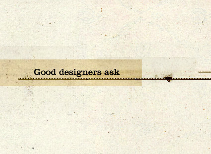
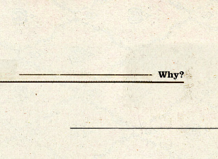
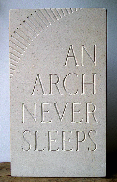
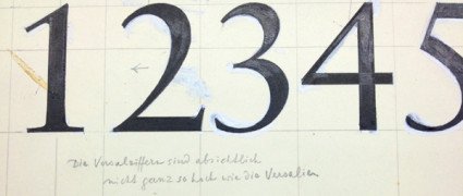
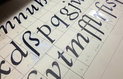
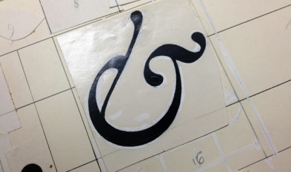
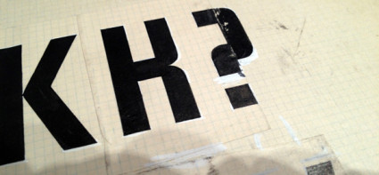
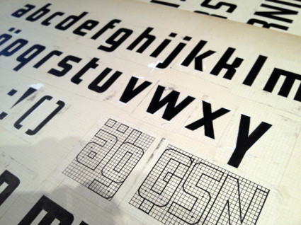
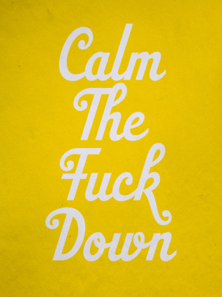
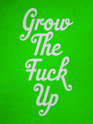
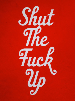
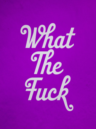
Designer Matthew Rogers took Fry’s comments on language – which has this wonderful way of evolving – and made it visual (above).
I am currently working on a project where I’m screwing with language for fun. Google Translate is a great video game, no scores or explosions (unless you look them up); but always fascinating results.
Found via Upworthy
Tags: design, education, thoughts, typography by steve
Comments Off on Stephen Fry on language