entries Tagged as [education]

Book gypsies in El Lay

‘They are traveling the country . . . join us for the day as they work on producing a unique keepsake with the Museum’s presses and materials – and then have a talk’
This Saturday, April 10, Santa Cruz-based book artists Peter and Donna Thomas will be at the International Printing Museum in Carson, CA. Details here.
More about the Thomases here.
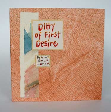
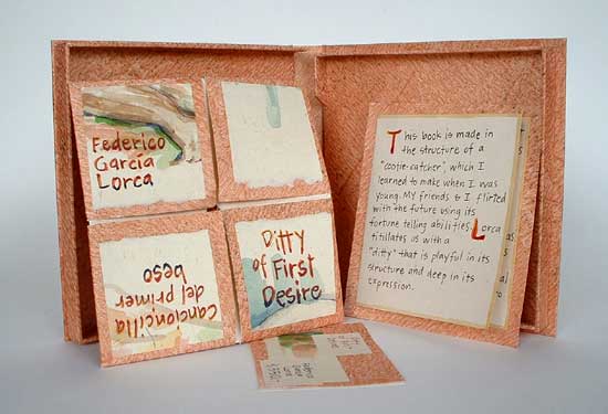
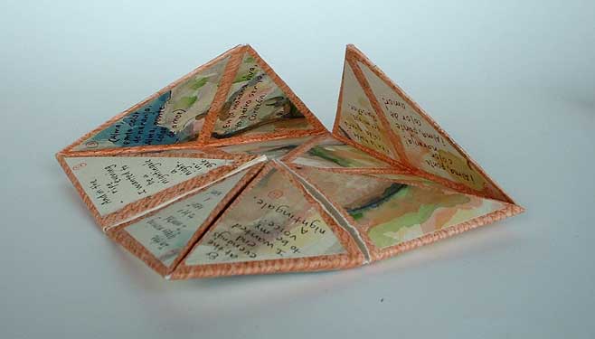
Peter and Donna Thomas’ Ditty of First Desire (2007), a ‘cootie-catcher’ shaped book – with paintings of nudes – showcasing the poem by Federico Garcia Lorca
Megadeth, reinterpreted
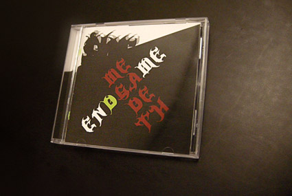
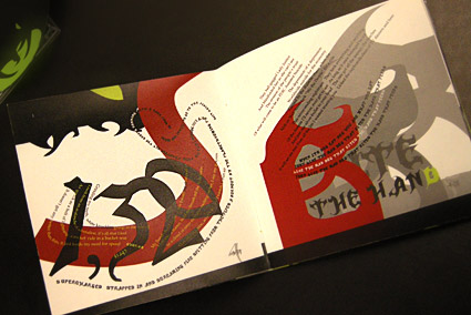
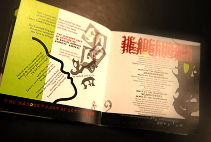
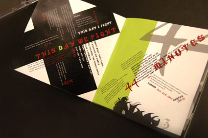
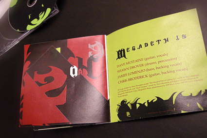
In my intermediate typography course at the California Art Institute Sacramento, students tackle CD packaging design – with a slight twist. Inspired by Project Runway, I like to put limitations on the work to force the student to engage the project where inventiveness will lead to unusual results.
If I could get them to do everything in 24 hours, with Tim Gunn checking in, I’d try that too.
project limits
In this case, students have to work with a band (or recording artist) that they do not know anything about or (preferably) simply do not like. The more they delve into a genre foreign to them, the more interesting the results have been.
Pictured is student Isla Waite’s interpretation of the Megadeth album Endgame. Her decision to reimagine the lyrics into typographic layouts (inspired by the lyrics’ subject matter) led to a unique interpretation of the traditional stylings of Heavy Metal.
Dead Sea Scrolls and Gutenberg, locally
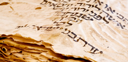
Opening April 8, 2010 at the Bayside Church in Granite Bay, CA is ‘From the Dead Sea Scrolls to the Bible in America,’ an exhibition featuring five pieces of the Dead Sea Scrolls.
Also on hand will be some rare Bibles including (reportedly) an original by Gutenberg.
More information here. SacBee article here.
Found via Susan Poirier
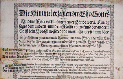
Blackletter in Mainz
I Love Typography takes a look at the holdings of the library of the Gutenberg Museum in Mainz. More than just Bibles.
Article here.
Jenson’s Italic
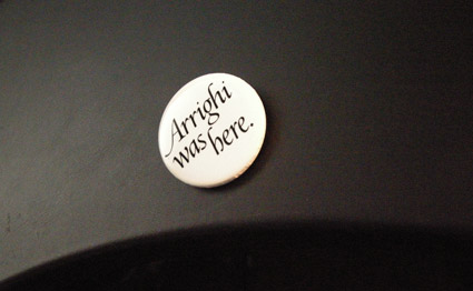
‘Arrighi was here’ button by George Abrams
Any current drawing of the type work of Nicholas Jenson (1420-80) that includes an Italic is doing a little fudging. Since (like Trajan and lowercase), Italic wasn’t quite around yet when Jenson was making type.
Typically the work of Ludovico Arrighi (1475–1527) is adapted as the companion font to Jenson – as the Italic.
Monotype did this with its Jenson-influenced Centaur – and Adobe Jenson sports an Arrighi-influenced italic. [Read more →]
MoMA and the history of @

‘MoMA’s announced what might be its boldest acquisition ever. And it didn’t even cost anything: The ‘@’ symbol is now a part of the museum’s permanent design collection.’
Article here.
Pictured above, the @ symbol from Goudy’s Bertham font.
Making Metal Typefaces in the 21th Century
‘This project has a dual goal of documenting the almost-lost skill of creating metal fonts and of capturing the personality and work process specifically of practitioner the late Canadian graphic artist Jim Rimmer (1931–2010)’
Richard Kegler’s long-delayed documentary, Making Faces: Metal Type in the 21st Century, has just secured just enough funding for completion.
For more about the film, go here and here.
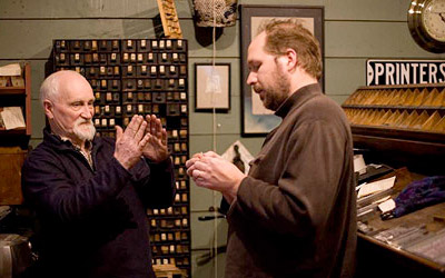
Rimmer and Kegler

handpicked posts

a piano falls in old manhattan
tetro and typography
it’s typography: film, song and dance
ghosts of gustov klimt
the great times new roman controversy
picking fonts
kapitaal
defining terms: design is not decoration
garcia's 'pure design'
'enhance that image!'
magic highway remixed
the cynic
rad anthem
Brought to you by man dom-


buy my fonts
go shopping
mehalloreads

Divinely Elegant: The World of Ernst Dryden
Jozsef Pecsi: Photo and Advertising
Color: A Natural History of the Palette
Collage: Assembling Contemporary Art
Modern Dog: 20 Years of Poster Art
Gaberbocchus Press: An Experiment in Publishing, 1948-1979
Advertising Art in the Art Deco Style
Googie Redux: Ultramodern Roadside Architecture
Hot Sour Salty Sweet: A Culinary Journey Through Southeast Asia
now playing


the work at the mehallo blog. beta. is licensed under a creative commons attribution - noncommercial - no derivative works 3.0 united states license. if reposting, credit must be given to steve mehallo - and if possible, please provide a link back to the mehallo blog. beta.
i include images for the purpose of critique, review, promotion and inspiration - and always make my best effort give credit/link back to the original source. if i’ve screwed up, please fire me a note.
page layout based on the wordpress 'darkwater theme' by antbag, adapted and redesigned by mehallo. valuable php assistance from bill mead.


