Sexy glyph
Cover story from the September 2009 W: Kate Moss shows off Miuccia Prada’s fall collection. Prefaced, of course, by a beautifully drawn typographic glyph.
Cover story from the September 2009 W: Kate Moss shows off Miuccia Prada’s fall collection. Prefaced, of course, by a beautifully drawn typographic glyph.

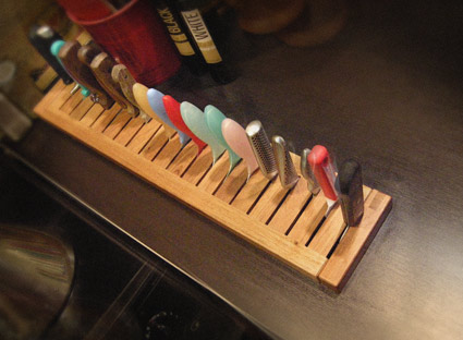
Built in knife rack by mehallo, hacked from an IKEA’s Molger bathroom shelf
I’m an IKEA hack. Because the products don’t always fit the space, don’t always work the right way or can be repurposed for other use. Form follows function – or form changes for better function – as it were.
IKEA is everywhere, almost. They seem to be in specific parts of the US, and then strategically all over the rest of the world. A photographer I once worked with noted that when they come to town, one can see them slowly change the look of a community. My dentist notes that they seem to open next to train tracks. [Read more →]
‘Foo-der-ah’ – as one of my students once called it. Paul Renner’s Futura is everywhere – and here’s a write up in idsgn’s ongoing know your type series.
Or – if you really want to get your hands dirty – snag a copy of the expanded edition of Christopher Burke’s wonderful biography of Paul Renner – detailing the creation of Futura – how knock offs were released before he even finished his drawings, his arrest by the Nazis, other fonts, sketches, experiments . . . But even more, the book details philosophy, beliefs and how they contributed to the creation of types that are as fresh today as they were in the 1920s.
Did you hear that IKEA???
Here’s a link to a cool collection of typographic wallpapers designed by Arno Kathollnig/Typoatelier. Including a fun ((t+y+p+o)-o)+e= version (pictured above) featuring my very own Jeanne Moderno fonts.
I miss these icons. Susan Kare developed them – and the standard city-named fonts – for the original Apple Macintosh in the early 1980s.
I particularly like the alert message guy in the right corner – a playful bitmapped take that has a similar feel as Oskar Schlemmer’s 1921 bauhaus icon.
My grungy Alta California font was inspired by Kare’s original San Francisco font; which, unfortunately hasn’t been available on a Macintosh for many years. I have a great respect for her ability to convey so many many different letters within a small 72 dpi black and white space. Unfortunately – thru gratuitous use – San Francisco did sort of become the Comic Sans of its day. Sort of.
Check out Kare’s online store for some fantastic tees and notecards. Rad digital art from a simpler era. An era that didn’t need gradients and drop shadows in order to dazzle.
And drop by the Japan-based Vintage Mac Museum to see some of Kare’s original icons in action.

Lite-Bright typography created by Brooklyn-based GrandArmy
More detail here.
Vintage Lite-Brite commercial
Found via Type Theory
gurus plant ideas
Steve Masseroni is an incredible artist I knew in high school. He was dabbling with working for Marvel Comics at the time, but set out in his own direction. In a afternoon critique in 1985, he gave me his favorite brush and a few tips on being an illustrator. [Read more →]
The thing is, there’s some mainstream stuff on the list too. To peruse, simply jump over to Designer Daily.
If you’re one who thinks there just aren’t enough font resources worth blogging about, Johno of I Love Typography begs to differ.
His newest endeavor – the Type Daily news aggregator – will embed you in a universe of lettering arts. A one-stop-source for typography, fonts and lettering; just about all the major resources are there.
Pop by and fill that typographic need you know you have.
Jamie Caliri Interview from SubmarineChannel on Vimeo
More detail and links at Forget the Film, Watch the Titles
Years back I was dazzled by the opening titles for the television program Big Apple (8 episodes, 2001). And when I found myself in a position to showcase motion graphics at an exhibition, title designer Jamie Caliri was at the top of our list.