entries Tagged as [design]
Tschichold and Alta California
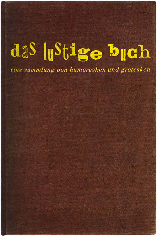
Rare Jan Tschichold book design, featuring his use of an early prototype of the Alta Calfornia font.
Cloth cover for Das lustige Buch (The Funny Book), Verlag der Bücherkreis GmbH, Berlin, 1931.
Letter March 2011
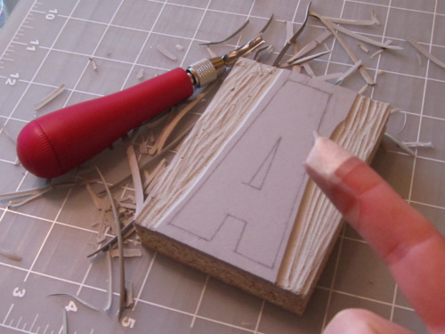
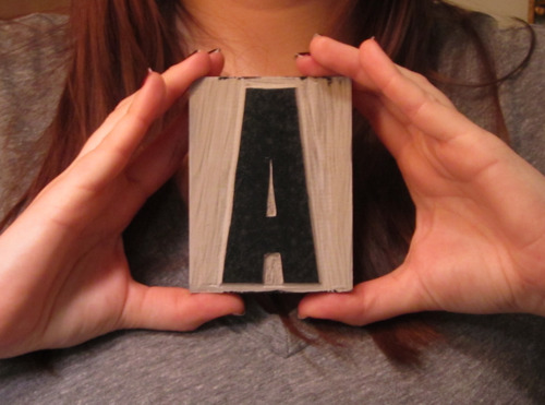
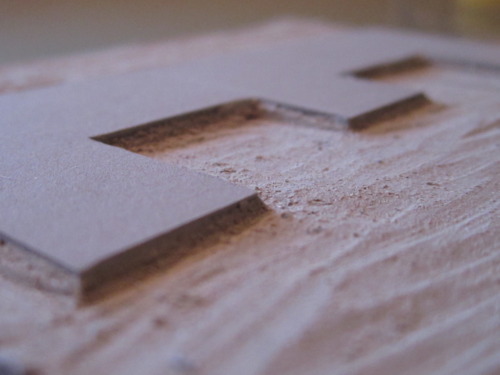
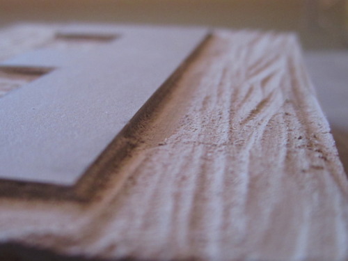
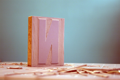
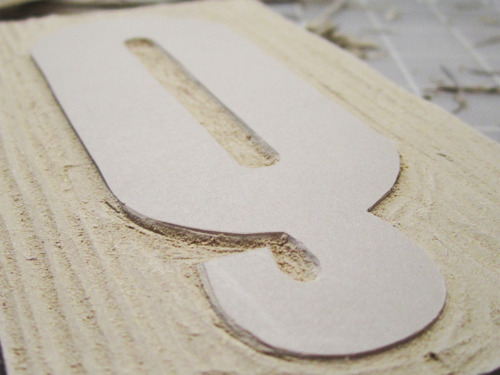
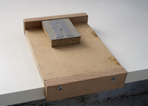
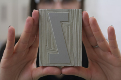
‘This is an experiment in carving one linocut letter per day in an attempt to complete an entire alphabet by March 31st. Chosen typeface: Champion Gothic by Hoefler & Frere-Jones. Lightweight was chosen based on a deep rooted affection with its ampersand.’
And so concludes Aymie Spitzer’s March of Letters. Blog here. Calendar archive here.
Found via Campbell BrownKorbel
Butter typography 7
‘Over in Missouri USA, yellow margarine remains illegal to this day’
A look at butter over margarine – animated by Kris Cook at Outside Line for the UK Friends of Butter folk.
Butter typography 4
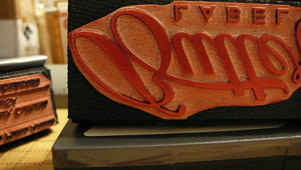
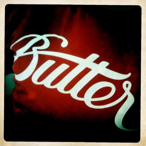
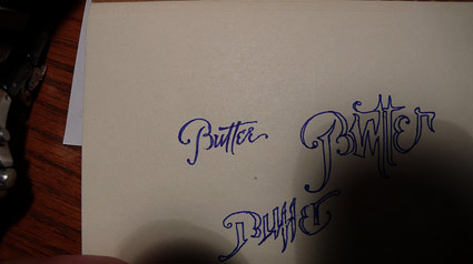
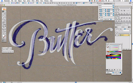
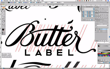
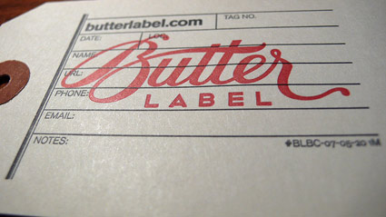
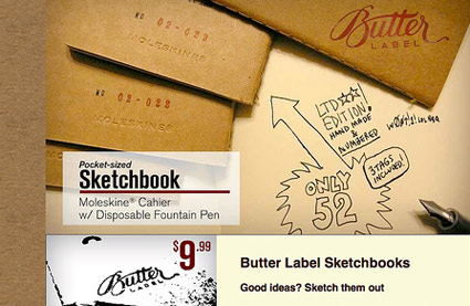
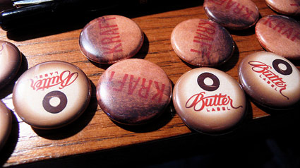
At last year’s TypeCon, I picked up a nice, red Butter Label shirt. One of a series of fun products designed by Luke Dorny of award-winning Ligature Loop & Stem fame.
Pictured, development of his Butter Label logotype, which was first cast in rubber for a limited edition Moleskine offering.
More images here.
Butter typography 3
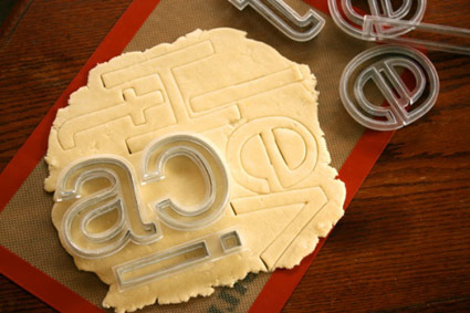
Helvetica cookies, Helvetica cookie cutters.
The work of Beverly Hsu.
Found via Pardeep’s Design Blog
Butter typography 1
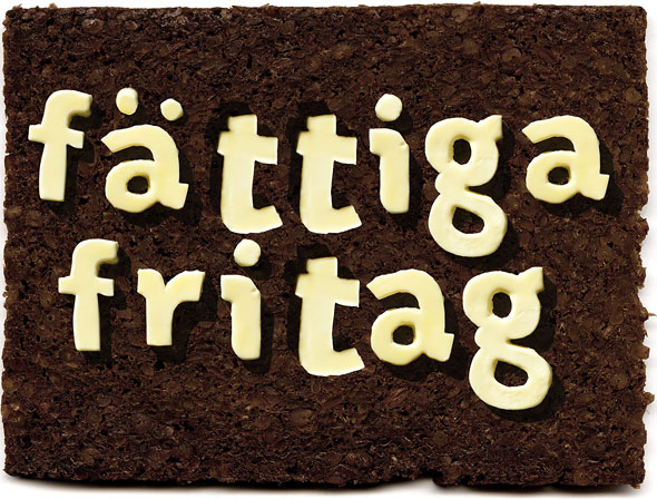
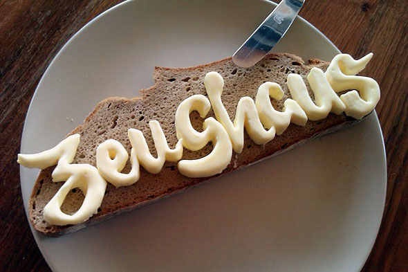
Was recently discussing with a culinary instructor that it’d be interesting if some of her students took one of my type classes. Imagine what would happen to plated up food with type knowledge floating thru young cooks’ brains.
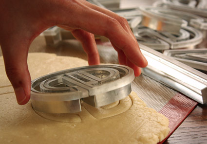
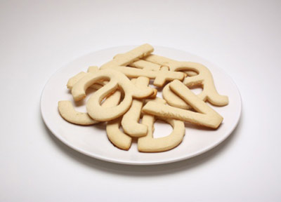
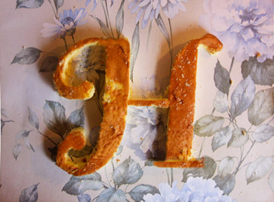
Then I saw Zeughaus’ butter letters, above.
Original type by Typejockeys, butter cut by Nadine Ruhm. Info here.
