Typographic propaganda
From 2003: What Barry Says by Simon Robson & Barry McNamara. Short anti-US fascism animation. This controversial film won Best Animation at the Brooklyn International Film Festival in 2004.
From 2003: What Barry Says by Simon Robson & Barry McNamara. Short anti-US fascism animation. This controversial film won Best Animation at the Brooklyn International Film Festival in 2004.
Student work from Sweden: Tomas Nilsson reinterprets Little Red Riding Hood (above). Music by Slagsmålsklubben. You know, I never did understand why the wolf – with the big ol’ teeth – never actually chewed his food.
Nilsson’s animation was inspired by Röyksopps’ Remind Me (below).
Found via Twitter.com/grain edit
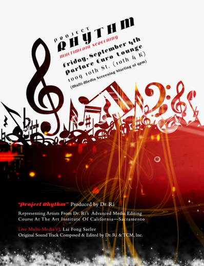
My Jeanne Moderno fonts were spotted on this poster for . . .
Project Rhythm Multimedia Screening
Friday, September 4th, 2009 at 9 p.m.
At Parlare Euro Lounge, 1009 10th Street (10th & K), Sacramento, CA 95814 [map]
Project Rhythm Multimedia Screening is produced by Dr. Ri and features artists from Dr. Ri’s Advanced Media Editing Course at the Art Institute of California-Sacramento. Also: Live Multimedia VJ: Lai Fong Saelee, original soundtrack composed and edited by Dr. Ri & TCM, Inc.
Jamie Caliri Interview from SubmarineChannel on Vimeo
More detail and links at Forget the Film, Watch the Titles
Years back I was dazzled by the opening titles for the television program Big Apple (8 episodes, 2001). And when I found myself in a position to showcase motion graphics at an exhibition, title designer Jamie Caliri was at the top of our list.
‘Pablo is the story of outlaw filmmaker, countercultural icon, and world famous title designer Pablo Ferro.
‘The film blends animation, documentary footage and testimonials of illustrious filmmakers and artists who unravel the legendary life of Pablo Ferro and his legacy.’
More on Pablo The Movie here. Updated trailer (with animation) posted here.

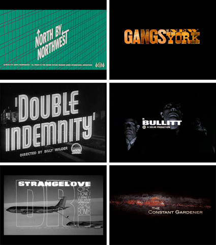
Browse thru Christian Annyas’ Movie Title Stills Collection, which contains ‘hundreds of main titles from feature films’ – and some shots of trailers – organized by decade.
Found via Designisms


Neville Brody’s New Deal fonts in use, custom designed for Public Enemies
Yves Peters over at The FontFeed gives their monthly roundup of movie poster typography.
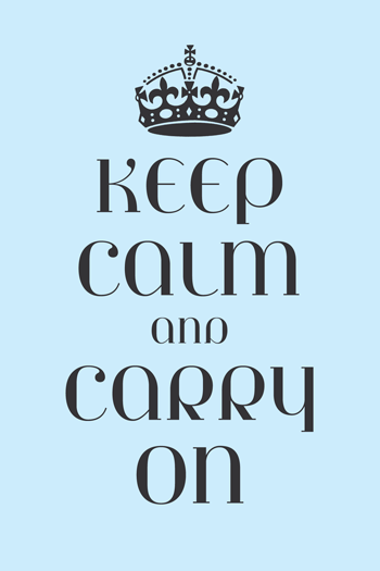
Designer Steven Shearer’s update of the iconic British Keep Calm and Carry On poster – typeset in one of my fonts, Jeanne Moderno. Available now on some nifty Cafe Press items.
Sort of reminds me of the revisionary 1930s British history portrayed in this version of Shakespeare’s Richard III (1995).
It’s the type that’s sexy.
If it were one of my fonts, that’d made it even sexier.
Make The Girl Dance is Campana & Perrin, aka Greg & Pierre. This is their MySpace page.
Found via Ashley Simko’s blog


the work at the mehallo blog. beta. is licensed under a creative commons attribution - noncommercial - no derivative works 3.0 united states license. if reposting, credit must be given to steve mehallo - and if possible, please provide a link back to the mehallo blog. beta.
i include images for the purpose of critique, review, promotion and inspiration - and always make my best effort give credit/link back to the original source. if i’ve screwed up, please fire me a note.
page layout based on the wordpress 'darkwater theme' by antbag, adapted and redesigned by mehallo. valuable php assistance from bill mead.


