entries Tagged as [art deco]
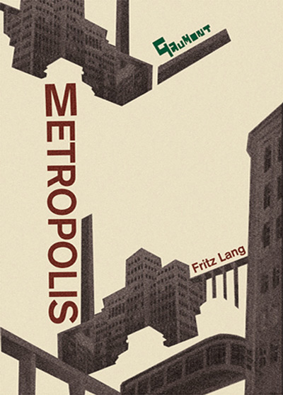
Metropolis reinterpreted 3
Video for Madonna’s Express Yourself. Production design by Vance Lorenzini, inspired by Metropolis. Directed by David Fincher. From 1989.
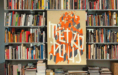
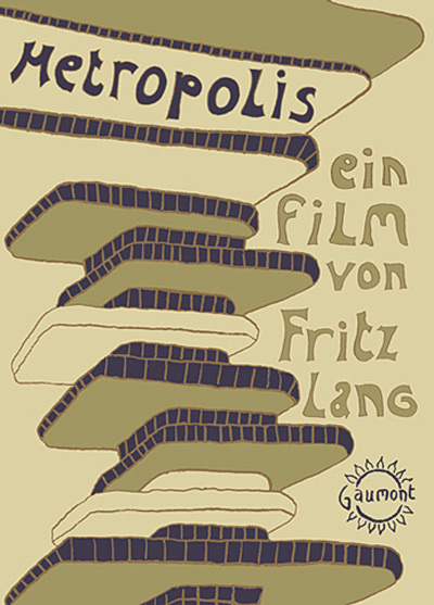
Metropolis reinterpreted 2
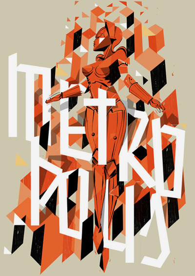
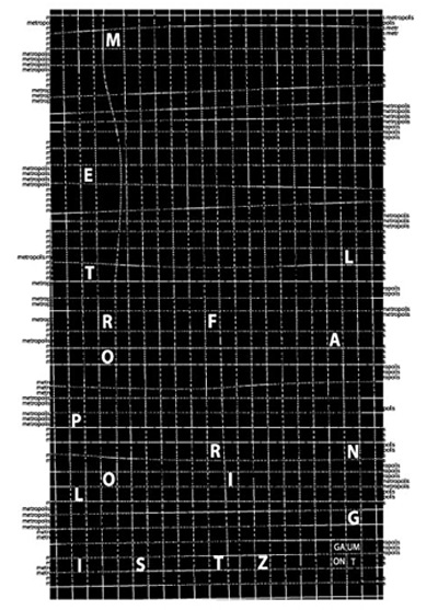
Metropolis poster by Pietari Posti and Underware. 6-layered silkscreen print, 2008. Run of 100.
With glow-in-the-dark lettering.
Metropolis visuals
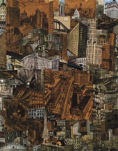
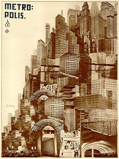
Cinematography for Fritz Lang’s Metropolis (1927) was inspired by Paul Citroen’s 1923 Metropolis photomontage (above).
And so was Boris Bilinsky’s poster for the film (below).
Commercial artists took some liberties with how they created visual promotion for Metropolis – redrawing or recreating the ‘maschinenmensch’ (machine-man) and the modernist cityscapes. [Read more →]
McKnight Kauffer’s Metropolis
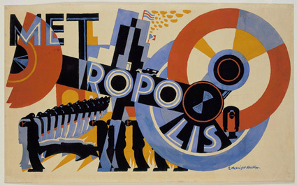
Metropolis by E. McKnight Kauffer. Gouache on paper, 1926.
Foreshadows Depero’s compositions, such as his view of New York – and his work for Campari.
Merry Oldsmobile 3
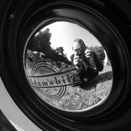
Photograph by Kent Hall.
Taken at the 2007 Gatsby Summer Afternoon, held annually by the Art Deco Society of California.
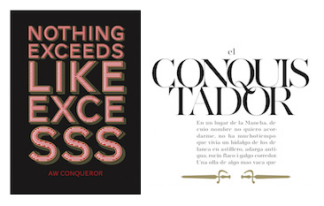
Free Conqueror fonts!
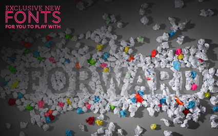
‘Jean François Porchez was approached at the end of 2009 to create a set of typefaces to relaunch the Conqueror papers collection.’
Jean François Porchez’s beautiful Conqueror fonts are based on some great historical design eras – and are available free via Arjowiggins Creative Papers thru end of March 2012.
The fonts themselves are mostly caps and missing a few punctuation marks – but they also have similar widths, cool alternate characters (such as swashes) and 3D carved versions (as extras) – making them vastly interchangeable. And who knows, since they’re free, maybe they’ll conqueror the design world.
A standard commercial font license applies. Grab em here.
More details here.

‘Escape from Comic Sans’
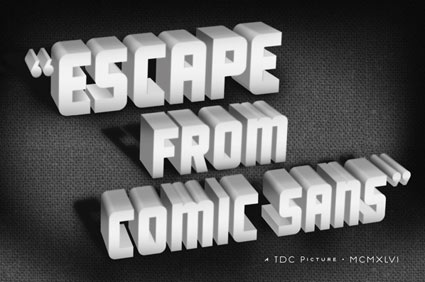
B-movie typography eCards, designed by Will Staehle for TDC. Go here.
And check out Will Staehle’s website here.
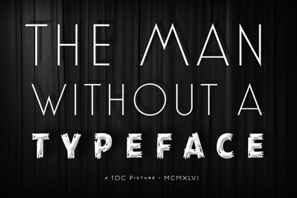
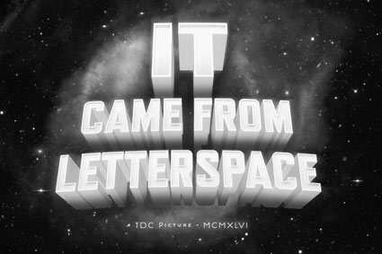
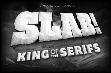
Found via Ilene Strizver

handpicked posts

a piano falls in old manhattan
tetro and typography
it’s typography: film, song and dance
ghosts of gustov klimt
the great times new roman controversy
picking fonts
kapitaal
defining terms: design is not decoration
garcia's 'pure design'
'enhance that image!'
magic highway remixed
the cynic
rad anthem
Brought to you by man dom-


buy my fonts
go shopping
mehalloreads

Divinely Elegant: The World of Ernst Dryden
Jozsef Pecsi: Photo and Advertising
Color: A Natural History of the Palette
Collage: Assembling Contemporary Art
Modern Dog: 20 Years of Poster Art
Gaberbocchus Press: An Experiment in Publishing, 1948-1979
Advertising Art in the Art Deco Style
Googie Redux: Ultramodern Roadside Architecture
Hot Sour Salty Sweet: A Culinary Journey Through Southeast Asia
now playing


the work at the mehallo blog. beta. is licensed under a creative commons attribution - noncommercial - no derivative works 3.0 united states license. if reposting, credit must be given to steve mehallo - and if possible, please provide a link back to the mehallo blog. beta.
i include images for the purpose of critique, review, promotion and inspiration - and always make my best effort give credit/link back to the original source. if i’ve screwed up, please fire me a note.
page layout based on the wordpress 'darkwater theme' by antbag, adapted and redesigned by mehallo. valuable php assistance from bill mead.


