Tatlin’s ‘Tower of Babel’
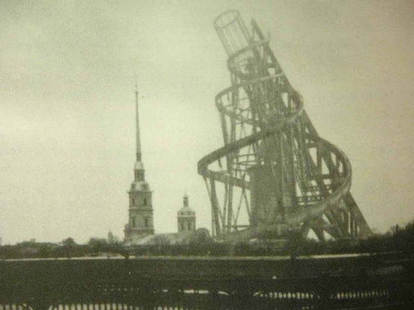
‘Tatlin’s Tower or The Monument to the Third International is a grand monumental building envisioned by the Russian artist and architect Vladimir Tatlin, but never built.’
Article here.
‘Tatlin’s Tower or The Monument to the Third International is a grand monumental building envisioned by the Russian artist and architect Vladimir Tatlin, but never built.’
Article here.

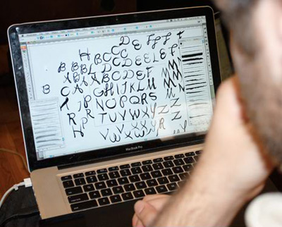
‘We’ll explore the hot button topic of web fonts; antique type and lettering of the textile trade; the typography of Disneyland; making smart fonts even smarter; the influence of Charles Eames; liquid typography; west coast ‘Cholo’ style graffiti; and so much more.’
typecon 2010: babel
Big typography conference next week in Los Angeles. Wood Type preview in Carson today. Designer talks, workshops, dealer room, font makers, stuff.
and me
I’ll be giving my first ever TypeCon talk as part of their Type & Design Education Forum. My title is Tell Lies in the Classroom and Get Away With It. It will be as weird as what I normally do in a classroom.
Promise. [Read more →]
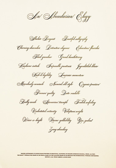
‘The broadside is printed on Mohawk Superfine Eggshell, White, 100t. Everyone attending TypeCon 2010 will receive a copy, courtesy of type quizmaster Allan Haley.’
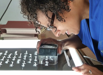
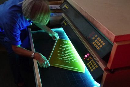
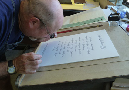
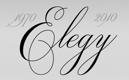
A broadside tribute to ITC’s new Elegy font – printed in letterpress at Patrick Reagh Printers in Sebastopol, CA. The poster was typeset by the wonderful Ilene Striver – who’s managed to talk me into giving a presentation as part of TypeCon’s Education Forum – next Thursday. More about TypeCon in my next post.
More info about the broadsheet here.

Original ITC logotype handlettered by Ed Benguiat, 1970

Elegy typeface designed by Jim Wasco, 2010
“Where can I get a font of the script used for the ITC logo?’ For almost four decades, this has been one of the most frequently asked questions of ITC. The answer has always been the same: ‘You can’t. The ITC script logo is handlettering and it is not available as a font.”
Now it is. Introducing: ITC Elegy. Two years in production, Jim Wasco took apart Ed Benguiat’s original Spencerian-style script and put it back together with updated spacing and a bunch of stylistic changes.
Detailed article here.

Comparison: Elegy and the original


Found via Delve Withrington
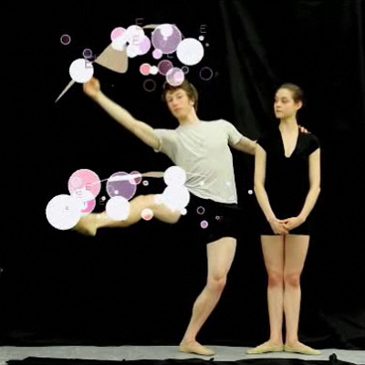
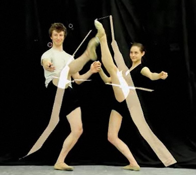
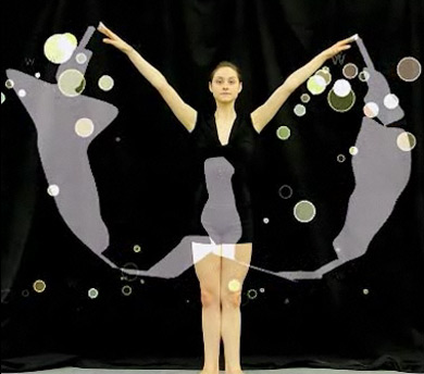
‘The resulting font is based on the physical movements of two Oregon ballet dancers . . . The dancers were fitted with infrared LED lights, which captured their steps in real time as they danced all 26 letters of the alphabet.’
Typography combined with ballet. Details (and final font) here.

Found via Lyndsie Ross
Queen’s Radio Gaga. From 1984.
The video features public domain footage from Fritz Lang’s Metropolis (1927).
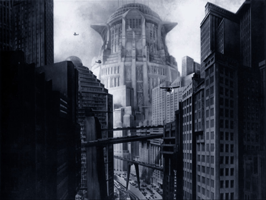
Metropolis’ New Tower of Babel; click for larger version/jump
Also in 1984, producer Giorgio Moroder updated Metropolis with a rock score – controversial for some purists. Queen’s Freddy Mercury contributed Love Kills to the soundtrack (video below); though unrelated to the Gaga single.
So far, Moroder’s new wave-esque version (due to music licensing) hasn’t been officially released on DVD. But in comparison to the original (which got a complete restoration just this year), Moroder’s music, color tints and enhanced sound fx result in a totally different, very 1980s film experience.
Musicians and creatives. The photography of Leigh Righton.
Found via Sara Taylor
‘A comparison between my two new cameras: The $1,800 Canon 7D versus the brand new $50 Barbie Video Girl . . . available in the girlie aisle of your local Toys R Us.’ –Brandon Bloch
Found via Ashley Simko

‘They make girls with no ass-at-all look like they have something back there . . . and girls with a little junk in their trunk, look like they have perfect apple bottoms.’
Cute Booty – pants for gals designed by Kelly Nishimoto, sister of musician Meiko.

‘I walk into a sea full of beauty’ -Brooke Burke, host
Another Jeanne Moderno spotting: Used for titles on TV Land’s third season of She’s Got The Look.
Judge Robert Verdi (above) can be really funny too. Been a fan since he was on that reality show where he used to sneak into people’s houses, redesign their rooms and make them cry at the end.
Click the above image to watch a preview/jump.
Found via Shandi Pierzina


the work at the mehallo blog. beta. is licensed under a creative commons attribution - noncommercial - no derivative works 3.0 united states license. if reposting, credit must be given to steve mehallo - and if possible, please provide a link back to the mehallo blog. beta.
i include images for the purpose of critique, review, promotion and inspiration - and always make my best effort give credit/link back to the original source. if i’ve screwed up, please fire me a note.
page layout based on the wordpress 'darkwater theme' by antbag, adapted and redesigned by mehallo. valuable php assistance from bill mead.