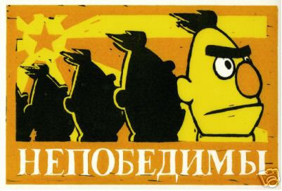
Classic green
Kermit, from 1969.
Kermit, from 1969.

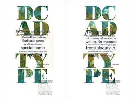
‘A sixty-page book covering the philosophical & semiotic aspects of typography, with content based on lectures by a SCAD professor & Robert Bringhurst’s The Elements of Typographic Style’
By Steven Acres. Details here.


Found Via Creativeoverflow
‘Typography is what language looks like.’ –Ellen Lupton
Great collection of typography quotes (with article), collected by Jacci Howard Bear. Go here for more.
And
Check out as8: Alessandro Segalini’s collection of quotes on typography here.
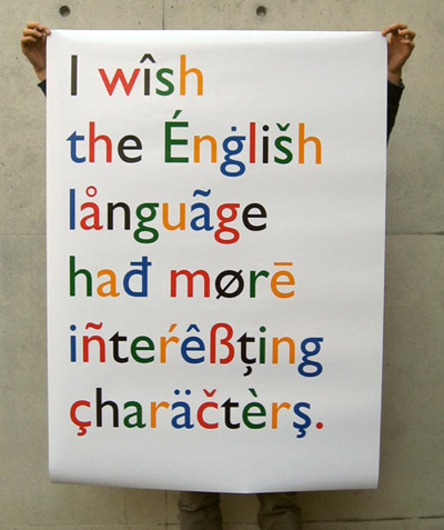
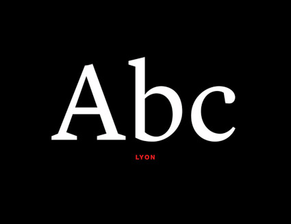
Image found via Lead Graffiti

‘Almost all human reasoning about facts, decisions, opinions, beliefs, and values is no longer considered to be based on the authority of absolute Reason, but instead, is seen to be intertwined with emotional elements, historical evaluations, and pragmatic motivations. In this sense, the new rhetoric considers the persuasive discourse not as a subtle, fraudulent procedure, but as a technique of ‘reasonable’ human interaction, controlled by doubt and explicitly subject to extra logical conditions.’ -Umberto Eco, Italian Scholar and Semiotician
Here’s a great article at Mert TOL on using type to . . . manipulate and control.
Photo by mehallo

‘It’s all in the details. Our end slug was pulled right from the logo itself, the dot on the ‘i’ to be exact. This was a small but proud moment for us. I’m sure you saw the connection right away . . . right?’
Check out this great, detailed article about the recent NYT Magazine redesign at the Society of Publication Designers Blog.


the work at the mehallo blog. beta. is licensed under a creative commons attribution - noncommercial - no derivative works 3.0 united states license. if reposting, credit must be given to steve mehallo - and if possible, please provide a link back to the mehallo blog. beta.
i include images for the purpose of critique, review, promotion and inspiration - and always make my best effort give credit/link back to the original source. if i’ve screwed up, please fire me a note.
page layout based on the wordpress 'darkwater theme' by antbag, adapted and redesigned by mehallo. valuable php assistance from bill mead.