entries Tagged as []
‘Obama, burdened’
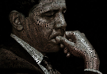
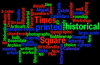
‘Includes type from Obama’s campaign and branding: Gotham, Knockout No. 48, Gill Sans, and Perpetua.’
Illustration for TIME by Dylan Roscover. Article here.
The State of the Union is tomorrow night.
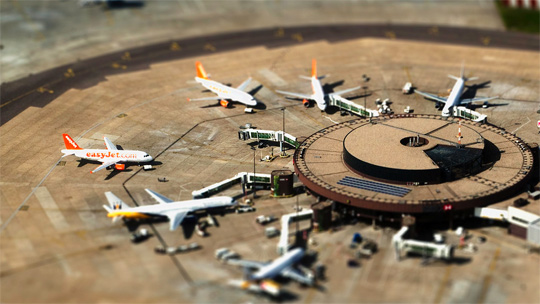
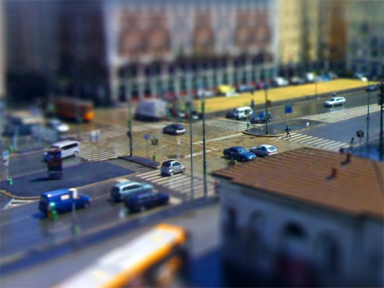
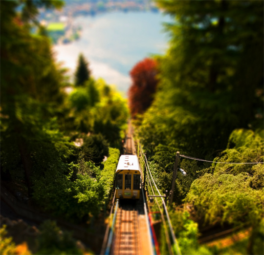
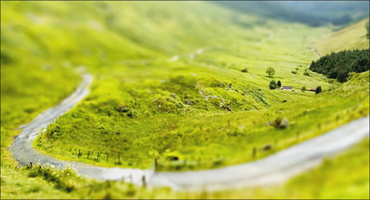
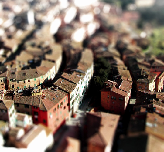
Miniature
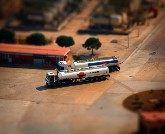
I really enjoy this stuff.
Many years ago I designed a large mural (in Photoshop) that was supposed to look like a bad movie miniature. TiltShiftMaker does it automatically. Or here’s instructions on doing it yourself.
And when I was a kid, my Uncle John had made the coolest train platform for under his Christmas tree. In it he employed his own take on HO scale suburban zoning – with a detailed downtown, country farms, residential section (in the hills, by a lake) and two circular tracks linking everything.
All the images shown are real, just TiltShifted into looking fake. More here.


The mehallo font library at Typekit
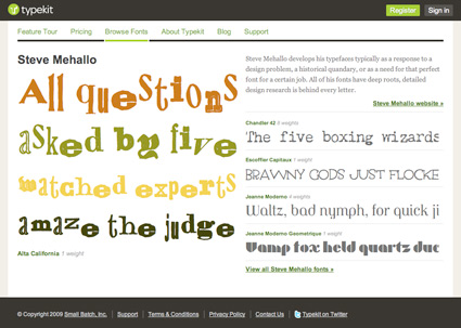
Recently, I made most of my font library available for the web via Typekit.
The list is here.
Thru TypeKit web designers can (legally) embed my fonts as html text at any website. Here’s a site that’s using Chandler 42.
Typekit has 4 subscription options; with a free trial plan available. Note: My fonts are only available through the Portfolio plan and higher.
For more info, drop by Typekit. Subscribe to their blog for updates.
And
Here’s a review at Webmonkey that does a good job explaining what all this font embedding hoohah is about.

This is crazy

I apologize for this.
On January 17, I sent out emails to the winners of my font contest. And heard nothing. Never knew if they did get my fonts. Finally heard back, nada. It looks like spam filters may have caught what was sent.
So if you were a winner in my font contest – the winners are listed here – I have now sent the fonts to your email address via YouSendIt. Please contact me if you do not receive and we can try carrier pigeon or something.

Alphabet ears
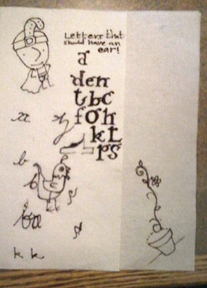
Sketches by dr. mendez and nurse wickland
I think our lowercase g is our screwiest letter. It evolved into something quite odd. It has parts that other letters do not have. It also has an ear. It’s often drawn just like a dog’s ear.
Two of my students have been pondering (above) other letters that should have ears.

handpicked posts

a piano falls in old manhattan
tetro and typography
it’s typography: film, song and dance
ghosts of gustov klimt
the great times new roman controversy
picking fonts
kapitaal
defining terms: design is not decoration
garcia's 'pure design'
'enhance that image!'
magic highway remixed
the cynic
rad anthem
Brought to you by man dom-


buy my fonts
go shopping
mehalloreads

Divinely Elegant: The World of Ernst Dryden
Jozsef Pecsi: Photo and Advertising
Color: A Natural History of the Palette
Collage: Assembling Contemporary Art
Modern Dog: 20 Years of Poster Art
Gaberbocchus Press: An Experiment in Publishing, 1948-1979
Advertising Art in the Art Deco Style
Googie Redux: Ultramodern Roadside Architecture
Hot Sour Salty Sweet: A Culinary Journey Through Southeast Asia
now playing


the work at the mehallo blog. beta. is licensed under a creative commons attribution - noncommercial - no derivative works 3.0 united states license. if reposting, credit must be given to steve mehallo - and if possible, please provide a link back to the mehallo blog. beta.
i include images for the purpose of critique, review, promotion and inspiration - and always make my best effort give credit/link back to the original source. if i’ve screwed up, please fire me a note.
page layout based on the wordpress 'darkwater theme' by antbag, adapted and redesigned by mehallo. valuable php assistance from bill mead.


