entries Tagged as []

Hangul at the Design Museum

Claudia Pungaru, one of my students, turned me on to the work of Dr. Hyunju Lee. Lee’s work is typographic and she uses the Korean script Hangul as a starting point for expressive interpretations – about Korean life and culture.

Ongoing right now is Typographic Exploration in Hangul: An Exhibition of work by Hyunju Lee and Phil Choo (work pictured above) at the UC Davis Design Museum. In the show, letters evoke emotions – all tied to the tradition and sounds of the Hangul writing system.

For more information about the show, go here. The Design Museum’s site is here.

The museum is open limited hours Monday thru Friday, and on Sunday afternoons. Show ends December 6, 2009.

Image found via design in society

‘It’s time to be bold’

The work of Poland-based designer/illustrator Martin Plonka.

Found via Typography Daily

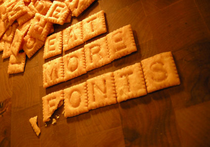
In my kitchen: Scrabble Cheez-Its

Could not find an ‘F’ in the whole bloody box.

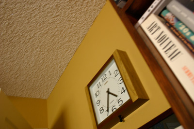
4:34 p.m.

My old store clock is noisy and uses big batteries. But it looks neat.

For as long as I could remember, San Francisco’s KFOG would play The Toyes’ Smoke Two Joints at quitting time on a Friday afternoon. Here’s three versions, including takes by Bob Marley and Sublime  . . .
 

get the playlist or create your own at mixpod.com
please support the musicians on my player by legally purchasing their music

Productivity

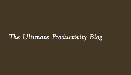
Wasting time online? Check out The Ultimate Productivity Blog.

Found via Twitter.com/Mirkohumbert

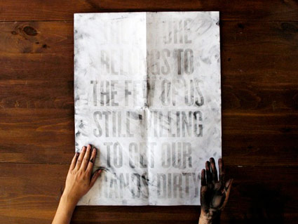
Interactive dirty poster!


Dirt Poster by Roland Reiner Tiangco

One can’t see the message in the poster unless one’s hands are dirty. See how it works here.

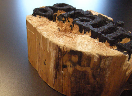
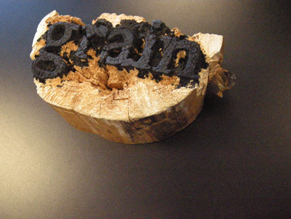
Wood type

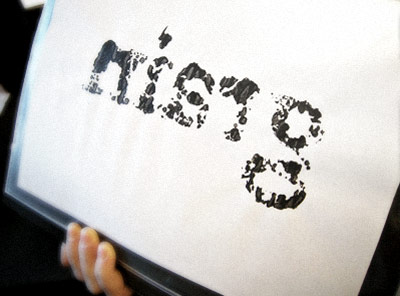
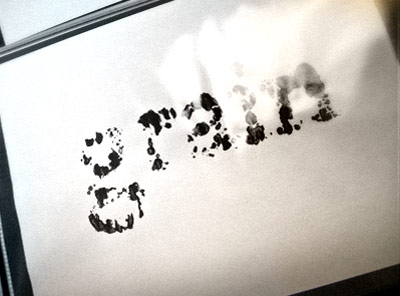
Experimental final project from my beginning typography course. Carved by student Rikki Morehouse.


First print  . . .


Offset print made from first print

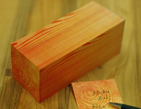
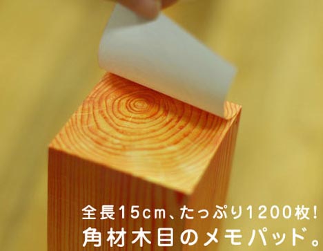
Woodgrain notes

Fake woodgrain notepad from Japan.

Found via Dornob

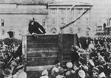
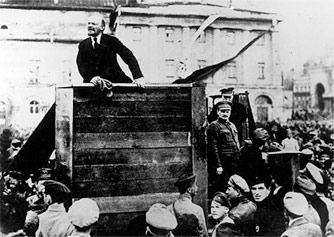
Before Photoshop


Lenin Addresses the Troops (1920); after  . . .


and (sorta) before

Here’s TIME’s Top 10 Doctored Photos.

Found via ISO50

Newspapers: What should be next?

One thing I know about journalists: They’re slow to change. Once dug in.

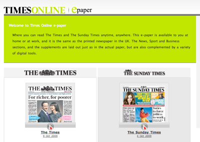
Here’s an opinion piece about where newspapers could be headed. It involves The Times of London’s ePaper, which is a nifty idea.

The online market – which, c’mon, papers still haven’t figured out – is tappable. Just have to reframe the conversation. It’ll be interesting to see where all of this goes.

Found via Japan_Blogs on Twitter

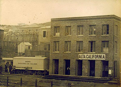
Alta California: Named after a newspaper


Alta California office, San Francisco 1851; found via Flickr

At one point in my life, I was going to be a journalist. So folly along  . . . .

I love history, so every one of my fonts falls into some historical category (or categories, if you look at Jeanne Moderno).

Alta California is my artist’s response to Susan Kare’s early Macintosh font, San Francisco. And it was a tricky build, as I was literally going thru book after book after book of old types – then messing them up, then messing them up more; and redrawing the edges until I had what I wanted.

(Please note, when it comes to ‘grunge typography’ – I don’t trust anything automatic; I’ve always gone in and tweaked the edges until I have something that looks – printed. Printed poorly, but printed.) [Read more →]


Creative Commons License

the work at the mehallo blog. beta. is licensed under a creative commons attribution - noncommercial - no derivative works 3.0 united states license.  if reposting, credit must be given to steve mehallo - and if possible, please provide a link back to the mehallo blog. beta.

i include images for the purpose of critique, review, promotion and inspiration - and always make my best effort give credit/link back to the original source.  if i’ve screwed up, please fire me a note.

page layout based on the wordpress 'darkwater theme' by antbag, adapted and redesigned by mehallo.  valuable php assistance from bill mead.