entries Tagged as []
Cola font
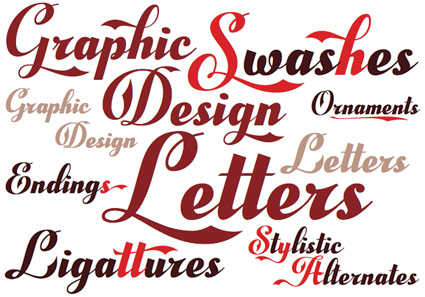
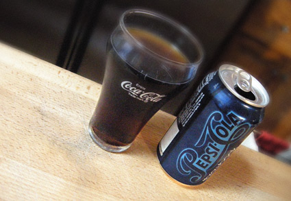
Here’s some Art Nouveau type based on a certain well-known soft drink logotype. Only different. Check out Rock And Cola Pro, a refreshing new font offering by Manuel Eduardo Corradine.
For a silly, fun, contrasting pairing, set your overlapping kickers in Emigre’s Soda Script.
Some things don’t translate

Found via thorn in paw
Paris Vogue uses Curlz font
There has been a trend in Europe where some really funky fonts have been showing up in editorial – sort of as a snarky way of saying, We know this isn’t right, but we’re doing it anyway. The UK edition of Elle Decoration has been playing in this arena for years, which often gives me quite the chuckle.
But . . . Paris Vogue is using Curlz. And they’re taken to task for it by 13-year-old fashion blogger Tavi.
C’mon. Paris Vogue.
Really?
Julia & styles . . .
There’s a huge part of me that wonders where celebrities get the idea that it’s just so easy to – overnight – become a fashion designer. And based on this snarky video, so does Julia Stiles.
Found via Huffington Post
Custom sole

Handmade shoes by Georges Esquivel
I love a good pair of shoes. And my range varies – on the low end I have my own collection of vintage bowling shoes; and my fav footwear are my yellow first generation Starck Pumas.
SoCal-based Georges Esquivel combines retro styling with handcrafted quality. Read more about how he’s taken a bite out of ‘Europe’s leading luxury brands.’
Found via Cool Hunting
Sexy glyph
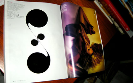
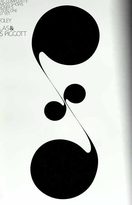
Cover story from the September 2009 W: Kate Moss shows off Miuccia Prada’s fall collection. Prefaced, of course, by a beautifully drawn typographic glyph.
Futurist footwear
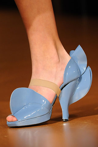
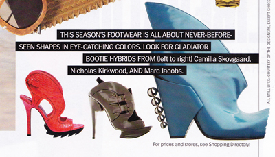
Prada (seen above) was tapping Futurism for 2008; and from the August 2009 Marie Claire, the trend may still have some wings . . .
Found via ItalianFuturism.org
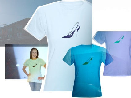
Stiletto shirts by mehallo
Choose from two vintage stiletto dingbats.
Options are an art deco-themed pump or basic, clean lines.
Part of my Moderno Collection at Café Press, limited edition tees featuring type and dingbats from my Jeanne Moderno fonts.

