entries Tagged as [typography]
Jeanne Moderno in Basel
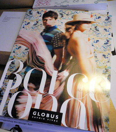
‘I was at a department store here in Basel and this in-store magazine caught my eye. The focus is Barcelona and all the headings are set in what must be Jeanne Moderno!’ -Nina
Nina Stössinger not only snagged me a copy of Globus Savoir Vivre‘s Barcelona issue; she also popped it in the mail. It just arrived a couple days ago.
It’s always great to see my fonts in use. Especially when the designer uses my funky accents.
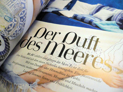
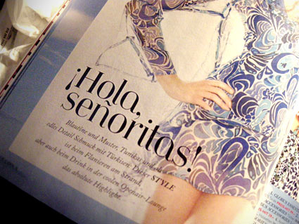
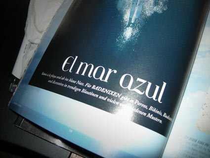
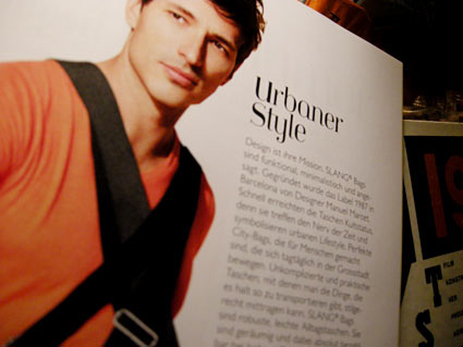
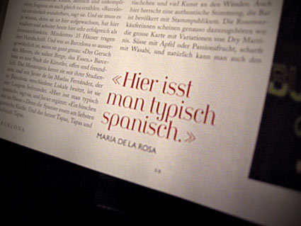
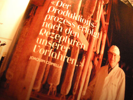
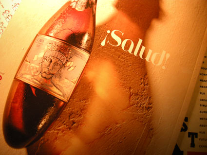
First two photos by Nina Stössinger, the rest by mehallo
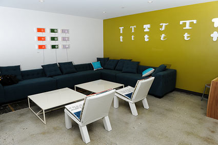
Jeanne Moderno invades Twitter HQ
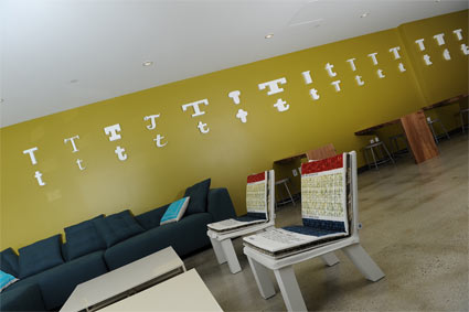
‘I tried to make small details count by making them meaningful, fun, playful, full of color, yet useful and sustainable . . . With artwork, we involved Twitter employees and local artists, 3 Fish Studios.’ -Sara
A Jeanne Moderno t graces the Cafe area at Twitter Headquarters in San Francisco.
Am I honored? Of course. Twitter has become one of my favorite screwy things to do.
Interiors designed by Sara Morishige. Fonts were sourced via the supercool Bryan Mason at Typekit.
More details here. Additional photos here.
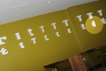
That be a Jeanne t, at right


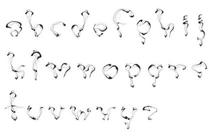

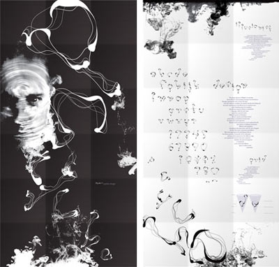


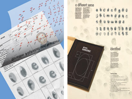
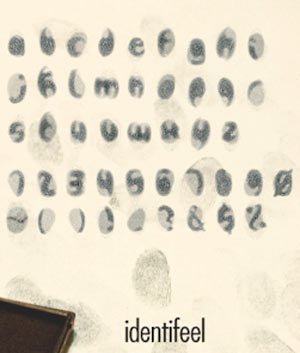
Type specimens galore!
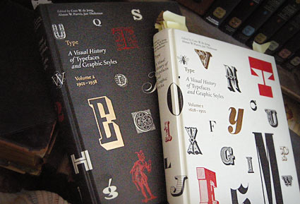
These two oversized coffee table books – which were published in the past year or so – are an odd sort.
Both volumes of Type A Visual History of Typefaces and Graphic Styles sell themselves as design history books.
They have the current editor of Meggs (and similar cover design), but the history is really just a backdrop (with, unfortunately, poorly annotated notes) to what the books are all about: They’re actually an incredible collection of rare typography specimens dated c. 1830-1930. [Read more →]
My take: Graphic design history fu
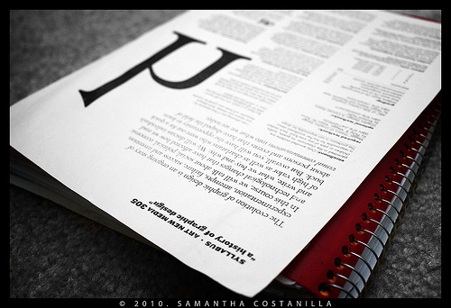
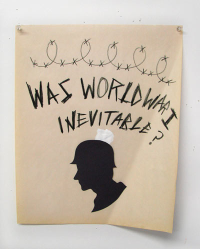
My syllabus, photographed by student Samantha Costanilla
So I’ve been teaching my version of ‘a history of graphic design’ for several years now. Just finished up my 9th session.
As a text, Philip B. Meggs’ landmark research book – History of Graphic Design, first released in 1984 – is the bible on the subject. Even the ‘making of’ has its own edition.
It’s the most thorough analysis, and one of the best graphic design reference books I own. But as Meggs points out in his introduction, it’s only the tip of the iceberg. There is so much more to discover, find, research and incorporate into one’s own view.
Finally, there is another book that just hit the market – The Story of Graphic Design by Patrick Cramsie. It tackles similar ground, but from another angle. A refreshing find. And from what I could tell so far, it syncs with my own classroom take on ‘The Story’ . . . [Read more →]
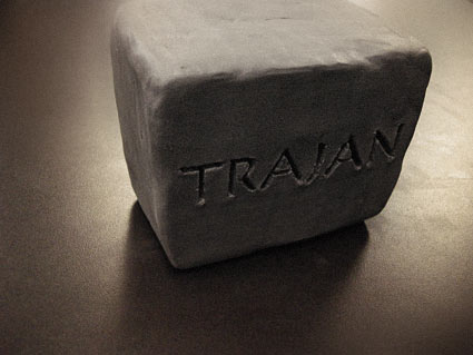
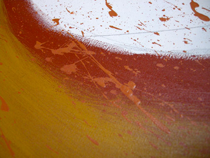
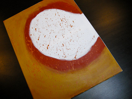
Anderson: Cooper Black
David M. Anderson’s Chaotic Times of Cooper Black, 2008. Mixed media on canvas.
Based on the type of Ozwald Cooper (1879-1940). From my Typography 3 course at Art Institute of California Sacramento.

handpicked posts

a piano falls in old manhattan
tetro and typography
it’s typography: film, song and dance
ghosts of gustov klimt
the great times new roman controversy
picking fonts
kapitaal
defining terms: design is not decoration
garcia's 'pure design'
'enhance that image!'
magic highway remixed
the cynic
rad anthem
Brought to you by man dom-


buy my fonts
go shopping
mehalloreads

Divinely Elegant: The World of Ernst Dryden
Jozsef Pecsi: Photo and Advertising
Color: A Natural History of the Palette
Collage: Assembling Contemporary Art
Modern Dog: 20 Years of Poster Art
Gaberbocchus Press: An Experiment in Publishing, 1948-1979
Advertising Art in the Art Deco Style
Googie Redux: Ultramodern Roadside Architecture
Hot Sour Salty Sweet: A Culinary Journey Through Southeast Asia
now playing


the work at the mehallo blog. beta. is licensed under a creative commons attribution - noncommercial - no derivative works 3.0 united states license. if reposting, credit must be given to steve mehallo - and if possible, please provide a link back to the mehallo blog. beta.
i include images for the purpose of critique, review, promotion and inspiration - and always make my best effort give credit/link back to the original source. if i’ve screwed up, please fire me a note.
page layout based on the wordpress 'darkwater theme' by antbag, adapted and redesigned by mehallo. valuable php assistance from bill mead.


