entries Tagged as [publication design]
El Lissitzky: ‘Frankreich’
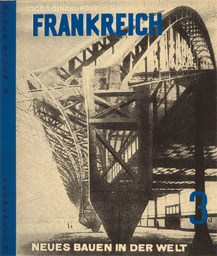
Cover design by El Lissitzky for Roget Ginzburger’s Frankreich (France) 1929.
From Neues Bauen in der Welt, a book series on modern architecture published in Vienna.
Below, recent release by Brooklyn-based Dream Diary, El Lissitzky.
Dream Diary: El Lissitzky
Tschichold and Alta California
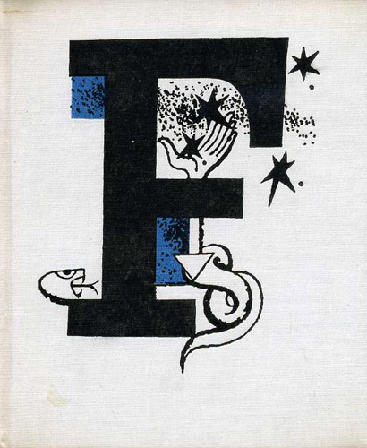
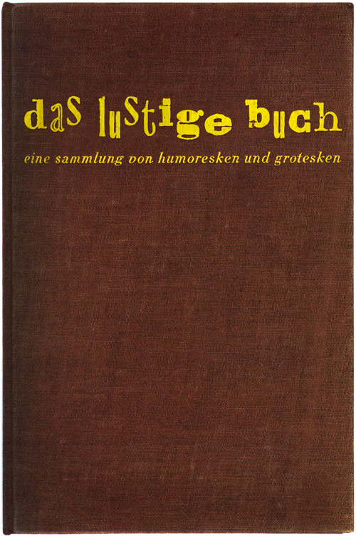
Rare Jan Tschichold book design, featuring his use of an early prototype of the Alta Calfornia font.
Cloth cover for Das lustige Buch (The Funny Book), Verlag der Bücherkreis GmbH, Berlin, 1931.
SPY, the very good (Google) archive
‘[Spy] was cruel, brilliant, beautifully written and perfectly designed, and feared by all.’ –Dave Eggers
SPY Magazine. The New York monthly. The most influential magazine of its time. The Rosetta Stone of modern periodical publishing. Really.
SPY took celebrities and the super rich to task for being, well, celebrities and super rich. Donald Trump was a frequent target. And the best part: SPY was caustically funny and incredibly smart in the way it did what it did. [Read more →]
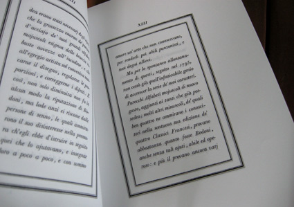
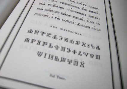
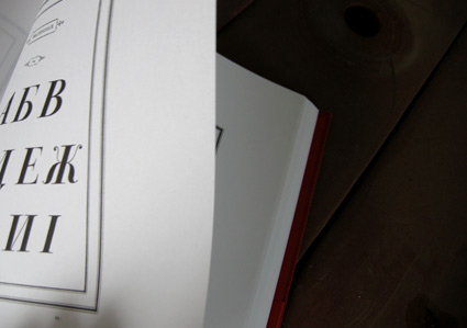
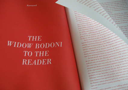
Bodoni’s Manuale Tipografico
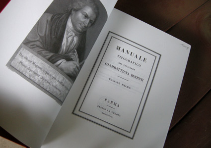
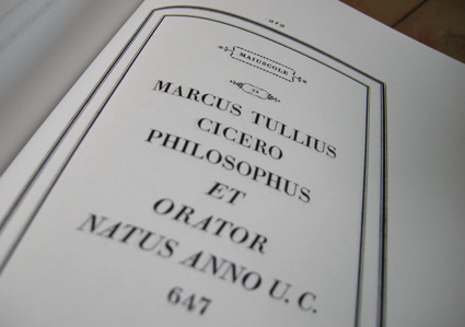
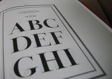
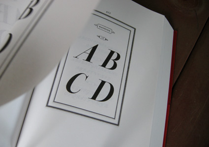
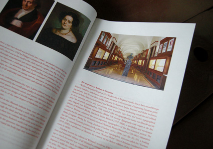
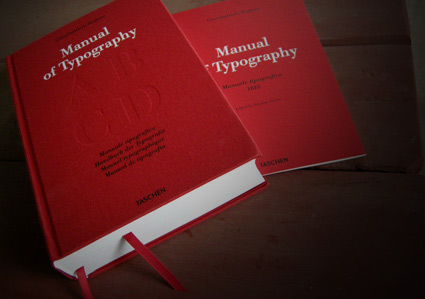
‘Published posthumously in a limited edition of 250, features 142 sets of roman and italic typefaces, a wide selection of borders, ornaments, symbols, and flowers, as well as Greek, Hebrew, Russian, Arabic, Phoenician, Armenian, Coptic and Tibetan alphabets.’
My birthday was last week and to my surprise, my wife got her hands on Taschen’s limited edition reprint of Giambattista Bodoni’s masterwork, his Manuale Tipografico (1818).
Bodoni had almost unlimited funding and resources at his disposal – so the details in his large body of types (he just kept going) is beyond what is seen in most revivals of his work. ITC Bodoni comes damn close, but a lot of Bodoni’s original designs end up on the cutting room floor.
My Jeanne types (named for my wife) have roots in Bodoni – and I used some digital resources to research his Manuale. But it is great to now actually have a print edition in my collection – cause I’m not done with tinkering.
Avant Garde money
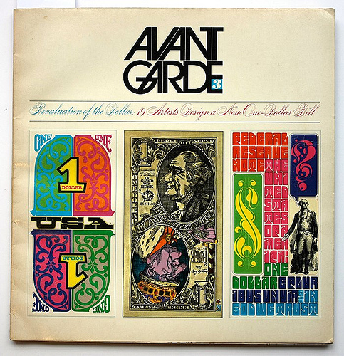
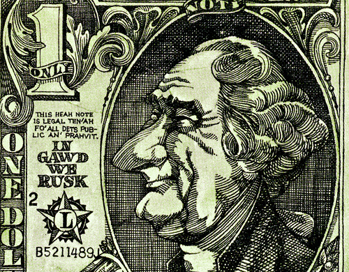
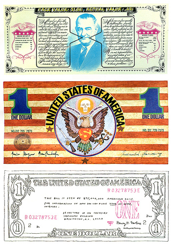
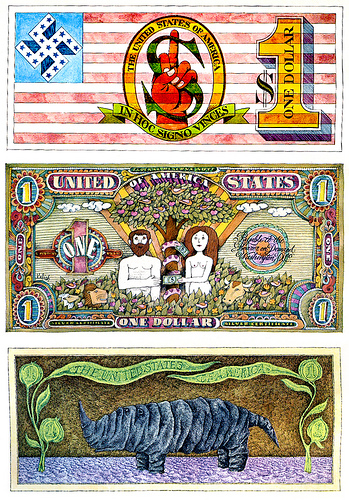
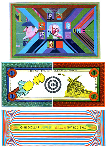
‘The third issue of Avant-Garde, May 1968, ran an attention-grabbing feature entitled ‘Revaluation of the Dollar: 19 Artists Design a New One-Dollar Bill.”
I have this issue of Avant Garde. Managed to acquire a stack of them at a rummage sale. Just thumbing thru, it’s great to see the original stuff that inspired so much 1970s revivalism this past decade.
A look at the money article here.
Found via the Eye magazine blog
All the news on tee vee
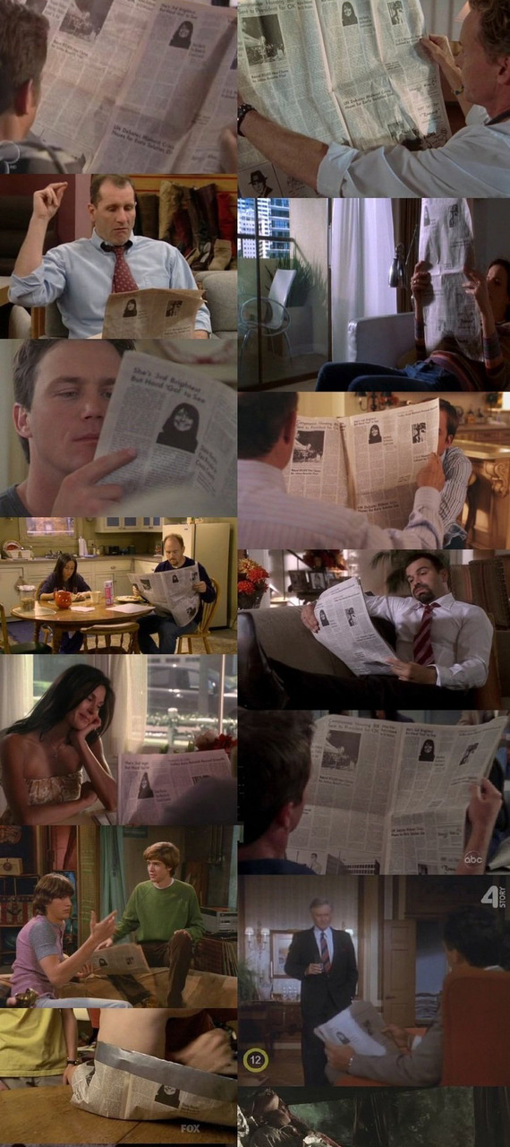
‘Either they all use the same newspaper, or all these shows take place on the same exact day . . . which kind of makes my head hurt.’
Click to view larger/jump.
Found via Hoefler+Frere-Jones, The High Definite
Magazines in motion
‘Photographer Alexx Henry and his team show you how a magazine might look in the not-so-distant future with the October cover and spread for Outside Magazine.’
Kinda like this, but different.
Found via Jake Favour
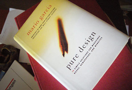
Garcia’s ‘Pure Design’
‘Included are insights into designing covers, formatting pages, selecting photos, using content, choosing a color palette, and picking type for newspapers, magazines, books, and websites’
Another great read. One of my favorites, Mario Garcia’s Pure Design is simple, to the point. A great overview of how to design for publications – from someone’s who been doing it a helluva long time. My copy is maimed by highlighter pen, my own notes and scribbles.
And it’s out of print. But one can easily peruse the free online reader version at issuu.
Follow Garcia’s blog here.
