entries Tagged as [photography]
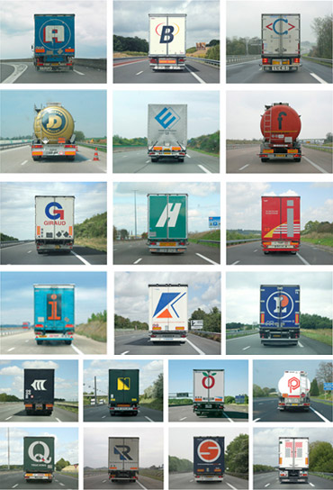
Alphabet Truck by Tabuchi
Since Sacramento is a hub for some of California’s major freeways (5, 80, 99), there’s a lot of local truck traffic.
And there’s always some interesting typography to go with them. Yellow is one of my favorites, because it’s not actually yellow. It’s orange.
I also enjoy the typography and colors of the Werner line.
And I do miss the iconic fruit covered Raley’s trucks – no longer seen around town. Artwork by the great Don Birrell of historical Vacaville Nut Tree fame.
On a related note, here’s images from Paris-based photographer Eric Tabuchi’s Alphabet Truck series (above) volume one and volume two.
Found via Splorp
talk to me . . .
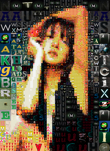
‘A letter mosaic of a japanese idol’
The photomosiac work of Charis Tsevis.
Click image for larger view/jump.
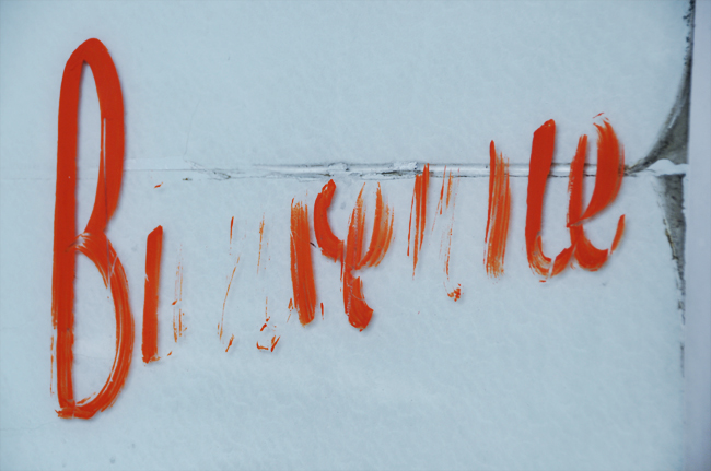
Type fades
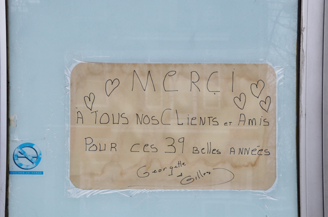
‘I heard there will be a bigger restaurant in their place. I never been to Di Lalla. I must say, it wasn’t very inviting. But it was there and now it’s not. I wish Georgette and Gilles to have a very happy retirement. On their last message, written on a paper place mat, they said : Thank you! To all our customers and friends for those beautiful 39 years. For some reason, I find this very moving.’ -nathalie
Photos by nathalie et cetera of a now abandoned restaurant that’s about to be updated by progress. More details here.
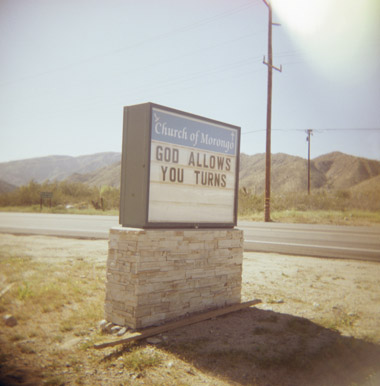
Polaroid in Arizona

Polariod 195, ID-UV, Black Canyon City, AZ
Photo by moominsean. Flickr here. Blog here.
Found via Planetary Folklore
Stauffacher line at the SFMOMA store
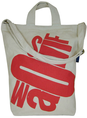
‘For the MuseumStore, typographer Jack Stauffacher designed a special line of products using the SFMOMA letters. Items include T-shirts, canvas tote bags, reusable grocery bags, mugs, ceramic double-walled coffee cups, and acrylic tumblers’
Details here. (Products are not quite at the SFMOMA site yet, hopefully they are coming soon!)
Plus
At Design Observer, Book Shelves from Stauffacher’s Greenwood Press. Photographs by Dennis Letbetter.
