F is for fail
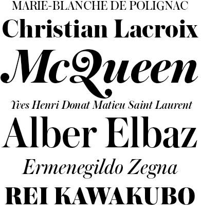
This one is always a favorite.
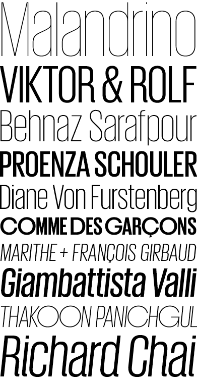
This one is always a favorite.
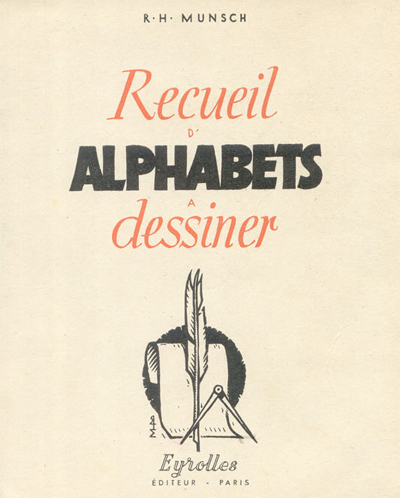
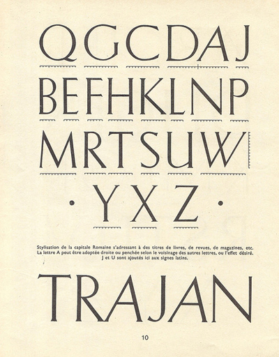
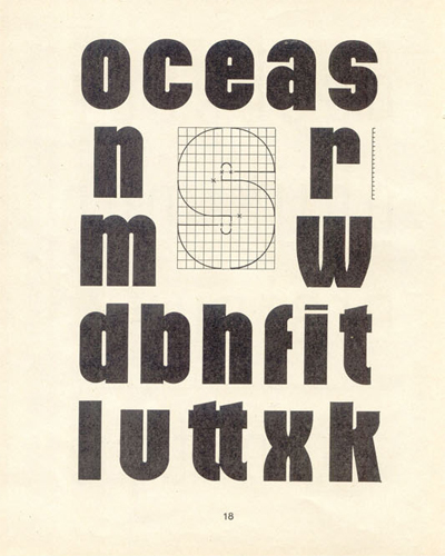
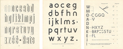
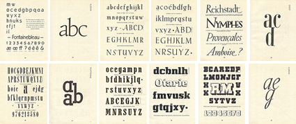
Pages from Recueil d’Alphabets à Dessiner by René Henry Munsch (1951).
More here.
Found via Biggest Apple
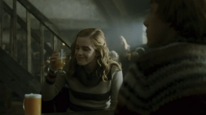
Butterbeer: A heavy, butterscotch soda. Can be made with alcohol too. Here’s a basic recipe.
And here’s some alternates.

Photos via fuckyeahemmawatson; Food Network
I have my social side, and my quiet side. Need both. My quiet side results in new fonts and other creative endeavors.
Visual poem (above) by Tanya Davis.
Found via Porcelain Grotto
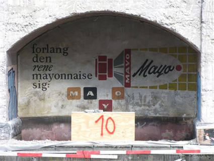
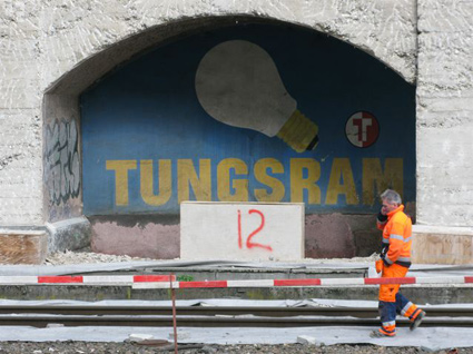
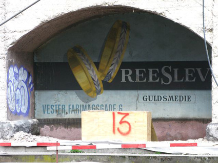
‘I could not be happier about this, or any more proud to live in a city that recognise the importance of preserving this kind of work.’
Vintage signs unearthed and preserved in Copenhagen. Details here.
Found via Martin Klasch
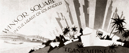
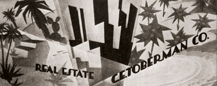
Los Angeles is famous for its billboards.
Pictured: 1925 promotional art for the Los Angeles real estate market by A. Asanger – from one of my favorite, inexpensive design resource books: Advertising Art in the Art Deco Style.
‘The film’s title is an allusion to Tatlin’s Tower. This animated short by Theodore Ushev is like a whirlwind tour of Russian constructivist art and is filled with visual references to artists of the era, including Vertov, Stenberg, Rodchenko, Lissitsky and Popova.’
Brilliantly done! From 2006.

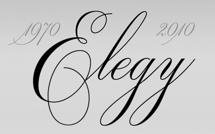
Original ITC logotype handlettered by Ed Benguiat, 1970

Elegy typeface designed by Jim Wasco, 2010
“Where can I get a font of the script used for the ITC logo?’ For almost four decades, this has been one of the most frequently asked questions of ITC. The answer has always been the same: ‘You can’t. The ITC script logo is handlettering and it is not available as a font.”
Now it is. Introducing: ITC Elegy. Two years in production, Jim Wasco took apart Ed Benguiat’s original Spencerian-style script and put it back together with updated spacing and a bunch of stylistic changes.
Detailed article here.

Comparison: Elegy and the original


Found via Delve Withrington


the work at the mehallo blog. beta. is licensed under a creative commons attribution - noncommercial - no derivative works 3.0 united states license. if reposting, credit must be given to steve mehallo - and if possible, please provide a link back to the mehallo blog. beta.
i include images for the purpose of critique, review, promotion and inspiration - and always make my best effort give credit/link back to the original source. if i’ve screwed up, please fire me a note.
page layout based on the wordpress 'darkwater theme' by antbag, adapted and redesigned by mehallo. valuable php assistance from bill mead.