Totally blunt: 8 common graphic design myths revealed
Thinking about going into graphic design? Wanna know what you’re getting yourself into? What’s it all about?
Click the image and read thru:
Found via Twitter.com/Colorburned
Thinking about going into graphic design? Wanna know what you’re getting yourself into? What’s it all about?
Click the image and read thru:
Found via Twitter.com/Colorburned
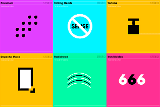
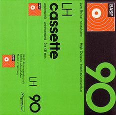
Image via Sleevage
‘It’s basically a set of modernist re-workings of classic album covers, where the album title has been distilled into a simple little black and white pictogram which acts as the artwork. So far the collection has 25 hits and misses.’ – Heath Killen, Illumination Ink
See em here.

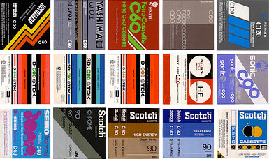
Image via dvisible magazine
Graphic designer Reid Miles and the Blue Note label – incredible album cover design. Here’s a great article on Miles.
And here’s the Wu-Tang albums as Blue Note releases. Found via Twitter.com/Sandoer.

Pictured: The products and designers; top: Braun, bottom: Apple
Great article at Gizmodo: 1960s Braun Products Hold the Secrets to Apple’s Future.
Found via twitter.com/undrln
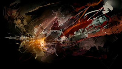
The work of Andrew Jones, found via the Alchemy Gallery
Check out Alchemy, experimental software that merges sound with artwork.
Former student Callista sent the link to me – it’s a similar concept to a ‘glyph’ project students do in my type classes.

Late Night with David Letterman premiere, February 1st, 1982
Photo: Nancy Kaye/AP
I’ve been a fan of David Letterman for years. Back when he used to guest host the Tonight Show and he did a long, long bit on how thick the chili was in the NBC commissary, when he once mentioned that the word ‘snacks’ never, ever appeared in the Bible, and asked a store called ‘just light bulbs’ if they sold anything else. [Read more →]
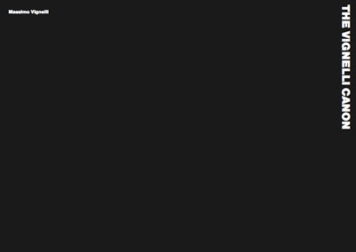
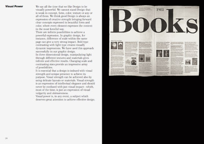
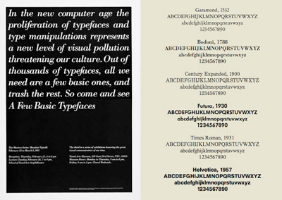
Swiss International Style guru Massimo Vignelli has released a new book on using type in graphic design. In it he explains in concise detail how it’s done. And as with all his work, it’s precise, clean, neat. Also, it’s free.
Download here: The Vignelli Canon [PDF]

The work of Niels Shoe Meulman, via Some Type of Wonderful
This comes up a lot in my type classes. Urban lettering – graffiti – is often practiced by students in my typography courses. The work is typically great, however, where things tend to fall apart is when I’m teaching traditional form, such as script or italic.
As one student put it, “in this class I learned not to be gangsta . . . . ” [Read more →]


the work at the mehallo blog. beta. is licensed under a creative commons attribution - noncommercial - no derivative works 3.0 united states license. if reposting, credit must be given to steve mehallo - and if possible, please provide a link back to the mehallo blog. beta.
i include images for the purpose of critique, review, promotion and inspiration - and always make my best effort give credit/link back to the original source. if i’ve screwed up, please fire me a note.
page layout based on the wordpress 'darkwater theme' by antbag, adapted and redesigned by mehallo. valuable php assistance from bill mead.