entries Tagged as [exhibitions]
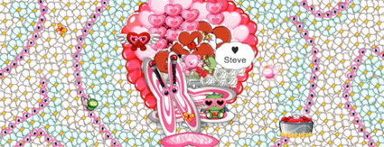
An SPP Valentine from my wife
Jeanne’s gotten herself hooked on this thing called SuperPoke! Pets.
And she’s turned it into a major playground, building elaborate constructed environments. With pets at the center. Grendl is her dragon. The whole thing has a manga-like feel.
My Valentine from my wife (above) took hours to build and features my absolute favorite food, crab. (It’s a San Francisco thing. And tearing thru all the shells, with one small fork, I consider an art form.) Each black dot is a piece of coal, each white and blue flower carefully placed. See the completed environment (animated) live today by clicking on the image.
Sort of watching from the sidelines, I’ve seen how elaborate this SPP universe has become. I have a few observations: [Read more →]
Holiday windows, NYC
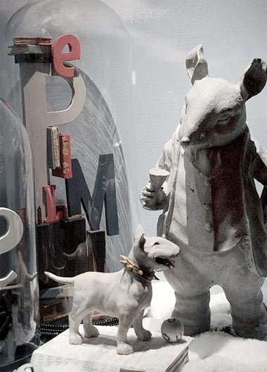
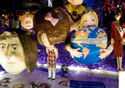
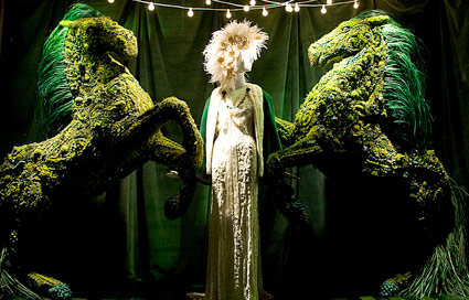
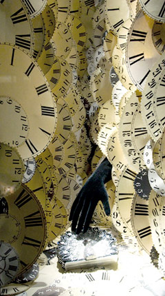
It’s a shame that department stores nationwide have mostly converted to printed advertising posters in their store windows. Money’s tight, of course.
In NYC, the window display tradition lives on. Here’s a 2009 gallery of great visuals. Including an SNL 35 year tribute at Barneys.
Found via Ashley Simko
Guy Saggee, posters
‘with particular emphasis on culture and politics’
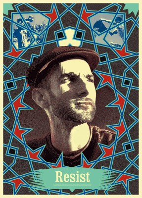
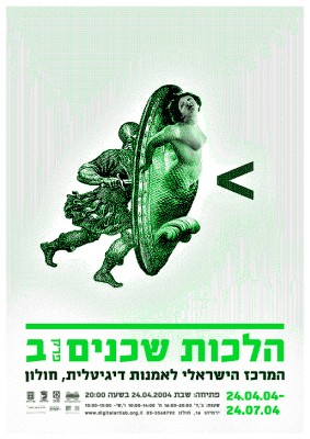
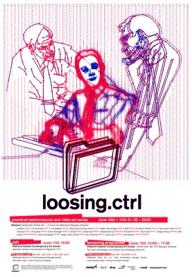
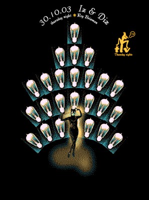
Check out the online exhibition of the poster work of Israel-based Guy Saggee.
DJG Design
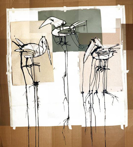
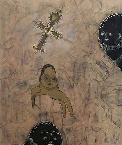
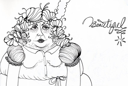
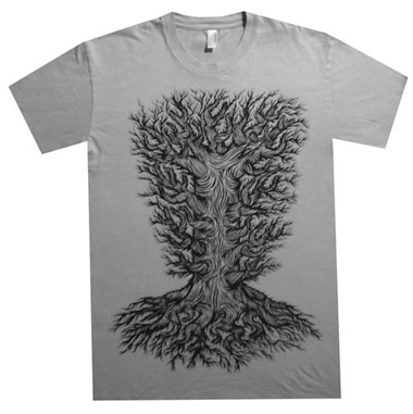
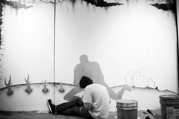
Graphic designer Danny Gibson doesn’t do things the way he’s supposed to.
And last we spoke, I think he said he’s not even using a computer anymore.
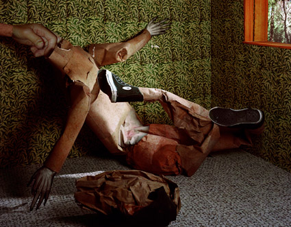
Based out of Kansas City, Danny is a prolific experimenter. Artist. Something like that. Has an eye for composition and his work is fresh, unusual and fun. I’m not even sure how I found him. Few years back, I’d shown his poster work in two local design exhibitions; one group show and a solo show at the Sacramento Fine Arts Center.
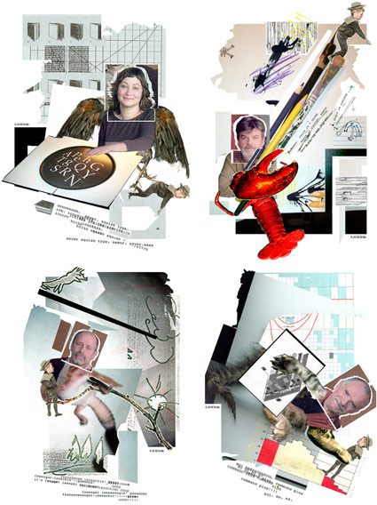
danny’s own take
Limited editions is the best way to describe what he does. Low budget, obsessive constructs. Mixed-media would be a good term too – since Danny uses anything he can get his paws on; used paper, envelopes, newspaper, stencils, handlettering, rubber stamps, yarn, hardware products – I’m pretty sure he’s got some rotting food in there too. [Read more →]
Less and More: Braun in London

‘Transparent plastics and wooden veneers were mixed and colour schemes were limited to tones of pure whites and greys, the only splash of colour being allocated to switches and dials’
Designer Dieter Rams’ work for Braun inspired Jonathan Ive at Apple. And just opened at the London’s Design Museum is a Rams retrospective. Details here.
Depero 50
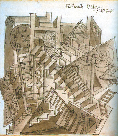
Roxy, c.1930
I finally made it over to the Depero 50 exhibit at the Italian Cultural Institute in San Francisco. Discovered many of Fortunato Depero’s originals were an interesting mix of ink washes. Above is his view of NYC from 1930. When he finally visited the overgrown metropolis, it wasn’t the Futurist utopia he’d imagined. Also below, the number composition is a sketch for a series of Futurist pillows.
A great exhibition catalog can be had for only 20 bucks – and thanks to the docents for all their help. Show details.
Exhibition ends December 4, 2009.
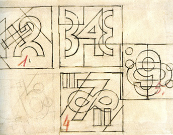
Composizioni Numeriche, 1927
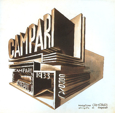
Campari, 1933
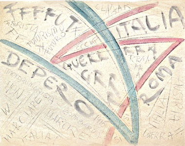
Italia – Guerra, 1916
Plus
Here’s more Depero over at designboom.
Bauhaus at the MoMA
”It’s a Haushold word, the Bauhaus, but a misunderstood one. Its influence is all around us, from Ikea furniture to glass skyscrapers, but it is credited – and blamed – for much more than it should be.’ -Candace Jackson, Wall Street Journal
The bauhaus was about advanced thinking in design, and it has its successes and failures. It was a great experiment and it changed the world. Its influence can be seen in everything today.
Workshops for Modernity: Bauhaus 1919-1933 just opened in NYC. And the exhibition is about going beyond the basics, show how far reaching the school actually was.
WSJ article here. Exhibition info here. Catalog here. TIME magazine video here. Show runs thru January 25, 2010.

Ludwig Mies van der Rohe armchair, 1927-30
Barbara Kruger: Born/Dying
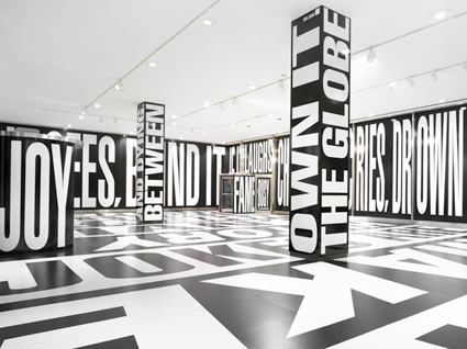
Continuing in NYC is Barbara Kruger’s typography-based exhibition about media bombardment, Between Being Born and Dying. Show runs thru November 21. More info here and here.
Found via Michael Martinho
