An ode to the book arts
‘3000 photographs (-ish), 35 books, 2 months’
The Complex of All of These, written by Abigail Uhteg, was letterpress printed at the Women’s Studio Workshop in Rosendale, NY.
Music by Ratatat.
‘3000 photographs (-ish), 35 books, 2 months’
The Complex of All of These, written by Abigail Uhteg, was letterpress printed at the Women’s Studio Workshop in Rosendale, NY.
Music by Ratatat.

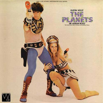
Gustav Holst (1874-1934) composed The Planets suite sometime between 1914 and 16. It’s become the ‘go to’ source for motion pictures ever since John Williams did some creative borrowing for Star Wars (1977).
Above, a very odd album cover for a 1978 recording of The Planets by Sir Adrian Boult. A remastered Boult recording can be found here.
And a 1976 moog/synthesizer version by Isao Tomita can be snagged here.
One of the most beautiful interpretations of The Planets is by John Eliot Gardiner, recorded in 1994. NPR review here. Album here. Track below:
Gustav Holst: Mars, The Bringer of War
some trivia
The Planets was also creatively borrowed for Cliff Eidelman’s haunting score used in Star Trek VI (1991). Paramount had tried to license the actual suite for the film, but the price was too high – so Eidelman crafted his own take.
Holst wrote different movements for each of the planets – but Pluto and Earth didn’t make it into the suite; since the themes were based on astrology/Roman gods instead of the actual planets. And Pluto wasn’t discovered until 1930.
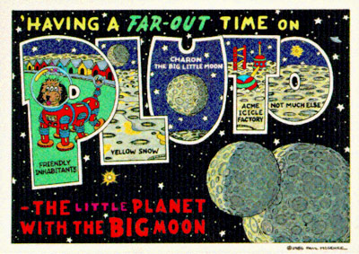
Tho, as of 2006, Pluto is no longer a planet anyway.

‘An Italian singer wrote this song with gibberish to sound like English. If you’ve ever wondered what other people think Americans sound like, this is it.’
Adriano Celentano’s Prisencolinensinainciusol, recorded 1972.
Pretty much how I sing in the shower.
Dance number and all.
Found via Daniel Will-Harris; Today’s BIG thing
So Sacramento’s kinda full of Kansas City emigres.
Many graphic design studio owners came from there, having studied under the legendary Rob Roy Kelly at the Kansas City Art Institute. And it may be only a matter of time until DJG ends up in Sac (I’m just guessing).
The Kansas City Kings moved to Sacramento in 1985. And recently, I found out a few of my students have been designing Kings billboards on the side.
Part of a campaign headed up by Sacramento Kings creative director Heather Vaughan – the handmade, graffiti-themed billboards have been appearing all over town. Not prints, but the actual handpainted art. The project has garnered national publicity appearing as a ‘Coast to Coast Best Practice’ in the Sports Business Journal.
Time-lapse video, above. Work (by students) below. More details here.
Found via Lyndsie Ross, Kings design intern
‘Chernikov drew by hand what today can seem only possible with a computer.’
I Love Typography takes a look at the limited edition monograph Graphic Masterpieces of Yakov G. Chernikhov: The Collection of Dmitry Y. Chernikov. Chernikhov’s work is on par with Dürer or Tory. Read more here.
Matter Teaser from Herbert Matter on Vimeo
In the hopper right now is a film about the career of graphic designer Herbert Matter (1907-84). Slated for release Spring 2010, The Visual Language of Herbert Matter is a documentary by Reto Caduff.
Documentary info, bio and more here.
Documentary teaser (above), development drawings for Matter’s 1955 redesign of the New Haven Railroad logo (below):
NHRR logo development from Herbert Matter on Vimeo
For more about the New Haven Railroad project, visit here.
Found via twitter.com/saawan
Lo Stile Italia (Italian Style) from killermedia on Vimeo
A short film about the history of Italian graphic design, by Antonio Prigiobbo, Clemente Brunetti and Gianluca Lannotta.

Collection: Urban Landscape; Location: Columbus, Ohio
More than just another image collection, HistoricType plans to be an online research library for students, professionals and scholars – concentrating on non-print typography, lettering used for old signs and buildings throughout the US.
Visit the HistoricType website here. Blog here.
HistoricType is edited by Laura Franz and Anna Dempsey; programmed by Randy Apuzzo/Jetscram Design and funded thru a grant from the University of Massachusetts Dartmouth.

Collection: Downtown, USA; Location: Grafton, West Virginia
Found via Justin Nelson

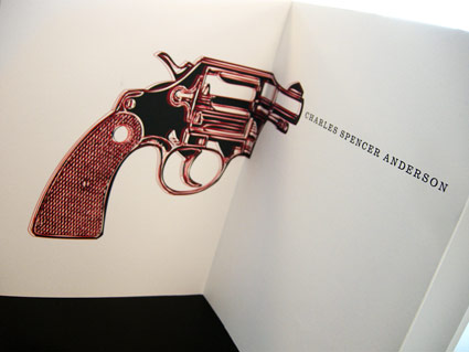
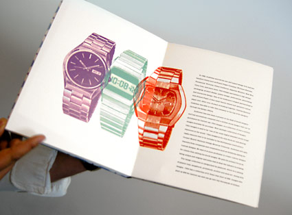
Every time I teach a publication design course, I assign a famous designer (or other acclaimed individual) as a biographical research subject. As part of the class, students have to do their own research, write their own text and design their own book.
Back in the 1980s, Charles S. Anderson pioneered ‘bonehead’ design, which involved a midwestern attitude and lots of clip art. Art Institute of California Sacramento graphic design student Trixy Riggan ran with it, developing the handmade biographical tome pictured.
On the side, Trixy runs a clothing company, Fabulously Butch. I still have to snag one of her shirts. I’m told there would be irony in me wearing one.


‘What about the children?’
Many worry about the content of children’s programming. Did anybody ever consider that the content may not have ever been as dangerous as the logos?
Video (above) of creepy tee vee logos that frightened us as children. End of shows, beginning of shows. Both versions of the Children’s Television Workshop (CTW) was nightmare-inducing. On merit alone, Viacom should get an award or something.
Here’s a few more . . . RKO Television 9 has to be the most chilling: