entries Tagged as [design]
8 Faces, 8 fonts, 8 designers
‘The magazine takes a very simple concept as its initial talking point: if you could only use eight typefaces for the rest of your life, what would they be?’
Coming soon: Elliott Jay Stock’s 8 Faces magazine.
The debut issue will feature Erik Spiekermann, David Carson, Jessica Hische, Jon Tan, Jos Buivenga, Ian Coyle, Bruce Willen & Nolen Strals.
Details here.
Found via Typegirl, Aaron Bell
Book gypsies in El Lay
‘They are traveling the country . . . join us for the day as they work on producing a unique keepsake with the Museum’s presses and materials – and then have a talk’
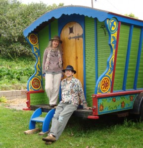
This Saturday, April 10, Santa Cruz-based book artists Peter and Donna Thomas will be at the International Printing Museum in Carson, CA. Details here.
More about the Thomases here.
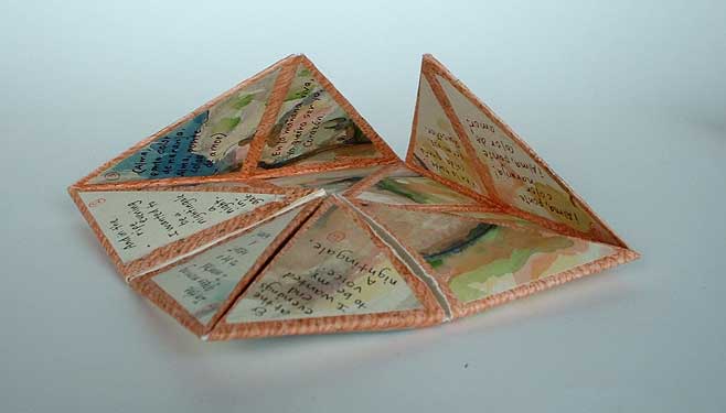
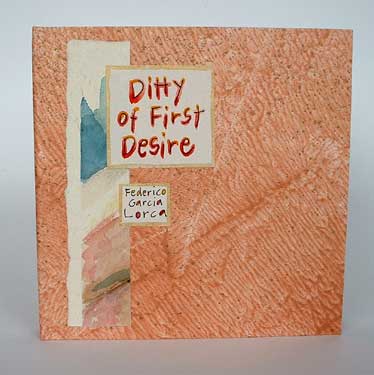
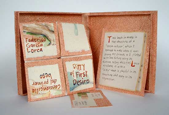
Peter and Donna Thomas’ Ditty of First Desire (2007), a ‘cootie-catcher’ shaped book – with paintings of nudes – showcasing the poem by Federico Garcia Lorca
Happy Yeaster!
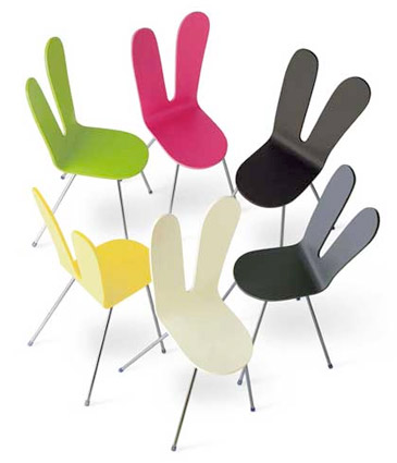
‘chair created by starchitects kazuyo sejima and ryue nishizawa of sanaa architects’
Details here.
I pronounce the nontraditional ‘Y’ in Yeaster. Doesn’t everyone?
Found via Gábor Kóthay
The Apple Calendar

‘Keeps the doctor away’
The Apple Calendar, which holds a month’s worth of the fruit, was designed by Serviceplan for the offices of health insurance provider AOK.
Details here.
Megadeth, reinterpreted
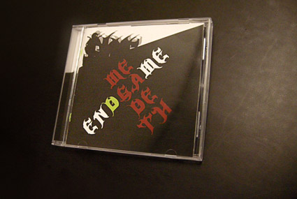
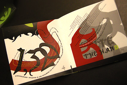
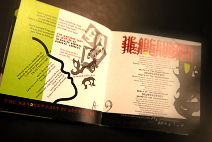
In my intermediate typography course at the California Art Institute Sacramento, students tackle CD packaging design – with a slight twist. Inspired by Project Runway, I like to put limitations on the work to force the student to engage the project where inventiveness will lead to unusual results.
If I could get them to do everything in 24 hours, with Tim Gunn checking in, I’d try that too.
project limits
In this case, students have to work with a band (or recording artist) that they do not know anything about or (preferably) simply do not like. The more they delve into a genre foreign to them, the more interesting the results have been.
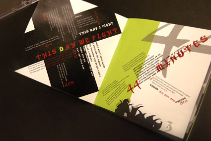
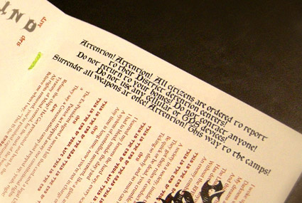
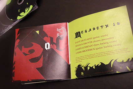
Pictured is student Isla Waite’s interpretation of the Megadeth album Endgame. Her decision to reimagine the lyrics into typographic layouts (inspired by the lyrics’ subject matter) led to a unique interpretation of the traditional stylings of Heavy Metal.
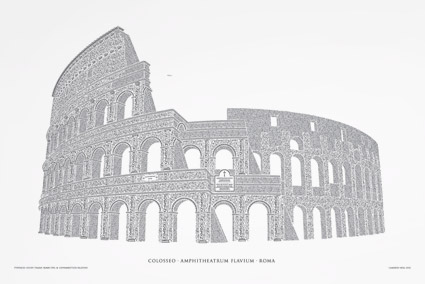
Reimagining the Roman Colosseum with type
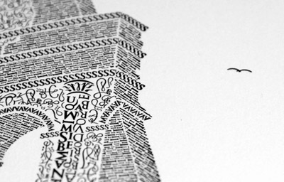
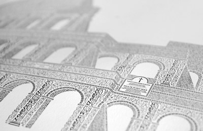
‘Over the course of the next 12 months, the artwork was handcrafted character by character, totaling roughly 250 hours of work from start to finish. Characters from the Goudy Trajan and Bembo Pro typefaces form the Coliseum (or Colosseum)’
Cameron Moll’s limited edition Colosseo letterpress posters. Video above, more project details here.
Picking fonts
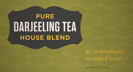
‘Is there a way to know what fonts will work together? Building a palette is an intuitive process, but expanding a typographic duet to three, four, or even five voices can be daunting.’ –H&FJ
‘how do I pick the right font?’
. . . is the most common question I’m asked in my type courses. And my answers aren’t usually simple. I liken it to picking the right suit, tie and shoes.
What handbag will work best, nail polish, lipstick, gloss or none, which eye liner will simply look great . . .
One learns by doing. [Read more →]
Origami in the pursuit of perfection
The work of Mabona Origami for ASICS. Creative director: Lars Rühmann, Nordpol+ Hamburg.
Found via Gábor Kóthay


