Typography Dude
‘The Dude can draw.’
Handlettering by Jeff Bridges for the cover of Esquire UK.
Behind the scenes here.
And check out more typographic wonders (some posted below) by Bridges at his own website.
Found via Stüf Stuff
‘The Dude can draw.’
Handlettering by Jeff Bridges for the cover of Esquire UK.
Behind the scenes here.
And check out more typographic wonders (some posted below) by Bridges at his own website.
Found via Stüf Stuff
Interpretation of Simon & Garfunkel’s Punky’s Dilemma. Animated by Scott Kellum.
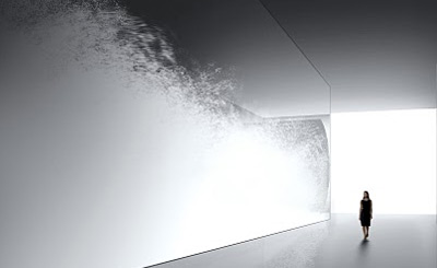
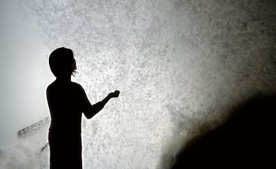
‘In a huge space of 15m in width, fine feathers are blown up by the wind’
The work of Tokujin Yoshioka.
Found via Design Scene
3 – 5,000 year old vase, Coca-Cola logo. The work of Ai Weiwei.
Article here.
Found via Daily Serving
‘about unnecessary items on the global brands’
Products screaming far too much for attention? Competition for shelf dominance taken to excess? Overdesigned labels that are trying too damn hard?
Antrepo breaks things down into simple. And then more simple.
More studies here.
Found via Laura Serra
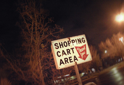
It’s cool to see a few of these vintage signs still doing their thing.
Photo by mehallo, December 2010.
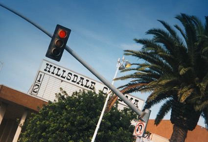
Across from Hillsdale Shopping Center in San Mateo, California was the Hillsdale Cinema. These are snapshots I took in 1997, before the building became something else.
Saw Superman: The Movie and The Wrath of Khan there on opening days. And for awhile, it was dang easy to sneak in; buy one ticket, watch for ushers, then let friends in thru the side door. The Hillsdale was part of the General Cinema chain.
Great article on GC’s history here.
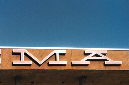
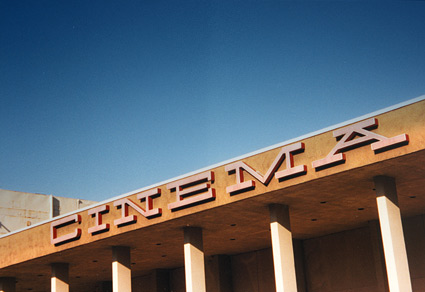
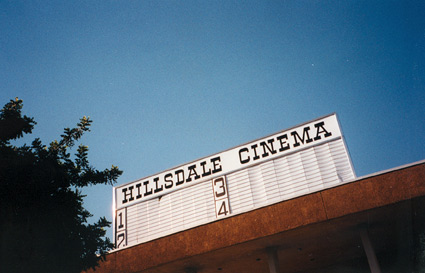
Below, 1964 concept drawings of General Cinema’s modernist theatres. Direct or not, there is a Herbert Matter influence in the type picks.
And I can’t forget General’s famous snap-yer-fingers bumpers.
Drawings found via Pleasant Valley Shopping