entries Tagged as [design]
Blast!!
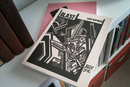
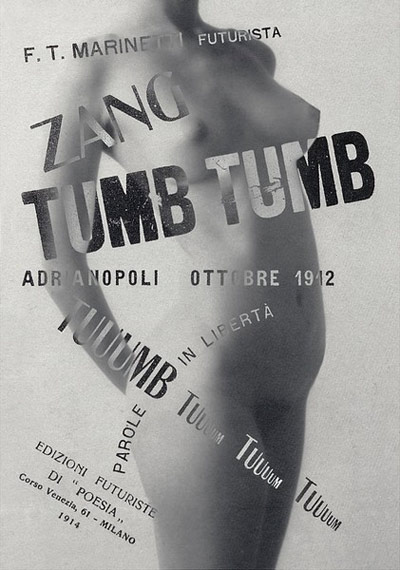
‘Vorticism was a radical art movement that shone briefly but brightly in the years before and during World War I.’
A few months back, I picked up Black Sparrow Press’ reprints of Wyndham Lewis’ Vorticist journal Blast Magazine. Vorticism was the British entry into the realm of modern art.
There were only two issues – which ‘blasted’ old Edwardian forms in favor of the new machine aesthetic that was about to take over the world.
Out with the old, in with the new, as it were.
The two issues of Blast – there were only two – are available for browsing at issuu. Check them out here and here.
I see a connection between Lewis’ work and the original production design of TRON. But that may just be me.
There is also a retrospective now going on at the Tate. Video referencing the work of Vorticist practitioner Henri Gaudier-Brzeska (1891-1915), below.
Ein Hungerkünstler
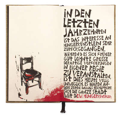
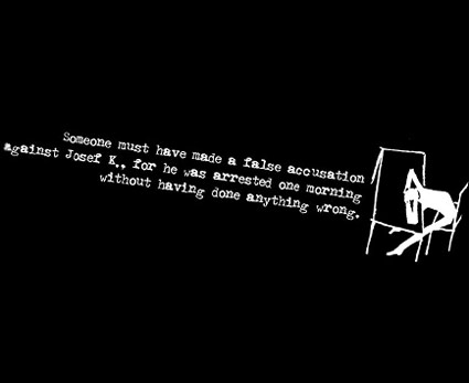
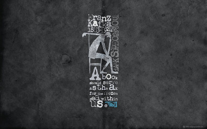
‘the letters and punctuation marks were carved into lino plates and digitized to portray the bipolar nature of the protagonist by using lettering with a harsh edge.’
Juergen Schlotter’s interpretation of Kafka’s Ein Hungerkünstler (A Starving Artist). Details here.
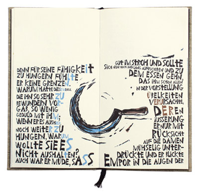
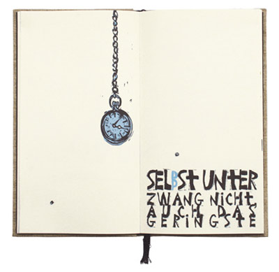
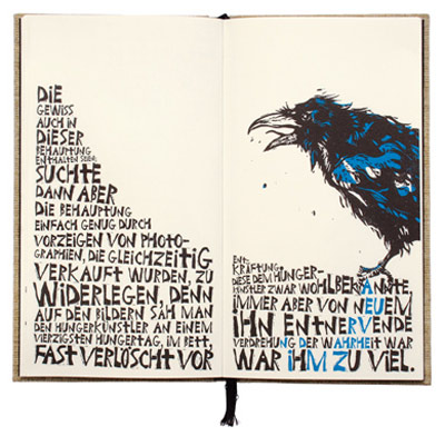
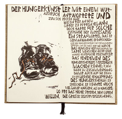
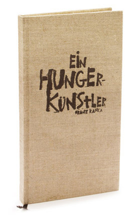
Found via Communication Arts
Kafka Chandler 42
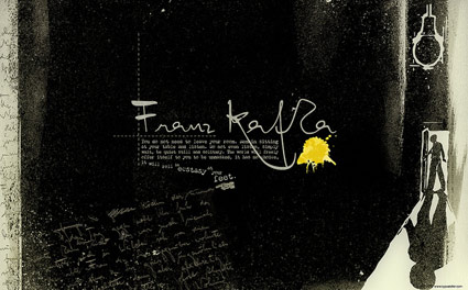
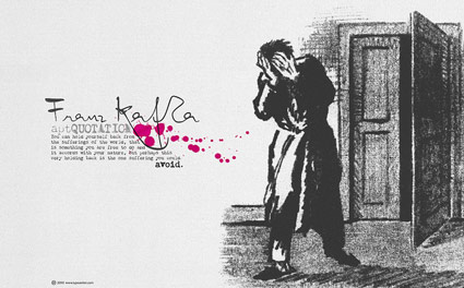
Even more free wallpapers by Arno Kathollnig . . .
Franz Kafka Trilogy – featuring my own Chandler 42 fonts (with some pointing hands from Alta California).
Amerika!
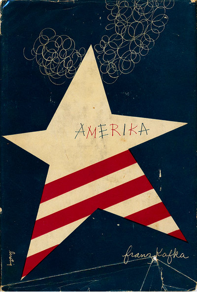
‘On the 4th we celebrate what it means to be American: Consuming more than we need to and making things explode.’ –Andy Borowitz
Pictured, Alvin Lustig’s 1946 cover design for Franz Kafka’s Amerika.
Image found via Scott Lindberg
Ditto!!
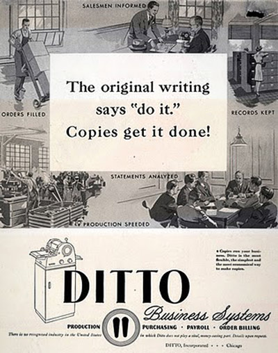
‘Before there were photocopiers, scanners and printers, there was the Ditto Machine (a.k.a. spirit duplicator), produced by the Illinois-based Ditto Corporation; originally introduced in 1923.’ –mnn
Clifford the Big Red Dog was supposed to be red. But in the handout I got in kindergarten, he was purple.
So was my introduction to the Ditto Machine – a device used to replicate most of the paperwork I’d used in elementary school.
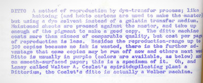
Some of my earliest experiences as a ‘graphics’ guy was playing with one of these machines – seeing what it could reproduce and what it couldn’t. It couldn’t reproduce much. The copies were so smudgy, Dittos were grunge before grunge was grunge.
And the smell of the purple ink was incredible. Fruity and chemically at the same time! Tho it turns out ink ingredients – isopropanol and methanol – are toxic substances. Who knew? [Read more →]
