Akzidenz Grotesk and industry

Köln-based graphic designer Tobias Battenberg projects Akzidenz Grotesk (the forerunner of Helvetica) onto industrial surfaces.


Found via Flores en el Atico
Köln-based graphic designer Tobias Battenberg projects Akzidenz Grotesk (the forerunner of Helvetica) onto industrial surfaces.
Found via Flores en el Atico

Building design by Giulio Cittato
From Basic Typography: Design With Letters (1974) by Ruedi Ruegg
In order for the Swiss International Style to actually work, it needs a sense of drama. Imagine how interesting our industrial zones could have been with this sort of design thinking.

Gore Vidal’s style quote, found via vi.sualize.us
I include a discussion about ‘style’ and ‘taste’ as applied to design in my classes. Far as I’m concerned, Gore Vidal always had whole thing nailed.

Via design*sponge
Words and Eggs has posted a bunch of cool type images, linking to some really cool design blogs. (Yes, I’ve been in quite the type mood this week – with a little bit more on the way)


Via Typoretum
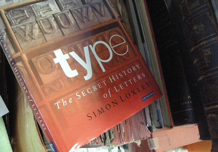
Behind every well-made font is, typically, an obsessive individual who is out to make the world a beautiful place. And individuals, human beings, can be rather screwy. And here’s a book (now in paperback) about all the screwiness.
Simon Loxley’s Type: The Secret History of Letters blows the lid off of William Caslon’s wicked right cross; Stanley Morison and the Wardes; Frederic Goudy’s tarnished shining star, M.F.Benton’s ulcers and what really happened with John Baskerville’s dead body. And Eric Gill, religious sex junkie. Don’t even know where to start with that.
If you don’t think type is anything more than what’s on the font menu, stay away from this book. Because it’ll drag you into a world of intrigue, ego and dalliances with God and dog.
(Okay, that was a good sentence, but truth be told, the dog stuff isn’t in this book. You’ll need other sources for that)
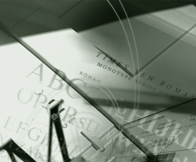
Photo composition by mehallo for Agfa Monotype, 2000
seeds
Mike Parker’s been in the news lately, mostly about the origins of Times New Roman. [Read more →]

Typography on the web is about to change dramatically. Several entities are involved. I have a bunch of my fonts about to launch with Typekit.
And here’s a really good rundown by Elliot Jay Stocks, posted on the i love typography blog.

Designer Steven Shearer’s update of the iconic British Keep Calm and Carry On poster – typeset in one of my fonts, Jeanne Moderno. Available now on some nifty Cafe Press items.
Sort of reminds me of the revisionary 1930s British history portrayed in this version of Shakespeare’s Richard III (1995).

Released just a few days ago: Jackson Cavanaugh’s Alright Sans
Alright Sans is a really nice contemporary update of early 20th century grotesk types. With roots related to the wonderful ATF gothics (which exist today in the form of the Knockout group and Benton Sans), but with a humanist twist. Sixteen styles designed by Jackson Cavanaugh, it can be found at MyFonts here. And it’s on sale right now: 20% off.
Follow Jackson on Twitter here. Visit his foundry, Okay Type & Design here.
Found via Twitter.com/Typegirl
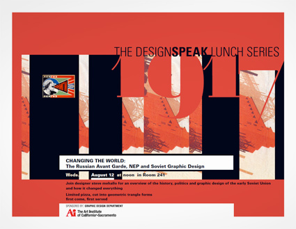
I’ll be giving a talk Wednesday as part of The DESIGNSPEAK Series at The Art Institute of California-Sacramento:
Changing the World:
The Russian Avant Garde, NEP and Soviet Graphic Design
An overview of the history, politics and graphic design of the Soviet Union and how it changed everything.
Wednesday, August 12, 2009 at noon
at The Art Institute of California-Sacramento, 2850 Gateway Oaks Drive, Room 241, Sacramento, CA 95833 [map]
Free admission
and limited ‘first come, first served’ pizza, cut into geometric triangle forms.

Calligraphy by Marsha Brady, found via the MyFonts Blog

Kalligraphia 12,
an exhibition of hand-lettered art and calligraphy
Runs thru August 23, 2009

A Trip to the Fair, 1939:
The Golden Gate International Exposition in San Francisco
Runs thru August 23, 2009
Both are the main branch of the San Francisco Public Library, 100 Larkin Street (at Grove), sixth floor, San Francisco, CA 94102 [map]
Details here.


the work at the mehallo blog. beta. is licensed under a creative commons attribution - noncommercial - no derivative works 3.0 united states license. if reposting, credit must be given to steve mehallo - and if possible, please provide a link back to the mehallo blog. beta.
i include images for the purpose of critique, review, promotion and inspiration - and always make my best effort give credit/link back to the original source. if i’ve screwed up, please fire me a note.
page layout based on the wordpress 'darkwater theme' by antbag, adapted and redesigned by mehallo. valuable php assistance from bill mead.


