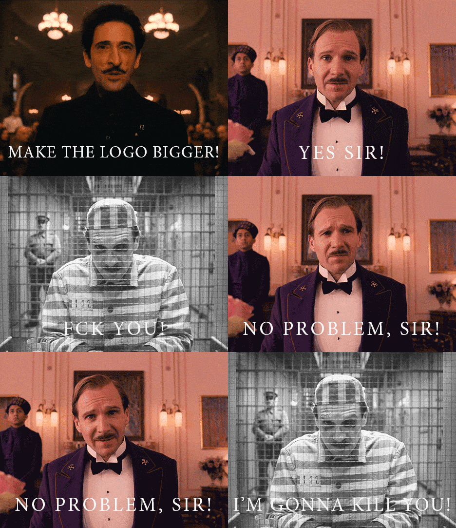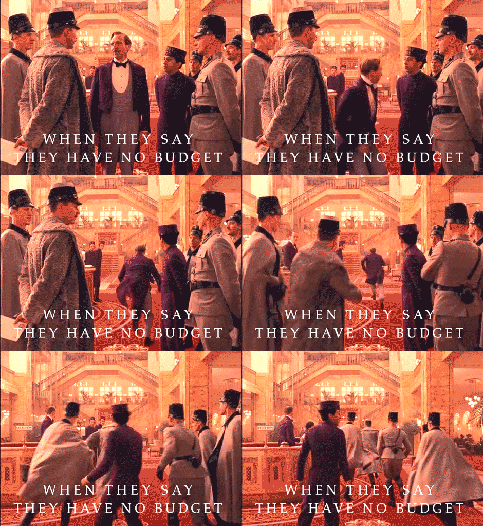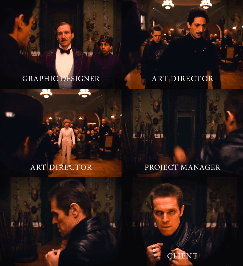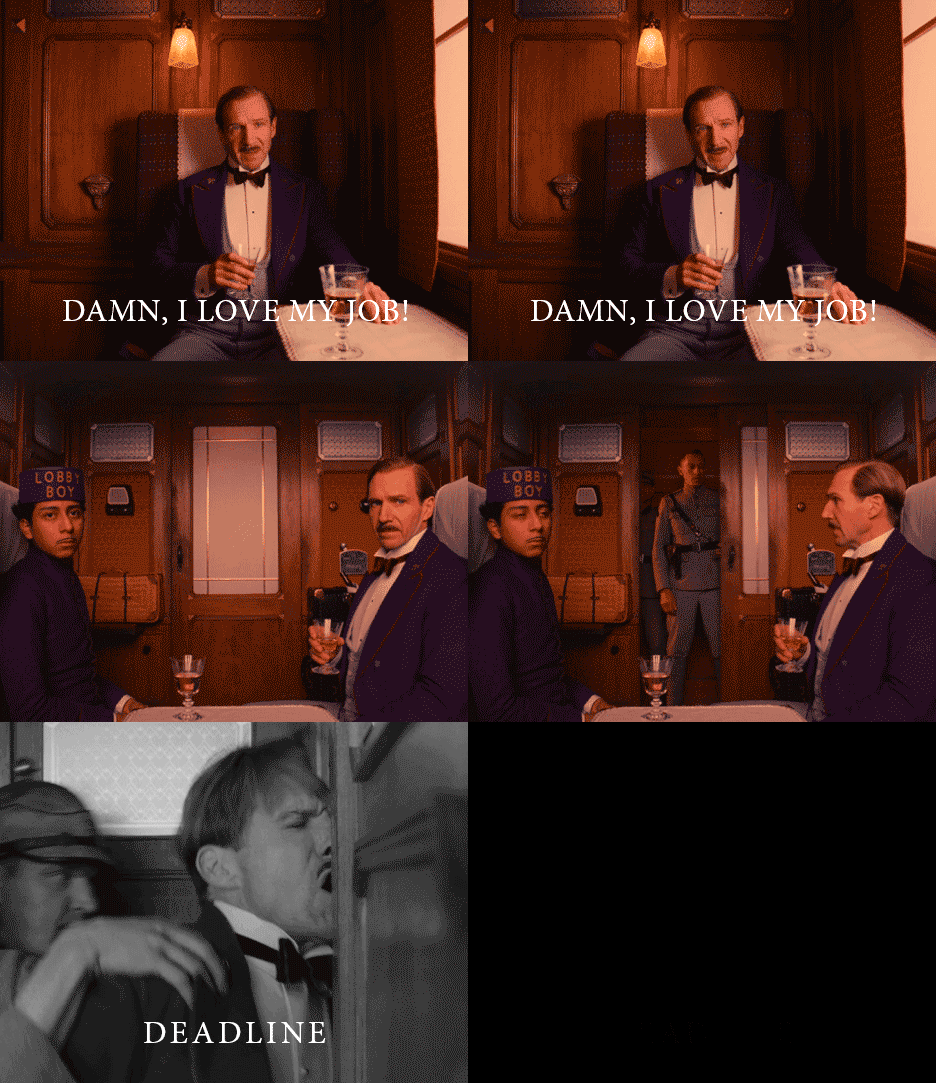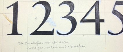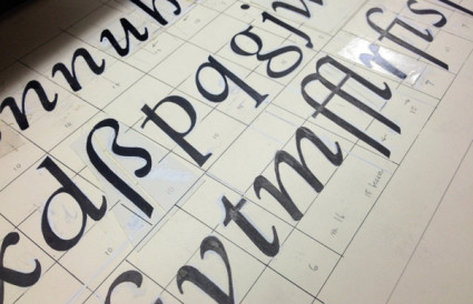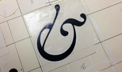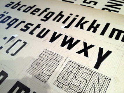
‘i can’t stop making gifs’
Ramin Nasibov knows graphic design. This week, he made these gifs. Seems he got a hold of a video editor and has been learning his way around it. I can’t wait to see what else he comes up with!
For more, head over to Facebook.
]]>Caroline B. from Stockholm.
Found via Lookbook
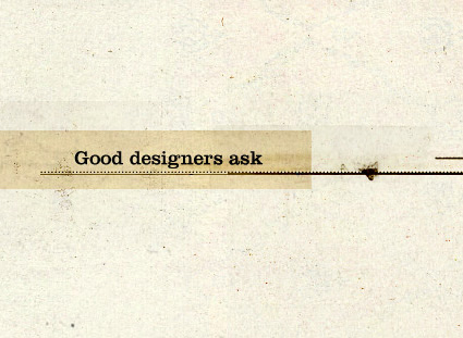
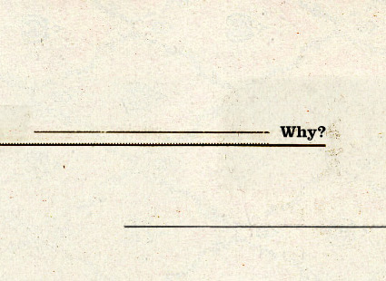
]]>‘The good designer asked why, discovered why the client was making their request and turned it around. Sometimes the client has no real reason and the suggestion disappears into the ether. Sometimes they’re just masks for an effect or emotion they are going for but can’t articulate.’
Essay over at Retinart on why ‘why?’ is so important in designer/client relationships. Read it here.
]]>The work of Simon Bailey.
Found via Jean François Porchez
]]>Found via Memento Mori
]]>Found via imjur
]]>‘In July 2013, artist José Parlá painted Nature of Language, a mural commissioned by SNØHETTA and North Carolina State University for the James B. Hunt Library in Raleigh. The library is best known for its architecture and technological integration, including a large robotic book storage and retrieval system which houses most of the university’s engineering, textiles and hard sciences collections.’
Jose Parla’s lettering art in a library. Syncs with concepts I’m throwing around in my Friday night type class.
Found via Graffuturism
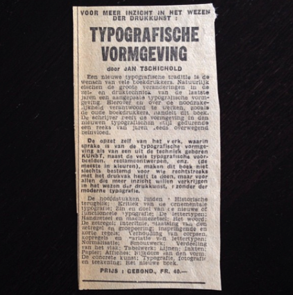
]]>‘rare Belgian newspaper article on the publication of Jan Tschichold’s ‘Typografische Vormgeving’ (unfortunately no information on the name of the newspaper nor the date)’
Found via typojo
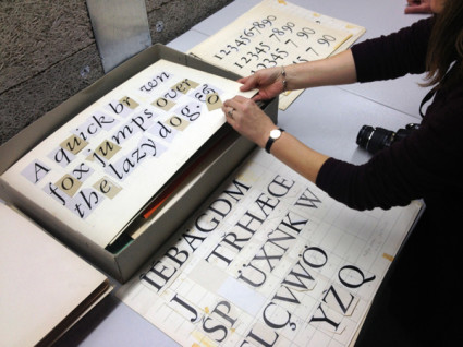
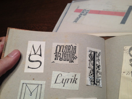
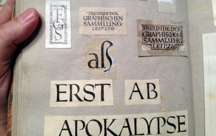
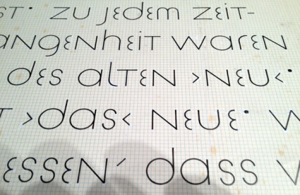
]]>‘Sketches by Jan Tschichold found in the National Library in Leipzig, Germany’
If one is going to do a Tschichold revival, one should pour through an archive, no?
Photos posted on Behance with a link to Sebastian Nagel’s Tschichold revival, Iwan Reschniev.
Found via Thinking Form
]]>It’s interesting how celebrity works.
I’ll often bring up Stephen Fry in the classroom (and mention his incredible Gutenberg documentary for the BBC) but very few students have heard of him. Then I mention Hugh Laurie and House, then draw the connection to Fry and Laurie and – just let things happen.
(I also think Laurie should have played Archer on the Star Trek prequel series, but what do I know)
Designer Matthew Rogers took Fry’s comments on language – which has this wonderful way of evolving – and made it visual (above).
I am currently working on a project where I’m screwing with language for fun. Google Translate is a great video game, no scores or explosions (unless you look them up); but always fascinating results.
Found via Upworthy
]]>A look at contemporary letterpress printing, the technology that goes back to Gutenberg. Short film by Raspberry and Jam for Cereal magazine.
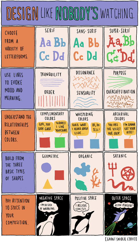
]]>Words and pictures by Grant Snider.
]]>Years ago Step By Step was a graphic design magazine that showed complex design solutions in a ‘step by step’ process. So was HOW, which broke out HOW things were designed.
Today we assume computers just design everything. Not true. Not everything.
Pictured is the work of Dmitry Karpov. And at Behance, here is the Step by Step breakdown of HOW they were done.
Found via Designcollector Network
]]>‘a nice typo series by talented recent SVA grad Zipeng Zhu’
Timely messages for a bunch of people in my life – including the redneck in the large white truck.
Found via Jessica Walsh
]]>‘His most famous title sequences include the animated paper cut-out of a heroin addict’s arm for Preminger’s The Man with the Golden Arm, the credits racing up and down what eventually becomes a high-angle shot of a skyscraper in Hitchcock’s North by Northwest, and the disjointed text that races together and apart in Psycho’
Last night, Google doodled this (above).
Last week in my history class, I presented footage of the original titles that Saul Bass designed that Google doodled this (above) was based on.
Dave Brubeck came along for the ride.
More info here.
Found via Alice Woodruff
]]>Covers for Kenny Burrell’s Blue Lights. Reid Miles, design; Andy Warhol, illustration. Blue Note Records, 1958.
Just because.
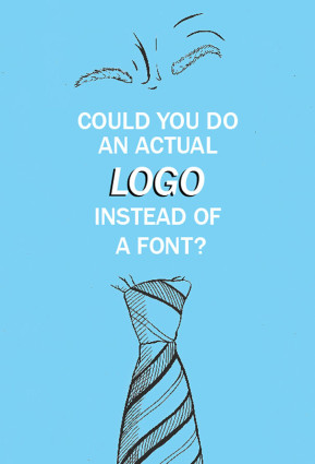
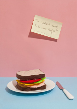
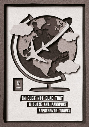
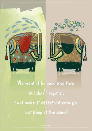
]]>As a side project, Irish graphic designers Mark Shanley and Paddy Treacy turned a bunch of client feedback (the bad kind) into a series of posters. They then put them up for sale and ended raising a bunch of money for charity.
Pictured, a few. More here.
Of course, the goal is always to work with clients that know shit. And are willing to go thru a creative process that leads to the best work imaginable. This usually involves understanding that good logos typically involve letterforms (I’ve heard poster #1 before).
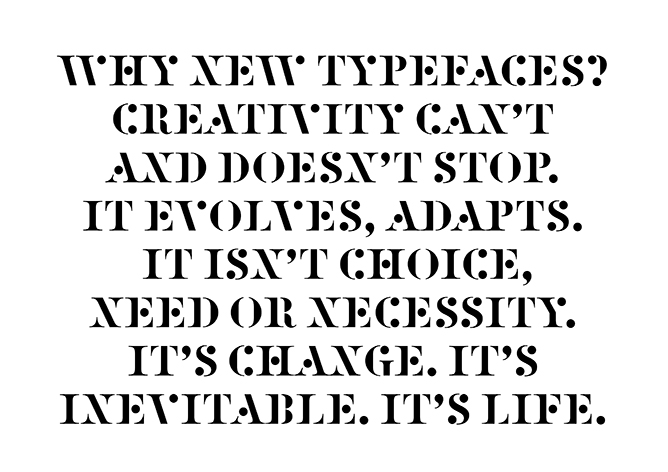
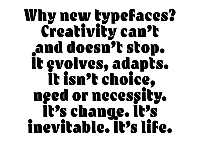
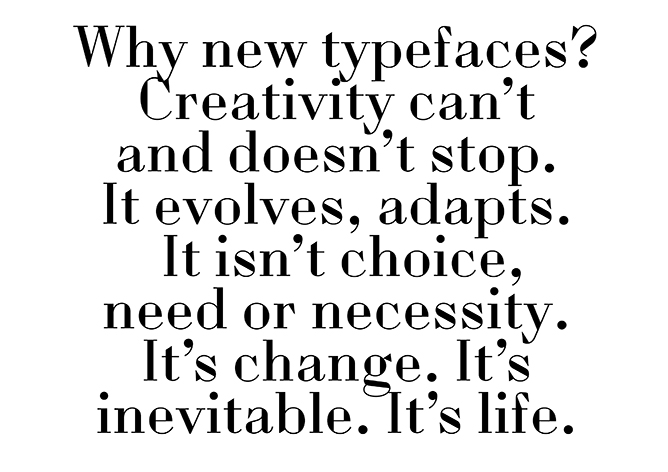
]]>‘So just as we change as we grow up and our bodies, opinions and tastes change. This is Time. This is Life. They are defined by Change. So Change is inevitable, its outside of need or necessity. It just Is.’
The images (and words) are from this wonderful post over at the Alias blog: Why new typefaces? Alias is run by David James and Gareth Hague.
In my opinion/experience, we’ll stop having a need for new typefaces right about the time we stop wanting new music, new food ideas (I’m hooked on detox water right now) and new ways of looking at how we dress ourselves.
Types have personality, just like humans. Take it all away and we become . . . Helvetica. On a Star Trek planet where we all look, think and dress alike.
Type is everywhere. And humans like to mess with shit.
via Alias
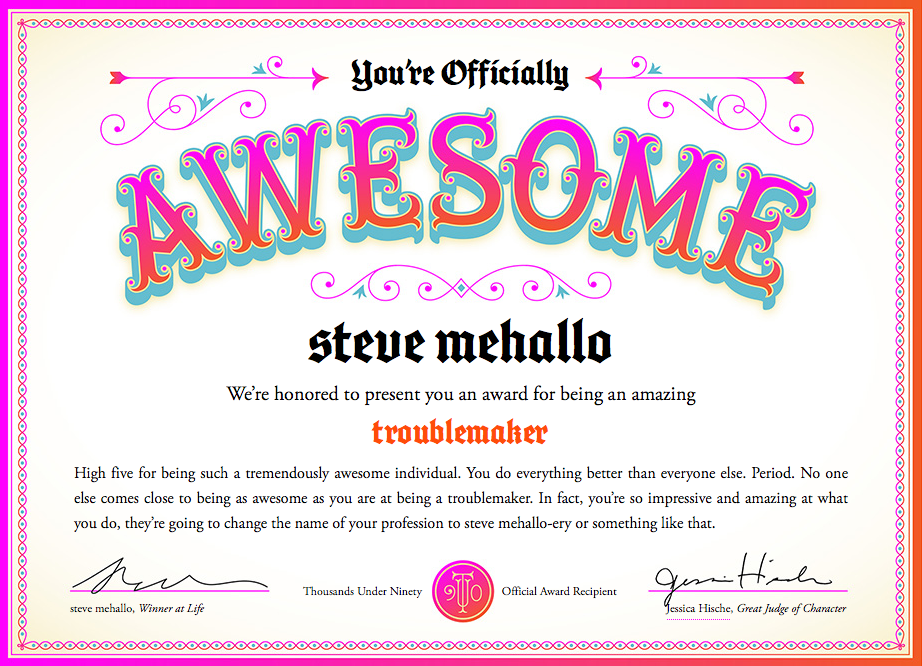
]]>Too many graphic design award competitions award people for being young and full of ideas. What about the rest of us who are OLDER than YOUNG and maybe filled with better ideas?
I think experience and wanting to keep doing NEW is worth something, no?
So you can now be AWESOME too. At any age. Go here.
Courtesy Jessica Hische; found via Jessica Walsh
]]>Last week I attended TYPO in San Francisco and noticed that my notebook was full. No room for notes.
My solution was the #typo13 hashtag, Twitter, plus big fingers and cranky iPhone. Everything I attended I tweeted, autocorrect had other ideas, TYPO ended up meaning typo.
Typically if I go on a tweeeeting binge like this, I lose ‘followers’ and get bitched out a bit. Instead I ended up meeting some cool people from around the planet.
Sol Kawage lives in South Tyrol, a ‘german speaking region in northern Italy.’ Her tagline on her Twitter account states: ‘Annoying people since 1980.’
Pics are from her blog, cool holdings of a small Museum of Modern Art in the City of Rovereto. More here and here.
]]>In 1998 I attended this over-the-top crazy creative conference in San Francisco.
It was called FUSE: Beyond Typography and it was a Neville Brody gig, named for his font magazine. The whole shebang overstuffed itself into San Francisco’s Masonic Center on Nob Hill. And what happened inside was really ‘beyond typography,’ in that the typophiles I knew were complaining where’s the type? It made sense. It was BEYOND.
It was many days. I think a week. Maybe a month, a year? I don’t remember. Nob Hill is up in the clouds, which was fitting. But what I do know is the speakers – which ranged from budding architects Zaha Hadid and Michael Sorkin to author Karrie Jacobs and a slide show from soon-to-pass-on Tibor Kalman – left me recharged about graphic design and what a real creative can do.
Then, turned out the week of FUSE Phil Hartman died.
And
2001 changed everything.
And the economic disaster that followed also put a lot of creative plans on hold. I quit my corporate job right after FUSE and moved on to more meaningful work, eventually landing in teaching. I kept doing the fun work, but bread-n-butter work started to take over. Survival became more important as creativity was pushed aside.
In 2007 I left my position as president of the Art Directors and Artists Club of Sacramento and from a distance, saw it shut down early 2012. BUT I did remember the spark of FUSE (which was a money-loser for the organizers) and kept side projects going. I started this very blog, released a few fonts.
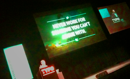
Mike Monteiro: ‘never work for someone you can’t argue with’
Last year TYPO came to San Francisco.
And turns out – TYPO is a smaller FUSE. Same group, been around a bit longer, but leaner. Two days of great speakers – Tina Roth Eisenberg, Jessica Hische, Jim Parkinson, Rod Cavazos, the snarky Mike Monteiro and the crazy colors of Morag Myerscough (we compared nail polish, clothing) – with last year’s event punctuated by a keynote by Neville Brody with emphasis on how all of us sort of dropped the ball on creativity since 1998. It is important to make time for play. Difficult play, going forward. Making what’s next.
This year’s TYPOsf: CONTRAST starts tomorrow. I’ll be tweeting live. And planning my next move.
]]>Modern graphic design has roots in Russian Suprematism and Constructivism. Here’s a trailer for a film by Sergey Shanovich that looks at what’s been happening since.
Facebook page here.
Found via Motioncollector
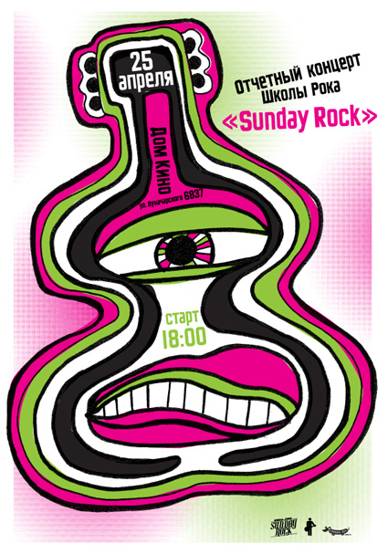
]]>Modern Dog recently created this poster for Sunday Rock, a music school in Yekaterinburg, Russia.
And I provided Robynne and Co. some quick Cyrillic type the old fashioned way: Scanned in from early 20th Century sources, pieced together letter by letter.
Four different scripts combined to have similar weight, rough edges, heavy caps. I’ve been doing a bunch of work this way lately – sometimes one has to go back to basics.
And on weathered days (like today) vinyl sounds better than digital.
]]>I will be giving a talk on April 19 at American River College. Covered will be the history of the Bauhaus (1919-33).
And as an add-on, I’ll be subtly previewing how the Bauhaus, Futurism and early Modern Art has inspired my new educational project, FLomm: THE BATTLE For MODeRN 1923 (which already has a tumblr presence here and twitter here).
For additional information, please visit the Art New Media at American River College Facebook page here.
]]>‘David A. Smith is a traditional sign-writer/designer specialising in high-quality ornamental hand-crafted reverse glass signs and decorative silvered and gilded mirrors. David recently produced a wonderful turn-of-the-century, trade-card styled album cover for popular American singer/songwriter John Mayer.’
More on David A. Smith here.
]]>‘The whole point of animation to me is to tell a story, make a joke, express an idea. The technique itself doesn’t really matter. Whatever works is the thing to use.’
Terry Gilliam on animation. From 1974.
Found via Cartoon Brew
]]>‘The very first rock and roll Music Video. A stop motion film of the Beatles singing ‘I Feel Fine’ drawn by Stephen Verona and hand colored by Verona and John Lennon’
]]>‘Voiced by Canadian legend Gordon Pinsent (Away From Her, Pillars Of The Earth) Typesetter Blues is written in the nonsense poetry tradition of Edward Lear and Shel Silverstein’
Crafted by Toronto-based TOGETHER – part of their silly rhymes series Beastly Bards.
]]>Andrea Stinga and Federico Gonzalez’s The ABC of Architects.
Visit their architectural tumblr here.
]]>If there were in the world today any large number of people who desired their own happiness more than they desired the unhappiness of others, we could have paradise in a few years. –Bertrand Russell (1872-1970)
Years ago I knew a head general counsel who worked for a legal department for a rather large corporation.
When it came to lawsuits, he explained to me that their approach was they ‘never settled’ and ‘would use all of our resources – millions of dollars at our disposal’ to fight any suit that came in. Whether they were right or wrong. “If they’re going to go up against us, that’s what they’re going to get.’
Years later I sat in on a ‘business ethics’ class where this ethic was explained in detail: ‘it is okay to destroy the competition. That’s good business ethics.’ And throw in that businesses today operate to ‘keep shareholders happy’ over everything else – we live in a very frightening world. One that squashes innovation and creativity in favor of ‘good competition.’
Good competition is fantastic – when the tables are ‘fair and balanced,’ a term – even today – that’s not used for what it actually means. There’s a lot we CAN be doing as a race – in terms of social, political and humanitarian causes – but we don’t. There’s a great scene in An Inconvenient Truth where Al Gore points to an illustration of a pot of gold. It’s our motivation. It’s what we live for. A pot of gold. A shiny pot of gold we can hide from others, shower with, rub on our bodies if it makes us feel better.
the battle
Right now there’s a David v. Goliath lawsuit going on. It seems simple open and shut: Large corporations profit from stolen artwork. So artists who created artwork get a lawyer and take on the corporations.
In this situation, the corporations are our darlings: The fantastically wonderful Disney and the ‘god I love what they do for design’ Target. And I spent an afternoon recently going thru the case files – which are posted at Friends of Modern Dog – and to me it seems it’s another bury the little guy response.
You’d think it would be Urban Outfitters doing this – it IS their modis operandi – but no. It appeares Disney and Target are poised to destroy Seattle’s very own Modern Dog.
Ashamed is not a word I use much. Though I think it applies here: BOTH Disney and Target should be ashamed. They are BOTH corporations that benefit from creative innovation. BOTH should be working WITH Modern Dog, not – as this lawsuit seems to be doing – putting them out of business . . .
Friends of Modern Dog website – donations are wholehartedly accepted, even a few bucks will help. Donate here.
bias
I will admit – I am a huge fan of Modern Dog. I can actually remember the first time I ran across their work – back in the early 1990s. I was flipping through a graphic design magazine and saw that there was this cool company in Seattle – tied to Seattle’s burgeoning music scene – that had not one, two or three BUT an entire tabletop covered with LOGOS. They are a creative juggernaut – one innovative piece after another. And in my view one of Seattle’s greatest design resources. I’ll even go so far as to say, they put Seattle on the map for me. I spent my honeymoon in 1995 in Seattle – not because of Modern Dog per se – but because I knew Seattle was cool.
the suit
So if one takes it apart: What it looks like is someone working for Disney thought it would be cool to lift images from Modern Dog’s 20 Years of Poster Art. They used it in a retail piece, a tee-shirt to promote an Ashley Tisdale film. Flip the images, no one will notice (see video up top). Well, someone did notice. And Modern Dog found itself defending their handdrawn illustrations of their own dogs.
What happened next was unexpected, the defendants fired back. Detailed legal jargon is the response. With a huge legal price tag. Modern Dog owners Robynne Raye and Michael Strassburger so far have sold their house to pay for things. Good press is on their side. Robert L. Peters has a great overview here. Though at this point, a settlement doesn’t seem to be in the picture.
the obvious solution
Years ago the Head General Counsel I knew also explained one more thing about business ethics to me: if someone fucks up, they should be responsible. Whoever did this – in whatever relationship to Disney and/or Target – is the plagarist. THEY caused this lawsuit to take place, THEY stole the work. Disney and Target – should do the right thing:
FIRE the plagarist, go after them for legal fees – and SETTLE with Modern Dog.
Disney and Target: It’s the RIGHT THING to do. Pretty sure you can afford this.
You guys are supposed to be doing the RIGHT THING. I remember a whole LOAD of Disney films thrown at me just about this very concept. Why is your legal department thinking otherwise? Especially after such a good PR month where you (Disney) now own STAR WARS because George Lucas thinks you guys are on the up and up. And he turned around and donated your money to education.
how to actually steal from modern dog
So I train graphic designers – on the fine art of inspiration over stealing. It’s a simple concept: using someone else’s artwork without permission is stealing. Getting inspired by others and bringing something new to the table: NOT stealing. Inspiration. In this case, Disney’s artist should have DRAWN THEIR OWN DAMN DOGS. It’s that simple.
Modern Dog inspired something I did recently: a simple logotype (above) for an animal shelter just south east of Seattle (opens January 2013). Since, for me, Seattle/Washington State is Modern Dog territory (a dog reference, of course) I decided to thumb thru Modern Dog’s wares to inspire me on how to approach the ‘dog/cat’ cartoon creature I came up with. Is it a direct copy from them? No. It’s my own thing. Simple, with a touch of empathy that I believe animal shelters need – beyond the ‘heart/paw’ thing most are doing. (And the type is modified Sutro, Jim Parkinson’s wonderful humanist slab serif.)
Dogs are cool. Modern Dog is cool. Be inspired by them. And help them – they need a few bucks. Donate here.
]]>‘Cieślewicz always compared himself to a journalist; but he referred to himself as a visual journalist. So Graphic designer, as a profession, is very close to that of journalism; except that it is about articulating clear ideas through the justaposition of imagery and layout – it’s a question of wanting to say something.’ –Professor Andrezej Klimowski, Royal College of Art
Above, a BBC overview of the work of Roman Cieślewicz (1930–96), which was part of a retrospective this summer at the Royal College of Art in London.
Click image to view video/jump.
Found via BBC News
]]>As an educator, I’ve broken graphic design into three components: Message, Typography, Layout.
I’m not the first educator to do this – just happened to constantly notice these three elements staring back at me in all the student pieces I evaluate. In my opinion, careful appreciation, understanding and implementation of the three can lead to beautiful work.
message
Graphic design is a communication field, so Message should always drive the project. Today we are bombarded by thousands of Messages on a daily basis, so being on Message is critical. And yes, this usually involves language and writing – which is why I love when students take their written studies seriously.
typography
I’ve seen an (often not cited/supported) statistic that graphic design is 95% typography. Scientific or not, I agree with this. Type is important. I like comparing the exploration of lettering to that of music – there’s enough complexity for it to become a lifetime endeavor. And most of what I teach is type, from multiple angles.
form
Graphic designers are taught to use grids for layout – though relying on ‘grid’ as a catch all way of handling form can be misleading. Grids provide support, a fallback position for dealing with massive amounts of information. Though important, grids have their limitations. Building structure using symmetry, asymmetry, balance, color – some elements obvious, some not – involves continuous practice, a trained eye, instinct.
These three are not formulas, can’t be added together. They need to work in tandem, like cooking a great stew where the ingredients are based on what feels just right.
On a related note, the above film – Edward Tufte’s Ingre Druckrey: Teaching to See – found its way into my Twitter feed. It’s about graphic design and beauty. And much more.
In January I’m going to be teaching my first non-type course on Form and Space. I’m starting prep now because I consider form so important – so powerful, so delicate.
And beautiful when done right.
Video found via ayana baltrip
]]>‘As a student, live by these words, ‘Quantity rather than quality.’ The more you design the better your quality will become and you will continue to grow’ –Tony Montano
I like that quote.
Quality does come later. Being a designer becomes all about instinct – not having the best computer, not software, not measurements, not rules.
I’ve just started teaching another semester of Graphic Design History and Typography at American River College – have a whole new group of kids to introduce to my gospel of visuals.
One thought that’s been weaving its way thru my classes over the years is simply, ‘the more you do, the better you get.’ We’ve all heard this, and yeah, it’s true. The only real stumbling block is ‘the more you do, if you’re not paying attention, you probably won’t get better.’
This year the student work has been incredible – but only when tied to good, old fashioned Hard Work. Risk taking, going out on that edge, trying something one has never done before leads to fantastic creations.
I haven’t been blogging much – I also have my usual four type classes at Ai Sacramento and a rather large project that’s been taking up the rest of my time (more on that soooooon) – so something had to give. It was blogging.
I’ll be posting more as time permits; otherwise been immediately throwing finds up on my Twitter account.
I’m keeping busy. Hope you are too.
Infographic found via Ai Sacramento Graphic Design; click image to jump/view larger
‘Signage for an alternative music festival.’
The work of Dani Wolf.
Found via YouWorkForThem
]]>New video for Amanda Palmer & The Grand Theft Orchestra’s Want It Back. Lettering by Curran James.
Found via aeroplanegirl
]]>The work of Britt Wilson.
Found via Ape on the Moon
]]>Exquisite lettering by Luca Barcellona and Francesca Biasetton for ELITA, Milan.
Found via Cátedra Bardelás
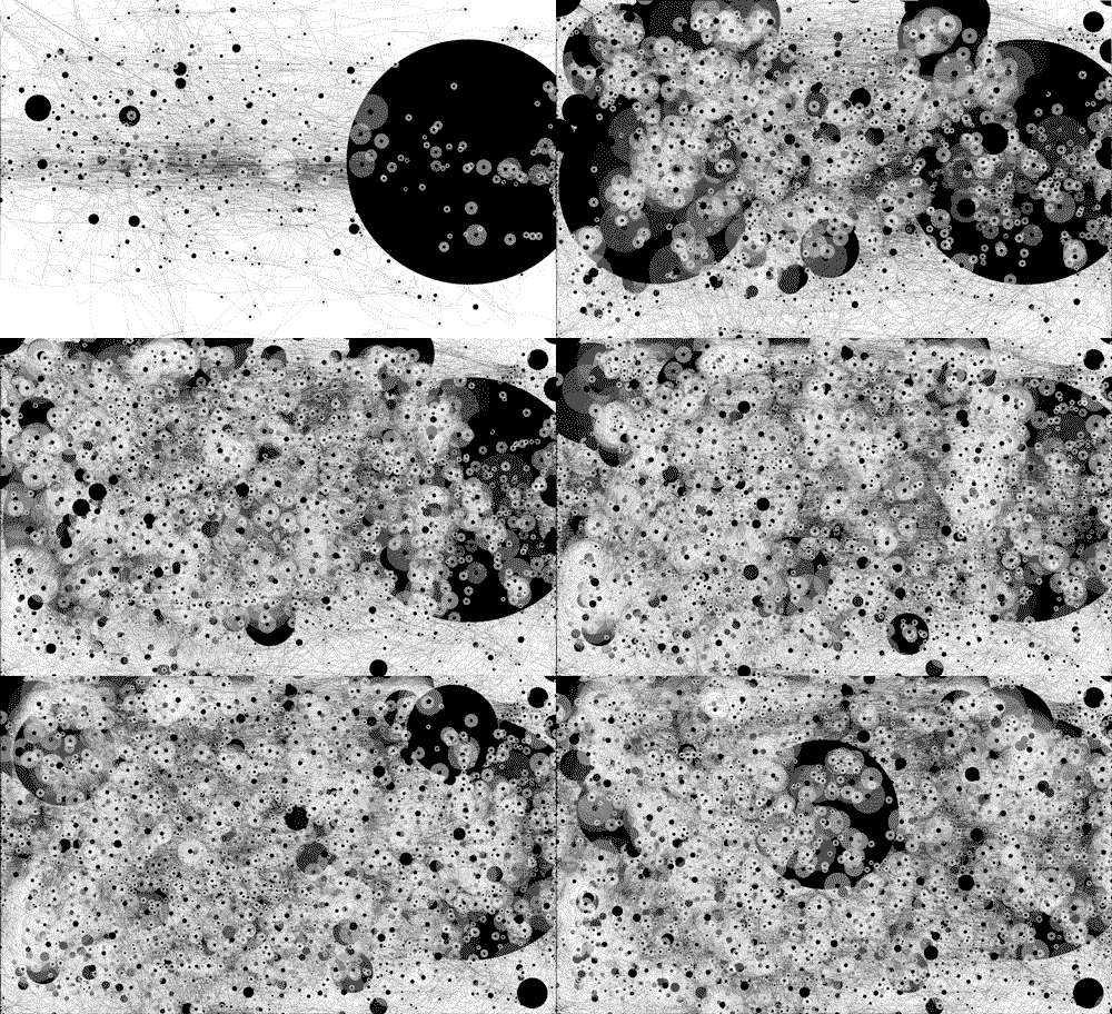
]]>‘My mouse cursor path over the course of a week’
Designer Gavin Potenza keeps track of his mouse.
Image borrowed from his blog; read more here.
]]>‘annular solar eclipse and pleiades alignment tonight. frequency shift. reset.’
Found via Jes Cellophane
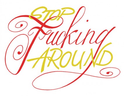
]]>Often there’s this thing – where the graphic designer – feels like shouting, ‘I’M A PROFESSIONAL, I KNOW WHAT I’M DOING. REALLY.’
It usually arises from the idea that graphic design is a voodoo art that many do not understand. Or they think they do, but only understand a small portion of it. Trained, professional designers do spend at least 4–5 years studying our craft – and the years after finessing what we know.
Keeping communication open to clients is also important. But really, there’s some of us who know what we’re doing.
Mostly.
Button design by UXPin.
Found via Sandoer Berg
Former student Alice Woodruff posted this list on my Facebook page.
It was written by writer and model Sovereign Syre, co-founder of Darling House. Syre’s ‘Things you should know’ was originally published on blogcritics.org back in 2009.
It’s good thoughts and will probably offend some. Turning off one’s ego long enough to connect with others is often difficult. I have to enact #25 before week’s end. A good, unexpected apology for something I didn’t expect to occur will make someone else’s day. Fingers crossed.
[1] Most people hide their suffering better than you think, you pass dozens of people a day on the street without any idea how well they’re wearing their tragedies.
[2] People’s names are the sweetest sounds they hear. You should make a point of being good at learning and using them.
[3] People love to spread their misery around, but not as much as they enjoy being lifted out of it.
[4] Being young is not in and of itself an achievement. Neither is being beautiful. But people often treat you as if they are.
[5] For a lot of people, music is a reflection of who they are and their relationship to life. Remember that before insulting someone’s favorite band.
[6] The Golden Age never existed. People are always trying to get back to a time when things were simpler and better. The world was a far more dangerous place fifty years ago, especially if you were black or a woman or gay or diagnosed with cancer.
[7] Most people, whatever their choice of profession, feel like complete novices that are about to be found out as frauds and fakers.
[8] Most people love quite helplessly, despite what they would have you believe.
[9] Show me the most beautiful woman in the world, and I’ll show you a man who’s bored with taking her to bed. Show me the most devoted husband, and I’ll show you a woman who feels that he’s just not doing enough. A lot of people are never satisfied because…
[10] Most people have no idea what they want out of life, let alone how to get it. Most others are still waiting for someone to give them permission.
[11] Whatever it is about yourself that you’re trying to hide, it’s usually the first thing someone else notices about you.
[12] You should call your mother and tell her you love her. Like most women who decide to marry and have children or help take care of a dying parent, she probably sacrificed a lot of her dreams to be there for you, and she wishes that you appreciated her more for it. Susan Boyle represented this demographic powerfully, but for every one of her, was a woman like your mother who will never get that standing ovation.
[13] If you tell a man about your problems, he assumes you want some sort of help or advice. If you tell a woman about your problems, she assumes you simply want a shoulder to cry on. Women rarely want to be told what to do about a problem, and men rarely want to be coddled through a hard time.
[14] Creative people thrive on feedback. You can never give them enough of it, and you will endear yourselves to them mightily if you do it frequently, thoughtfully, and honestly. They understand far better than most think, the value of time.
[15] For most people religion is a social commitment more than a spiritual one.
[16] A lot of people who consider themselves intelligent can’t properly label all the states on a map, or all the countries in Europe, let alone Africa or the Middle East. Most couldn’t list off the ten commandments, five pilars, or the amendments of the Constitution, and feel that politics are too complicated to bother with understanding, let alone talking about.
[17] A lot of Christians have never, and will never, read the Bible. Most of them will conduct their lives exactly as they would if they’d never attended a single church service. It is nearly impossible to tell a Christian from an atheist by their actions alone. Both Christians and atheists will probably find the previous statement offensive.
[18] For nearly every crazy idea, you can find a fully credentialed scientist who will back it up.
[19] People are more frequently kind and compassionate than they are fooled by our manipulations or lies.
[20] Life often works in reverse. People treat strangers more politely than their family or friends. People will ask a friend’s band to play their party for free, will call their best girlfriend to come over and cut their hair without a thought to payment, but would never dream of calling a mechanic they found in the phonebook and asking them to donate their time and labor to fix a broken down car.
[21] Everyone has done something they would be desperately embarrassed for anyone else to know about.
[22] Never joke with a man about his sexual performance, and never joke with a woman about her appearance. No matter how much they make fun of these things in themselves, never, never do it for them. They may laugh along with you, but you’ve just driven a tiny needle into their brain.
[23] Most women get married because they want to have a wedding, most men get married because they are ready to settle down with a woman for the rest of their lives. Women, statistically speaking are more likely to suffer clinical depression if married, and initiate upwards of 80% of all divorces citing irreconcilable differences. People expect a significant other to change their lives and make them happy without any conception of how this change will take place. Sort of like assuming a college degree is going to guarantee you security in life without ever thinking of how this can be practically possible. I call this the ‘If you build it, they will come’ approach to romance and one out of every two times it ends in divorce.
[24] Most people are worried they’re not having as much fun as they should be. This usually makes men cheat and women nag.
[25] When you insult or offend someone, always admit it and apologize promptly, even if it wasn’t your intention or you had no idea. It is always better to be a penitent villain than to appear so socially inept as to not recognize when you’ve hurt the people around you. An evil genius is someone to bring to your side, a blundering fool is someone to keep as far away from you as possible.
Sketches by Alice Woodruff
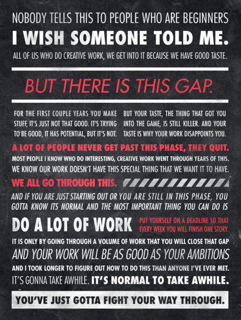
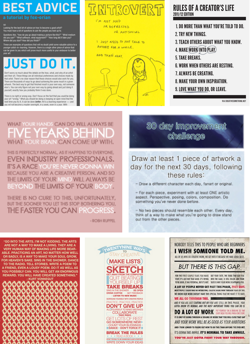
]]>Here’s a roundup of advice graphics.
I’m always frustrated when beginning students give up prematurely, when there are those who see being ‘creative’ as either a job or something not important and/or not realizing the more a creative works at what they’re doing, the better they will get; collaboration is great, rules get in the way, others will never understand you and that’s okay, work should be fun (especially hard work), breaks are important and a zillion other things.
Click to view larger/jump.
Found via hyenabonz
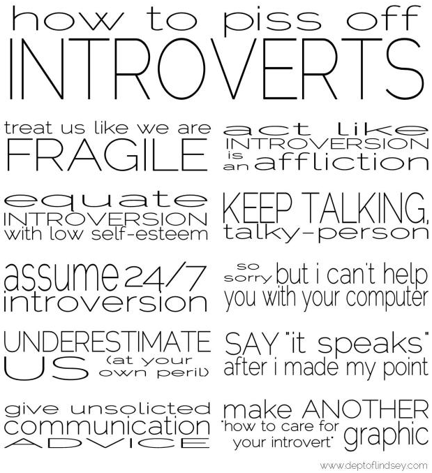
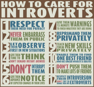
Many creatives are introverts – some famous ones include J.K. Rowling, Eleanor Roosevelt, Clint Eastwood, David Letterman, Howard Stern, Steve Martin. The trick is most introverts are annoyed just enough by the banalities of everyday societal demands that one typically doesn’t want to get bogged down by the bullshit. Introverts have important thinking to do – typically, introverts are out to change the world in one way or another.
There’s a graphic that’s been bouncing around the interwebs (below) that doesn’t quite hit the mark. Shyness is something totally different.
Above, a list that nails it (and yes, the type is stretched. Typographers: Deal.) – it came from this cool post. And here’s an article with more detail (book available too).
When I’m in quiet mode, I’m busy. Then I come out and play when in a classroom or social situation. Even though the second part is a learned behavior, it is also quite fun and a great balance. Wouldn’t change it for anything.
Bullshit
Found via Lindsey, Jes
]]>‘Perfectionism is exhausting’
I’ve watched my students push themselves so hard to get an ‘A’ that they’ll overlook what it really takes to come up with creative work.
Here’s another take on the concept – by author Michael Nobbs, with a pitch for his book Sustainable Creativity.
]]>‘Creative people across all genres, it seems, have this reputation for being enormously mentally unstable . . . [and we’ve] accepted collectively the notion that creativity and suffering are somehow inherently linked’
Creativity = a horrible life? Anxieties, fear, alcohol – ?
In her TED Talk from 2009, Author Elizabeth Gilbert throws out some diversionary concepts to keep going – be undaunted.
]]>What really motivates us to do the things we do? I’ve read studies like these over and over – it’s not quite money. And it’s not very simple either.
Found via Bill Mead
From last year: The bold choices ad. Starring Willem Dafoe and directed by Dante Ariola for StrawberryFrog.
Behind the scenes here.
‘Check out one of the songs i’m most proud of – my cowrite with Nicola Roberts on a very personal, epic and beautiful ballad.’ –Maya von Doll, Sohodolls
Video for Nicola Roberts’ Sticks + Stones.
Sticks + Stones brings back memories. When one is ‘creative,’ one doesn’t always fit in.
And you know what I’ve learned over the years? It’s fucking cool to not fit in.
]]>Video for The Ting Tings’ Silence.
]]>